435 Manhasset Deli
435 Manhasset Deli is a New York neighborhood deli turned into a premium gourmet destination.
What Wasn’t Working
People in the area knew the name 435 Manhasset Deli. But the brand was holding it back. The look hadn't been touched in years. The reputation was just okay. Neither showed the quality the new owners wanted to deliver.
They wanted to bring in new customers, keep the regulars, and compete for catering jobs, all without losing the local feel the deli had built over the years. That meant a rebrand that felt like an upgrade, not a replacement.
How We Solved It
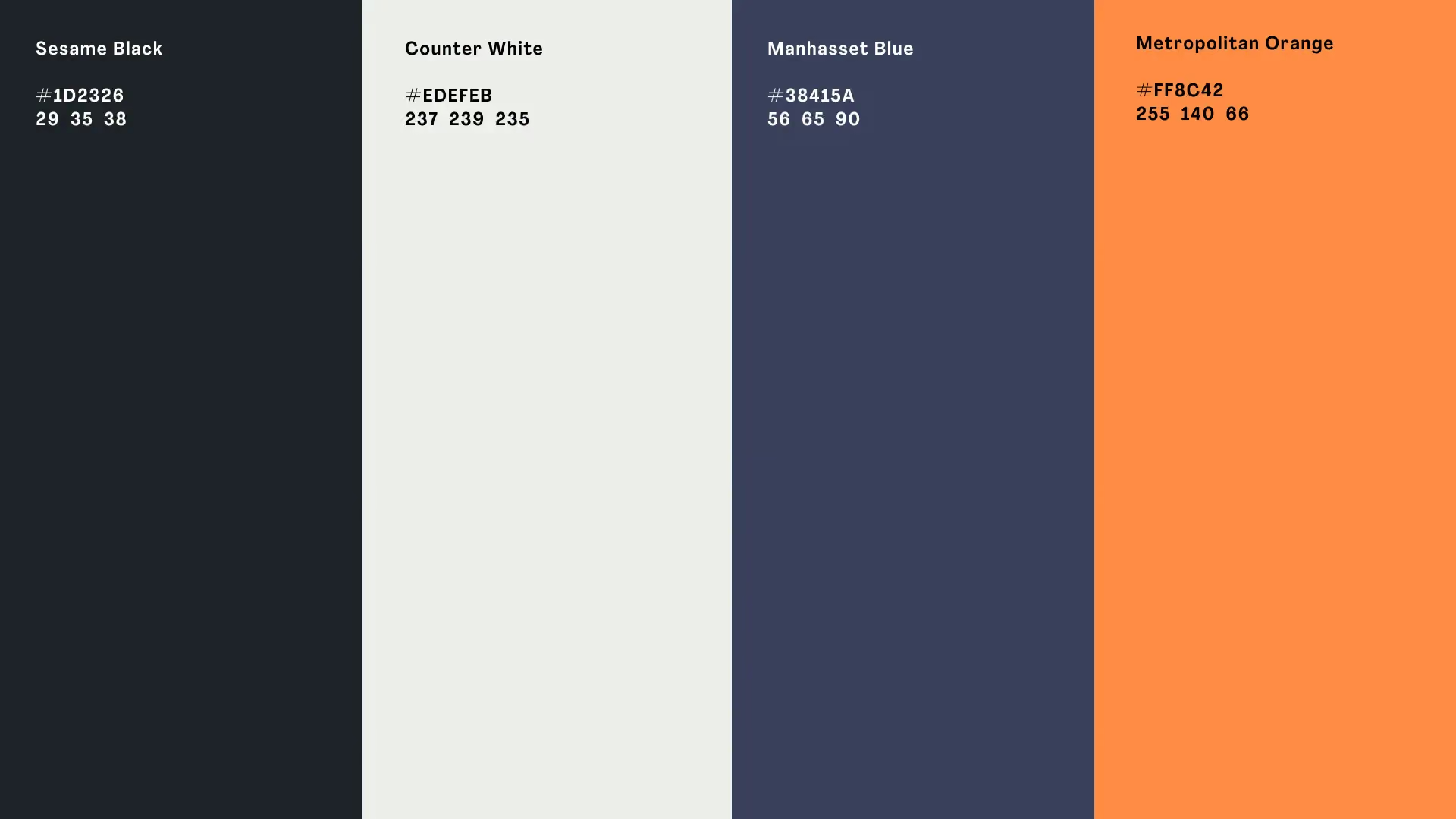
We leaned into early 1900s American style, the kind of look that says craft, tradition, and quality at a single glance. We built the colors from neutrals plus the city's own colors, so the deli feels local and the look won't date fast.
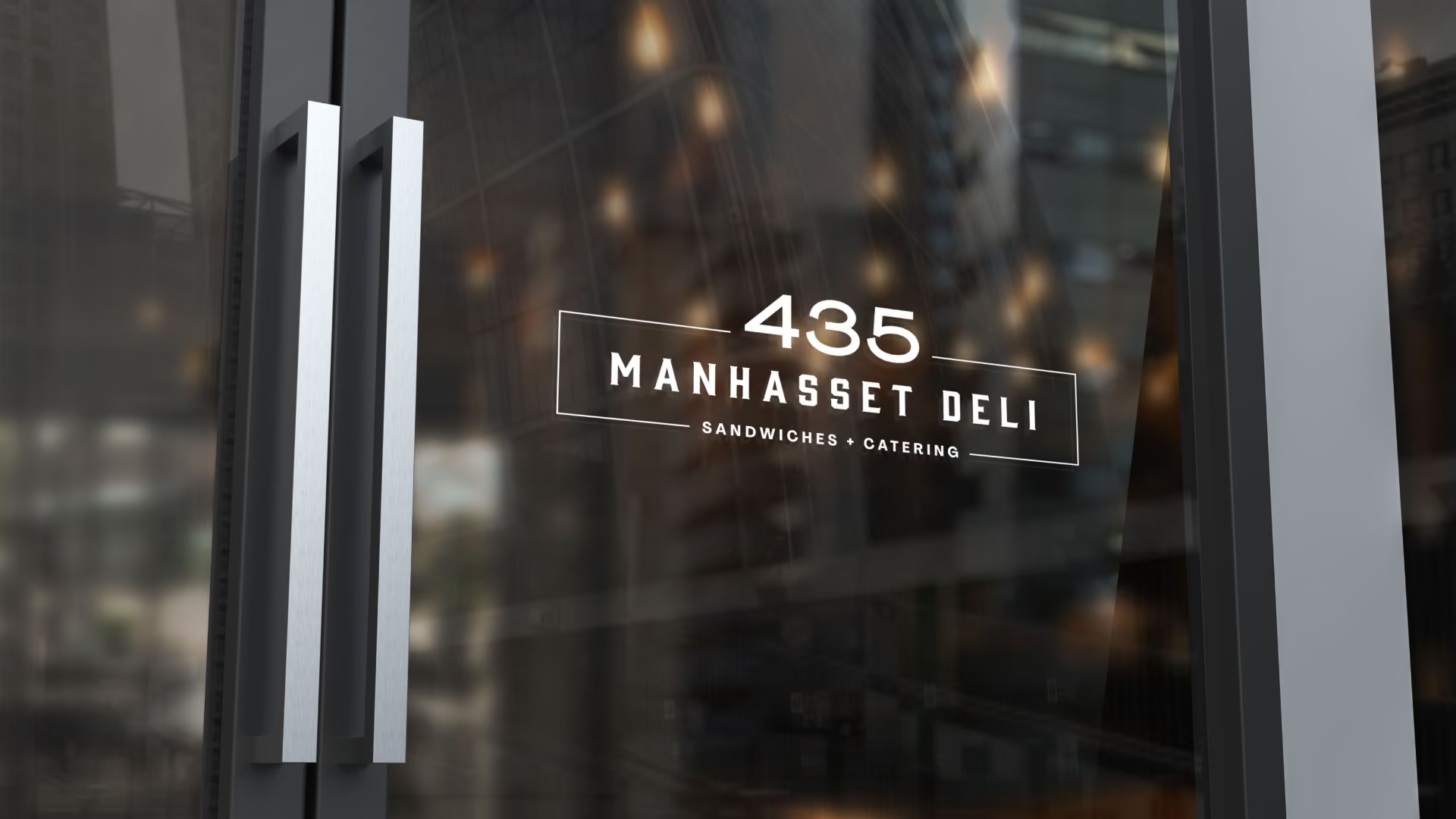
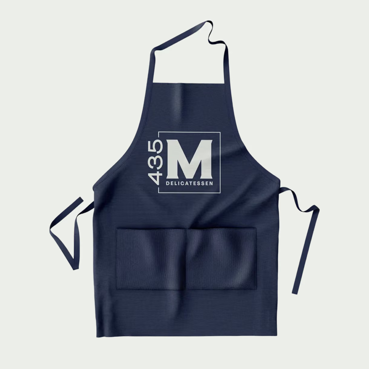
The updated logo went on new uniforms, packaging, and signs, so customers see the same story everywhere.
The goal was to make the deli feel like a destination, not just a quick stop. Walking in should feel like stepping into a place that takes real pride in its food. That's what the brand delivers.
What We Delivered
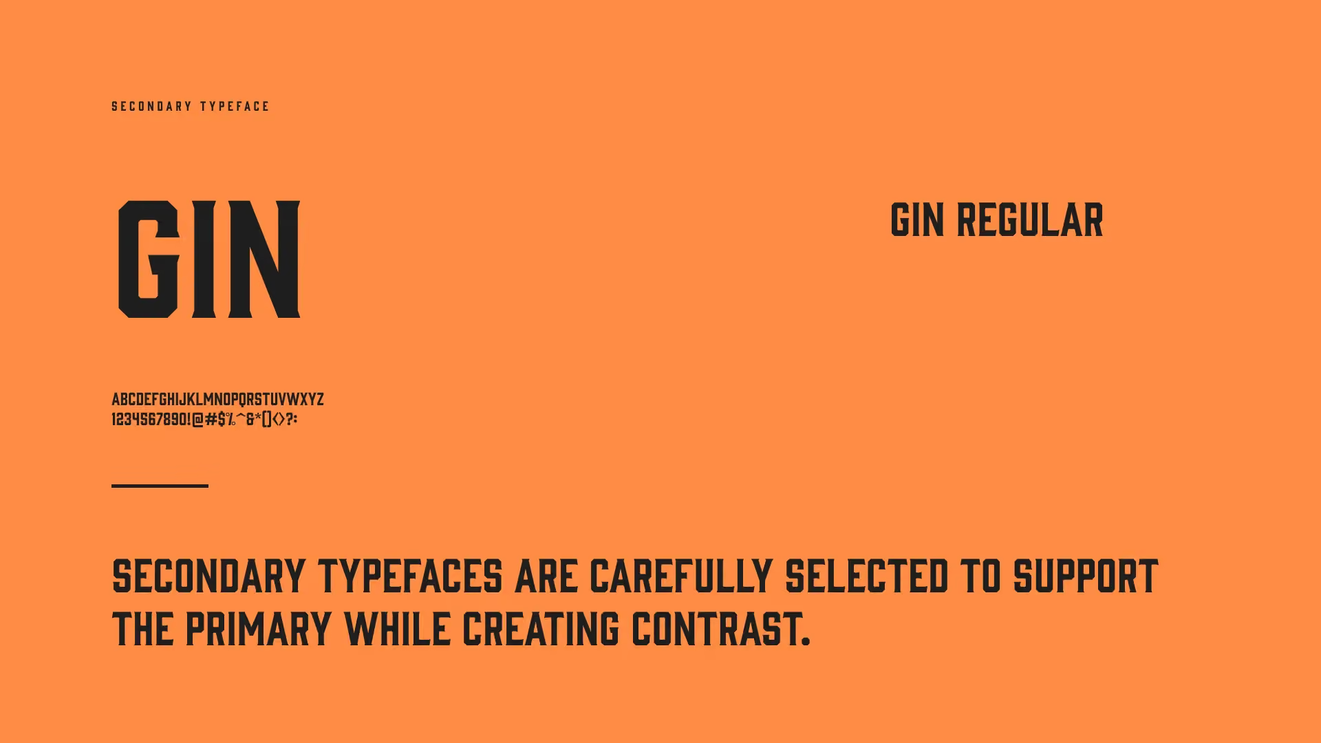
The deli received the full look: a refreshed logo, colors that won't go out of style, and fonts with early 1900s American character. The new look rolled out across uniforms, packaging, and in-store signs, so every place a customer sees the deli tells the same story. Behind it sat brand strategy: a clear plan to win gourmet dining customers in the neighborhood and make a real push into catering.
The Result
435 Manhasset Deli is now the top choice on the block. It outsells the delis around it, even the ones right next door. The gourmet look brought in new customers, brought the regulars back more often, and opened the door to catering money. More people know the name, more people walk in, and catering has grown since the rebrand. That's the upgrade the new owners wanted: the same deli the neighborhood knows, presented like the destination it wanted to become.