Dear Coffee
Dear Coffee is a New York City concept coffee shop created by the founders of Kaigo Coffee, inspired by the idea of writing love letters to a great cup.
What Wasn’t Working
Building a brand for a new coffee shop in New York City means competing in one of the most crowded markets in the world.
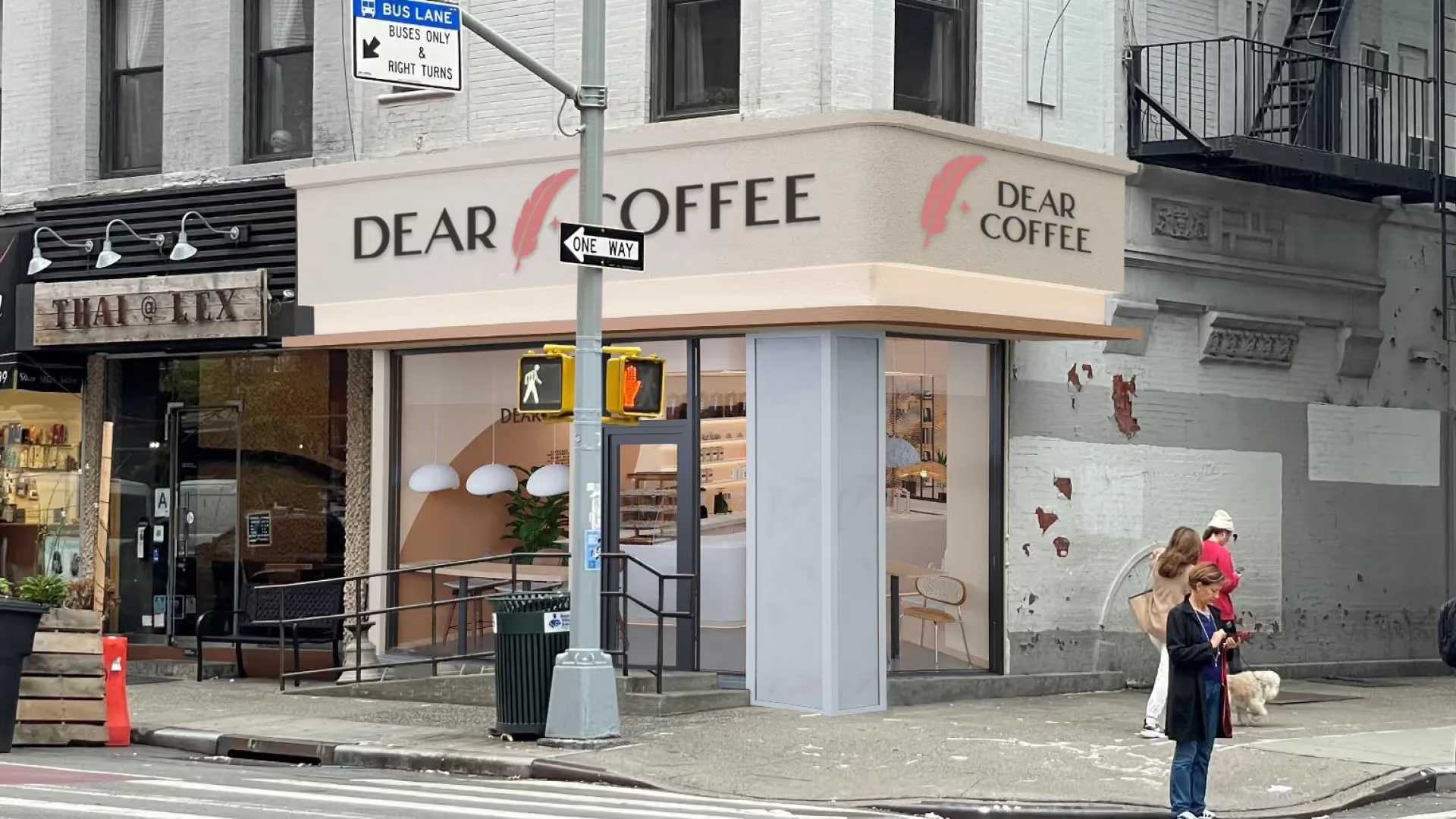
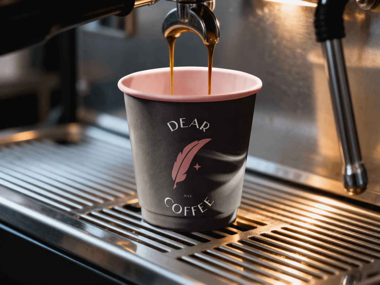
Dear Coffee also came with a specific request: the shop itself was planned around creamy earth tones and simple Scandinavian style. The brand had to feel like it belonged in that space. No coffee beans. No generic cups. A previous designer had missed the mark.
The new look needed to feel personal. And flexible enough for more than one location.

How We Solved It
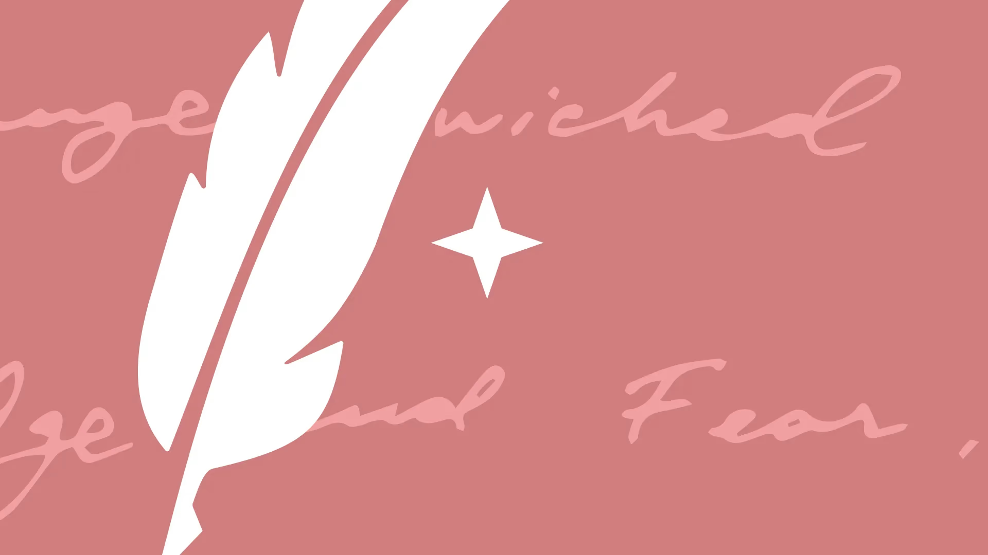
Two icons anchor the whole look.
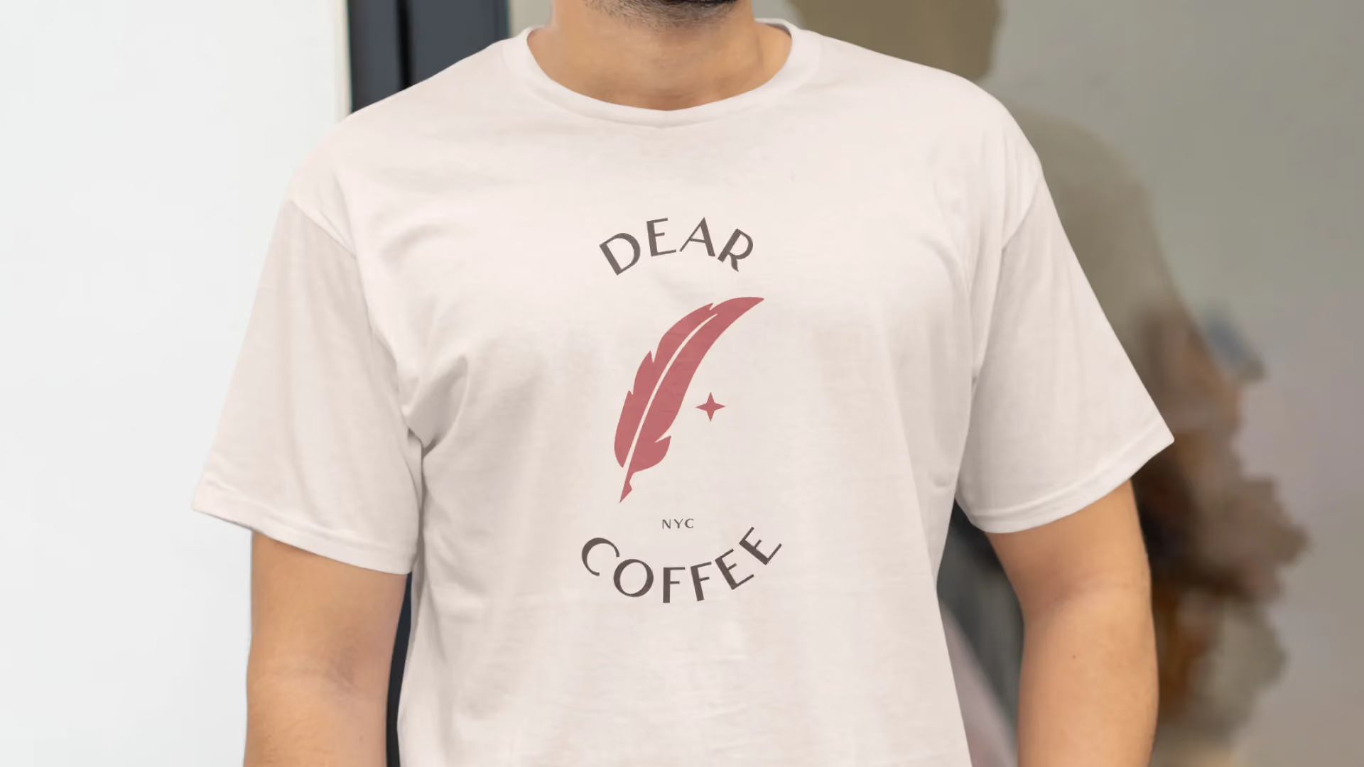
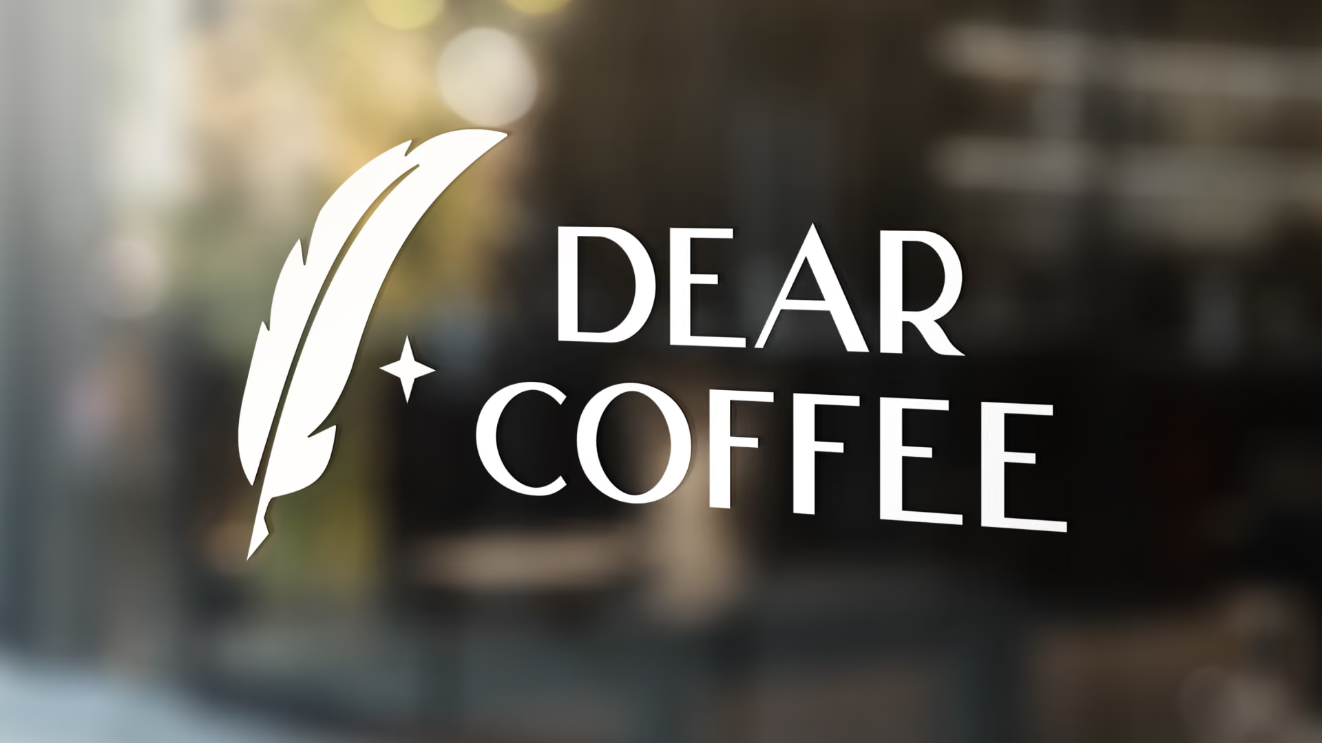
The first is a quill feather. It brings to mind the love letters someone might write to a favorite cup. The name Dear Coffee called for something personal and warm. The feather delivered that. It also points to the founder's travels and his search for great coffee around the world.
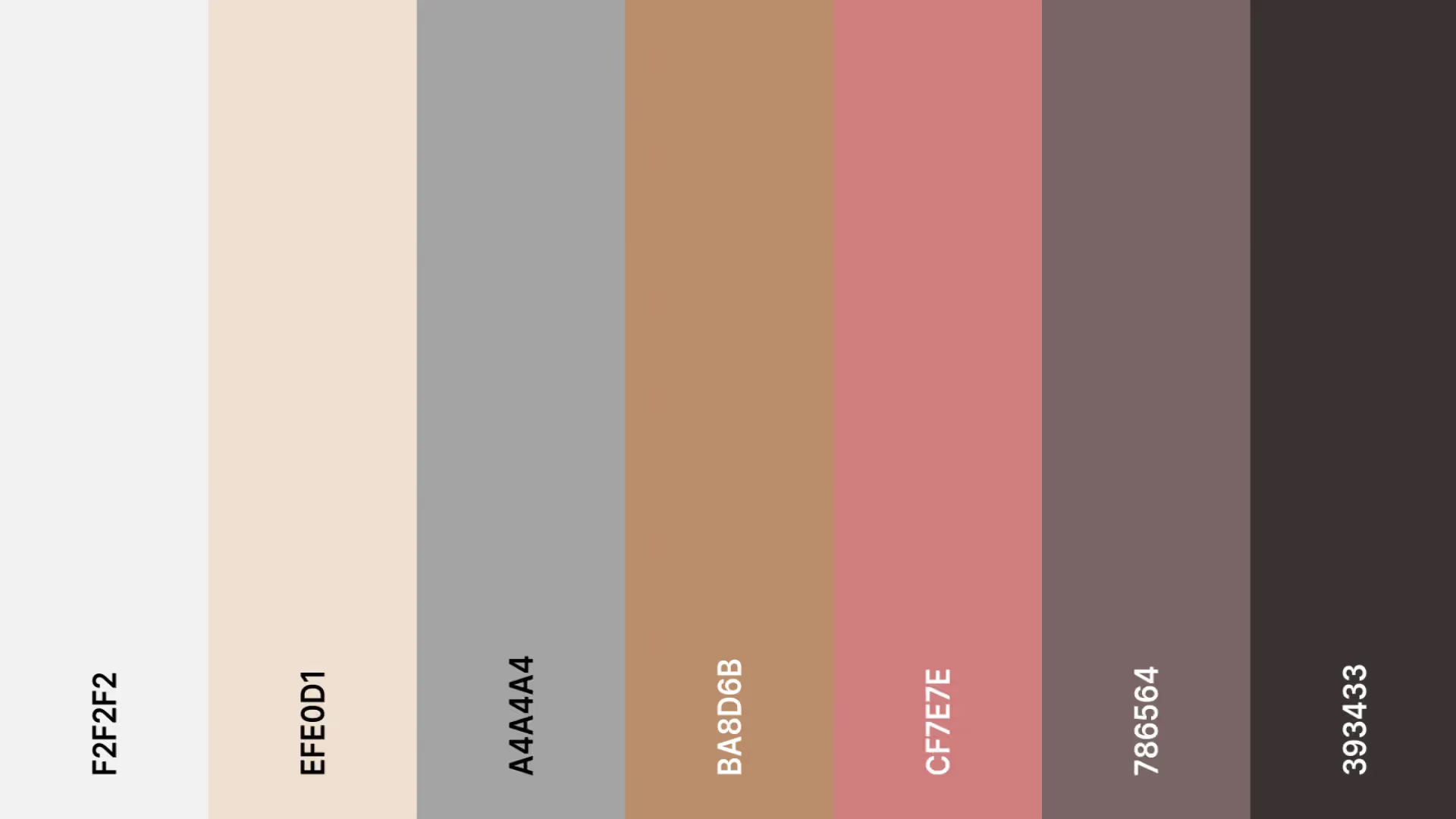
The second is a star that works as a North Star compass, guiding coffee lovers on their own flavorful journey. Handwritten-style lettering echoes the love letters. The blush colors were picked to blend naturally with the creamy, Scandinavian-style interior. The brand feels like it always belonged in that space.
What We Delivered
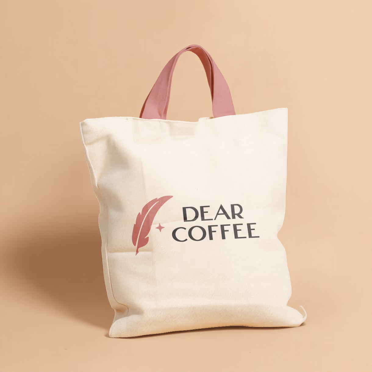
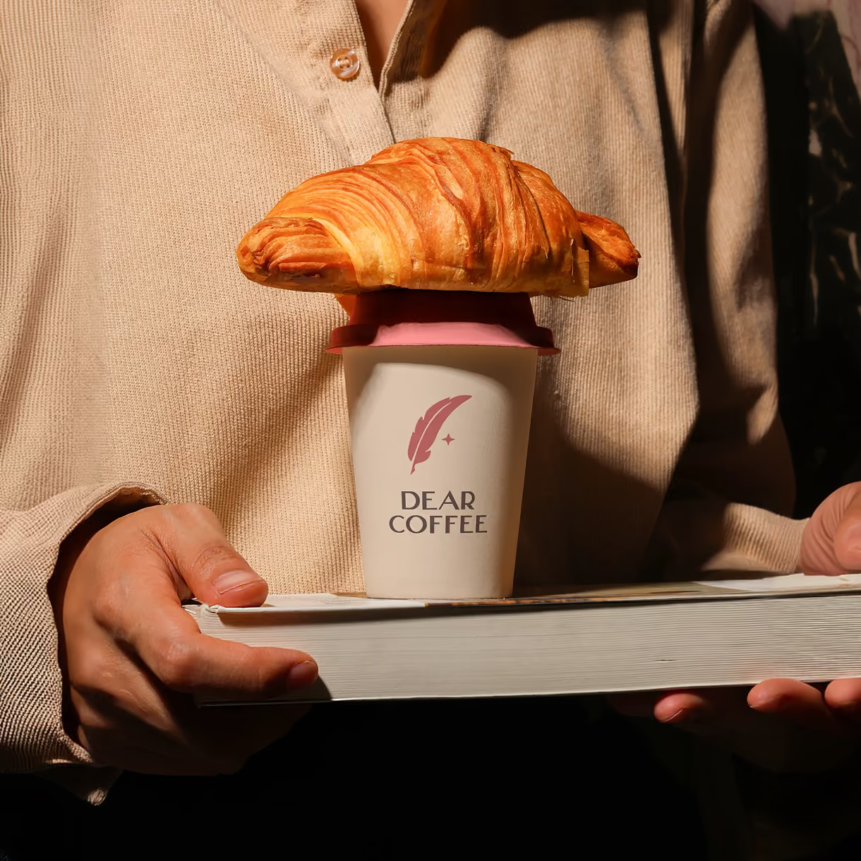
The founders walked away with the full brand identity: two icon marks, the quill feather and the compass star. Plus the handwritten-style lettering and the blush colors. We packaged it all into a complete branding kit, ready for marketing materials now. And built to carry across more locations as the idea grows.
The Result
Dear Coffee launched with a look that felt made for the space. The blush colors and handwritten touches blended naturally with the interior. The brand captured what the previous designer missed: the personal, warm relationship with coffee at the heart of everything the founders do. And the look is ready to grow as they expand.