Foundbl
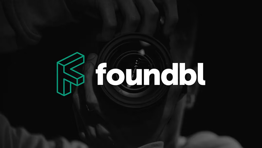
Foundbl is an app that learns, adapts, and teaches photographers at every level. We built their look and simplified how they explain what they do.
What Wasn’t Working
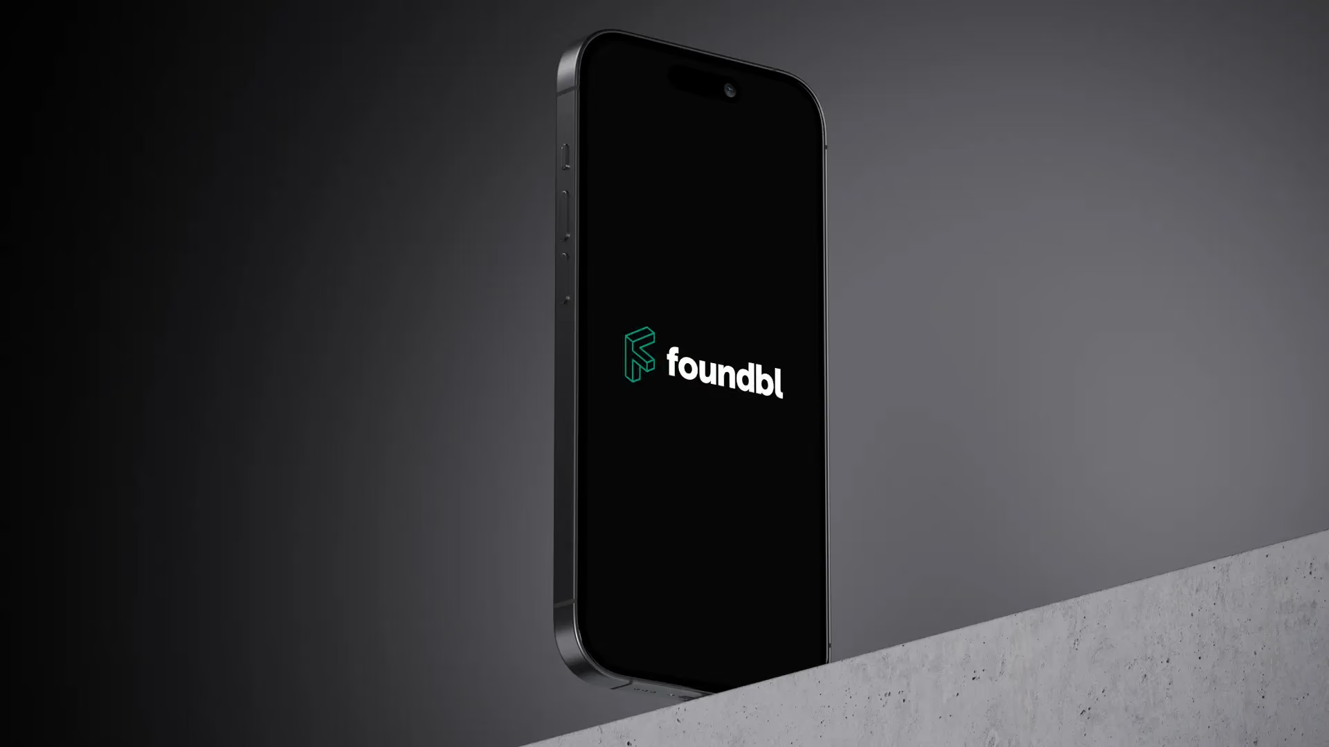
Foundbl had a powerful idea with nothing to show for it. No logo. No brand system. Nothing for the app to stand behind. Their dark-themed app screens needed a mark that matched their ambition: bold, minimal, and hard to mix up with anyone else.
The challenge was building that brand without endless back-and-forth. And without the client having to manage every small decision.
How We Solved It
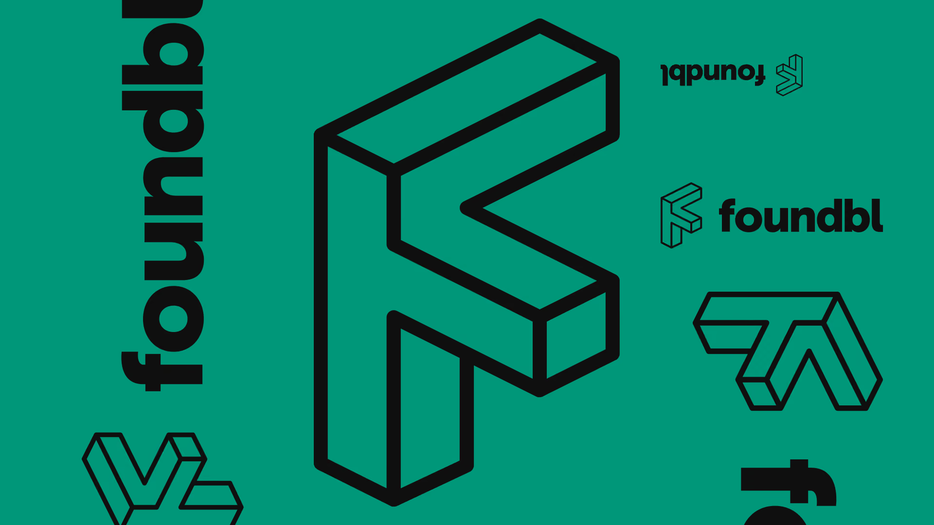
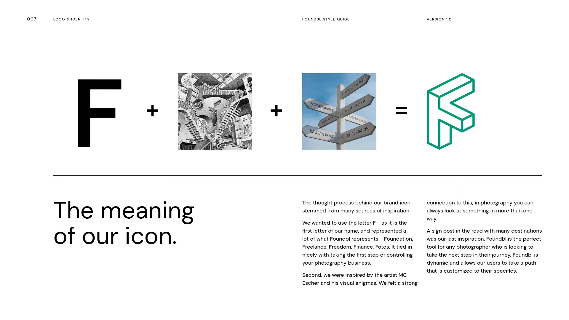
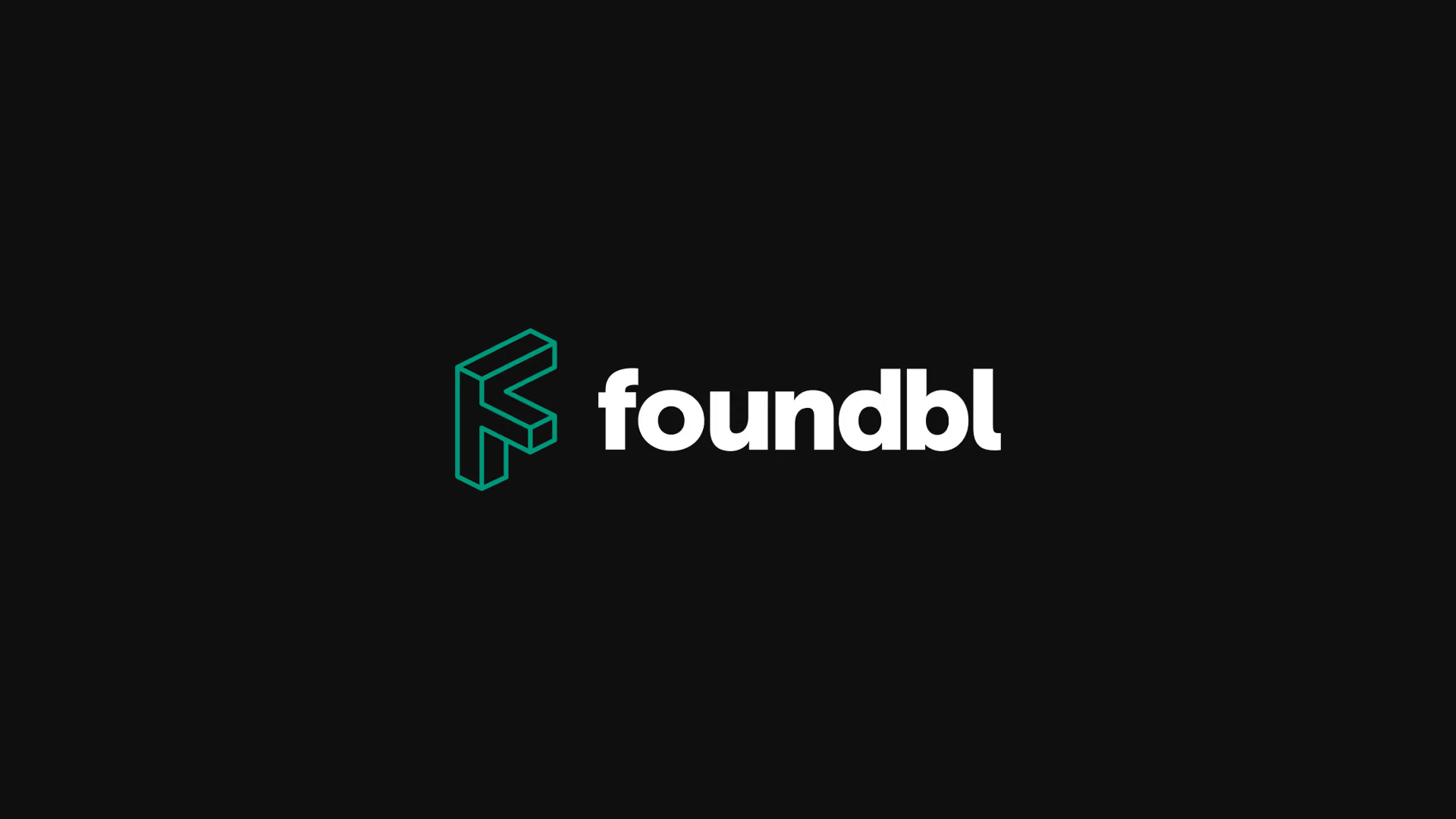
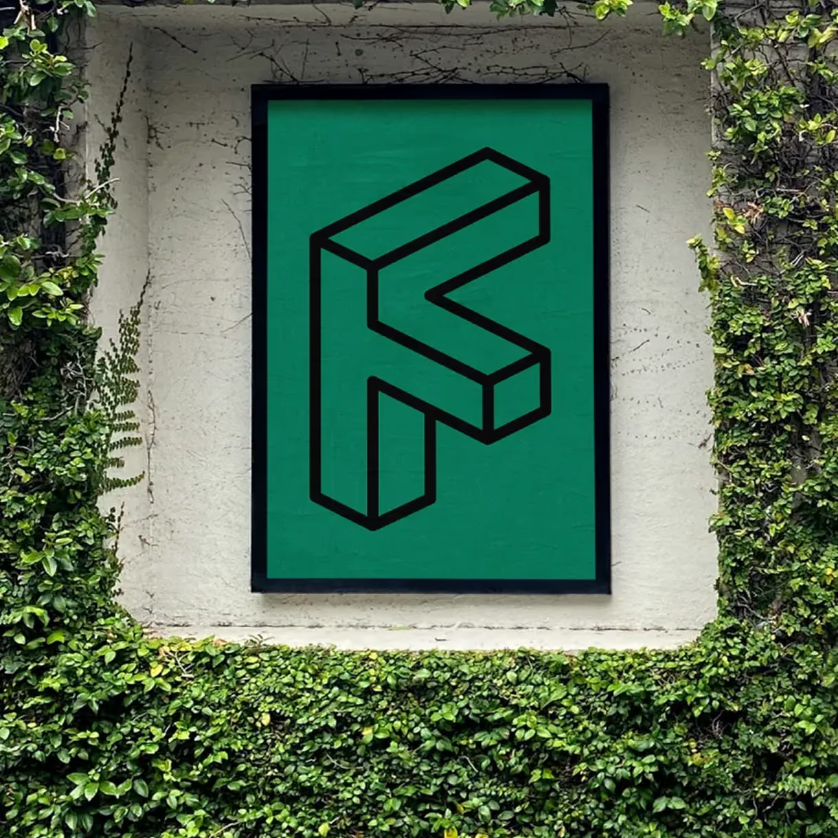
Foundbl's icon was built from layers of meaning. We anchored the mark in the letter F: Foundation, Freelance, Freedom, Finance, Fotos. The abstract shape was inspired by MC Escher's visual puzzles and a signpost at a crossroads. It captures the many-paths nature of the platform.
Sample design boards and early agreement kept surprises off the table. The process stayed fast and decisive from the first round on.
What We Delivered
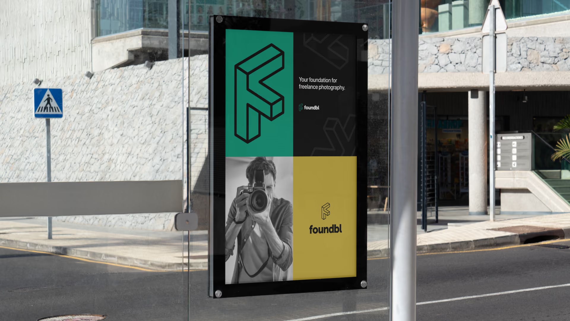
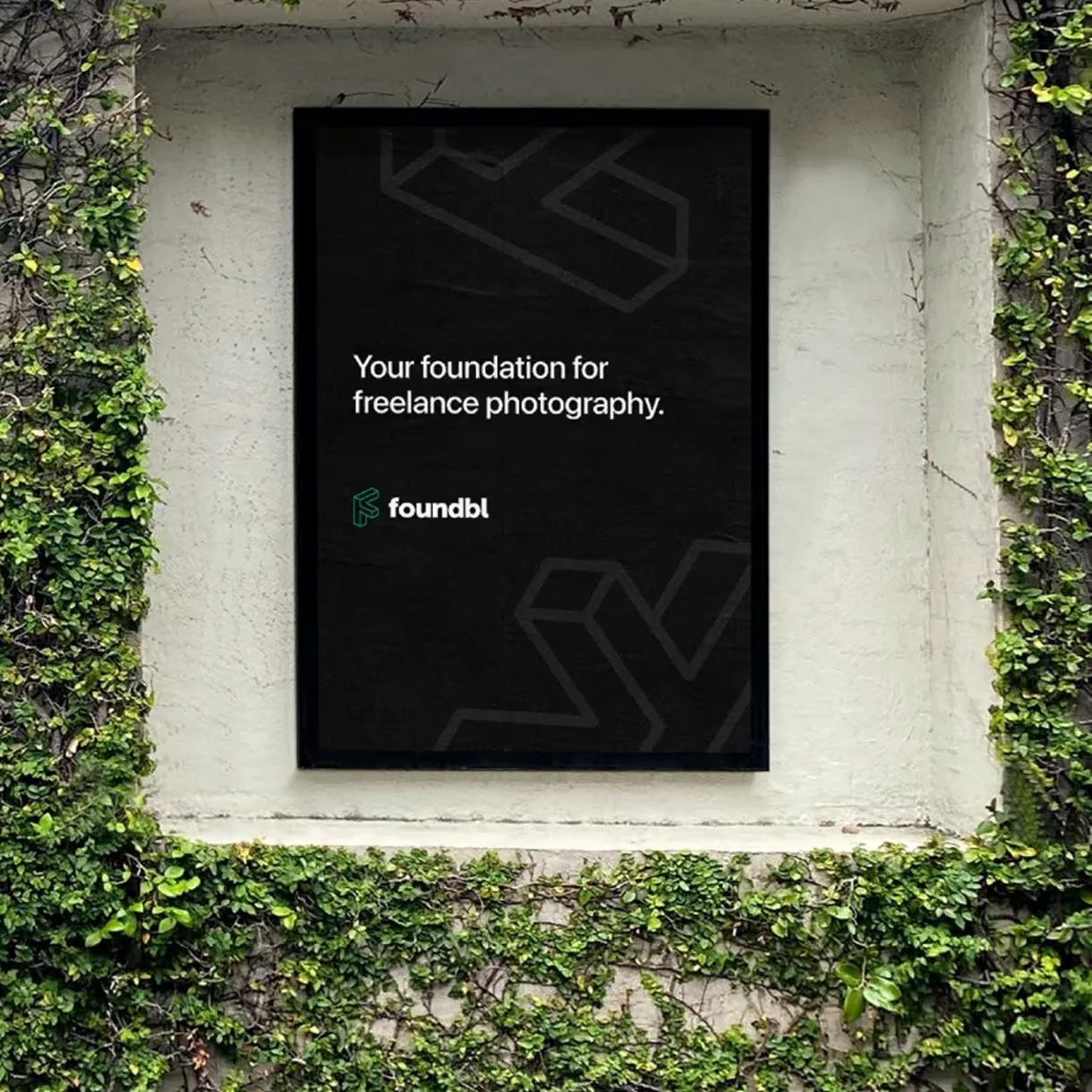
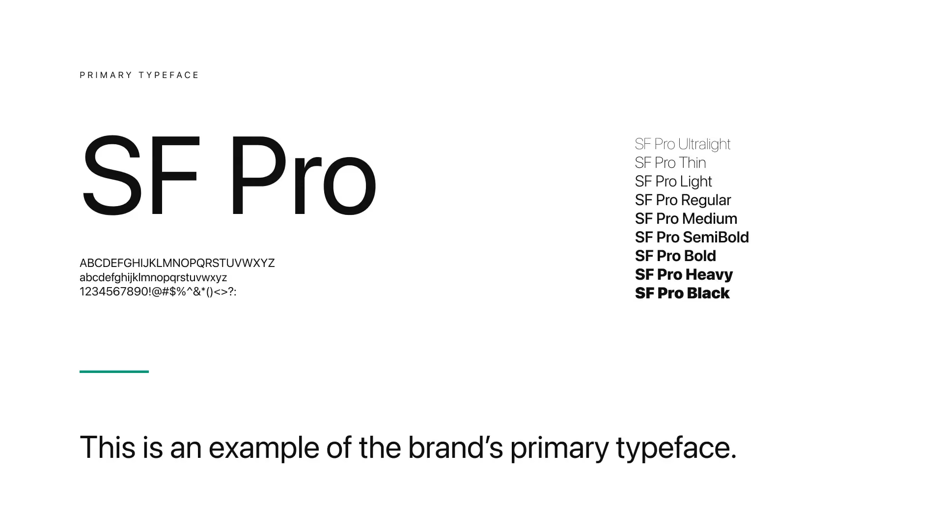
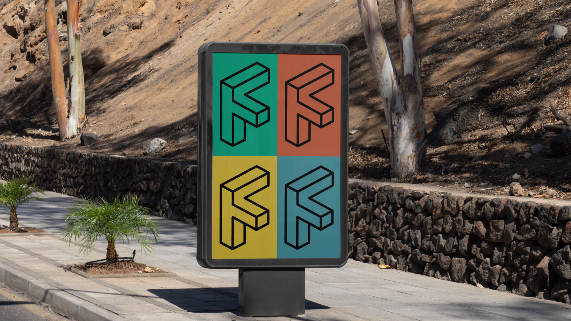
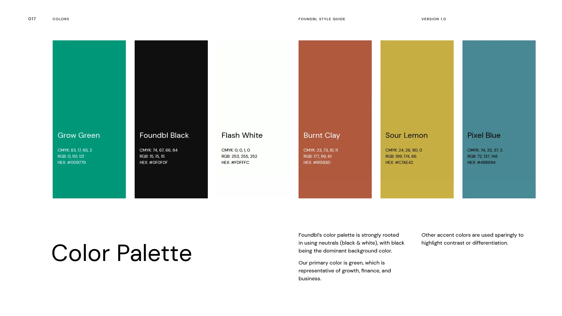
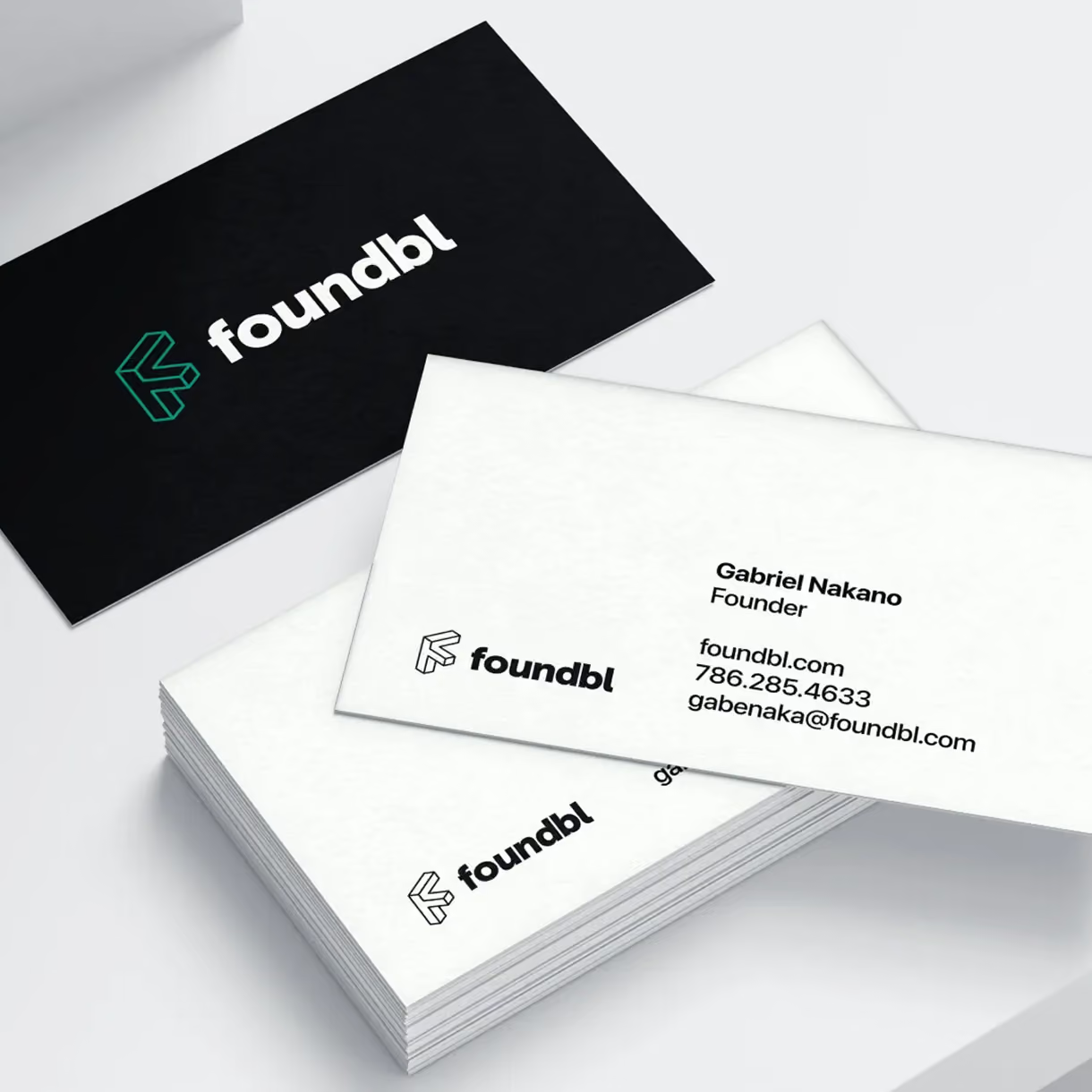
Foundbl walked away with the full brand identity: a set of logo versions, colors, and fonts. Plus a simple rule book for using them. All of it built to sit well with the app's dark screens. We also sharpened the words they use to explain Foundbl. Now the team can say clearly what it does, and why it matters to photographers at every stage of their journey.
The Result
Foundbl went from zero graphics to a complete look that feels premium, modern, and relevant. The colors and logo mark are instantly recognizable. The marketing copy is short and clear, helping users understand exactly what Foundbl does and why it's built for them. The team now has a brand they can stand behind as confidently as the product itself.