
RehabSpot
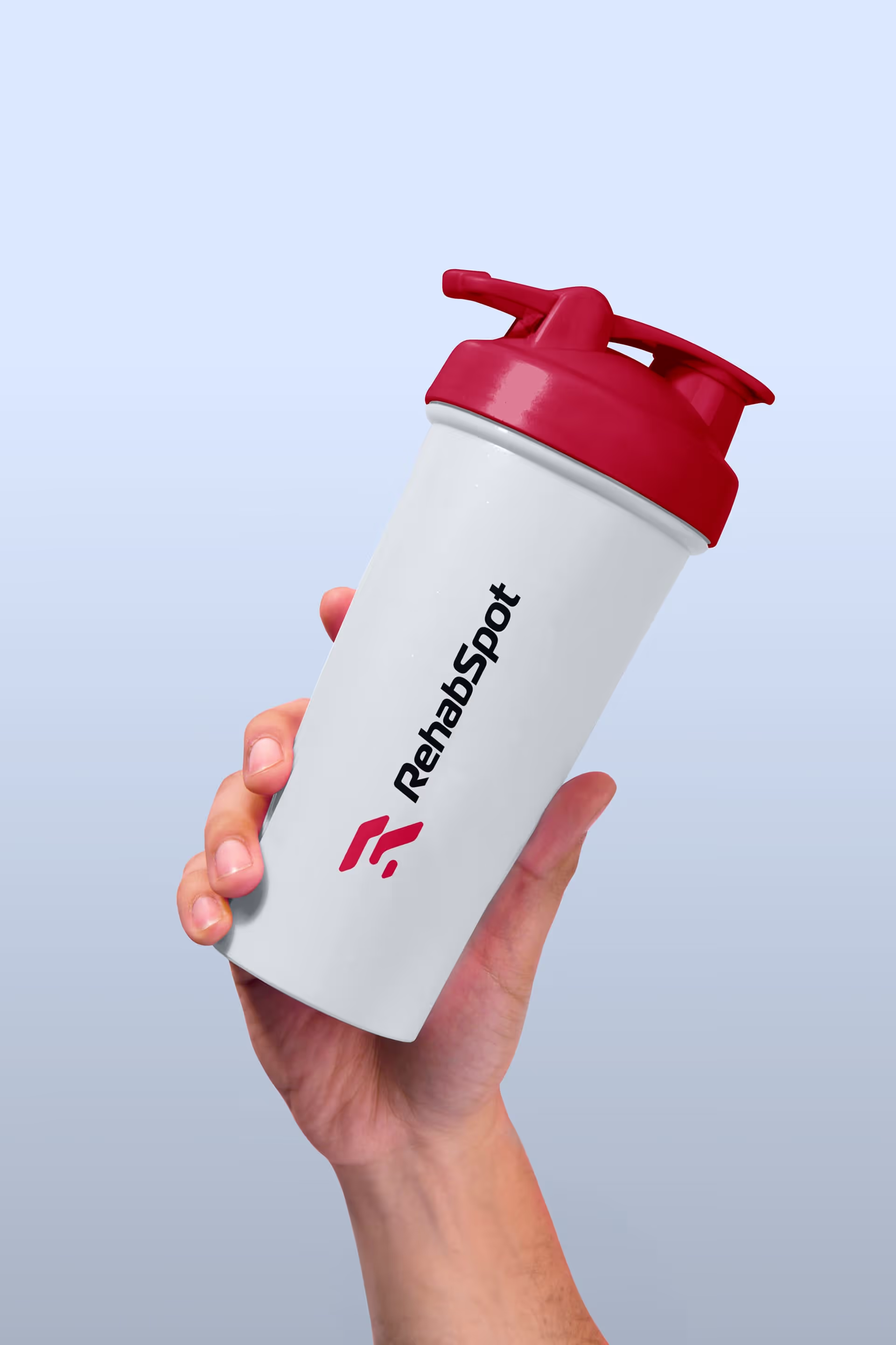
RehabSpot is a physical therapy practice founded on the belief that every patient deserves truly personalized care, not a revolving door approach.
What Wasn’t Working
Most physical therapy clinics move patients through like an assembly line. Quick appointments. Generic exercises. Billing cycles put ahead of real recovery. For people with serious injuries or chronic conditions, that approach often makes things worse.
RehabSpot's founder, Jonathan Gonzalez, built his practice to do the opposite. But his brand did not reflect it. The logo and the look said nothing about the depth of care his team actually gives.

How We Solved It
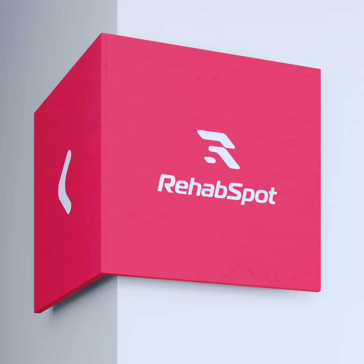
We found the answer inside the name itself. The logo uses a slanted R. The empty space inside the R is shaped like an S. So both letters live in one clean mark. The forward lean adds a sense of motion and progress. That fits a practice built on real recovery.
For the colors, we moved away from the cold clinical blues that fill healthcare. The palette mixes soft pastels with a warm coral accent and a grounded dark navy. It feels approachable and trustworthy. Warm enough to signal that this is not a typical PT clinic. Every element, from the shape of the logo to the colors, was chosen to say the same thing: this practice actually pays attention.


What We Delivered
RehabSpot received the full look of the business. At the center is the custom logo design, with both letters built into one mark. Around it sit a defined color palette and clear font rules.
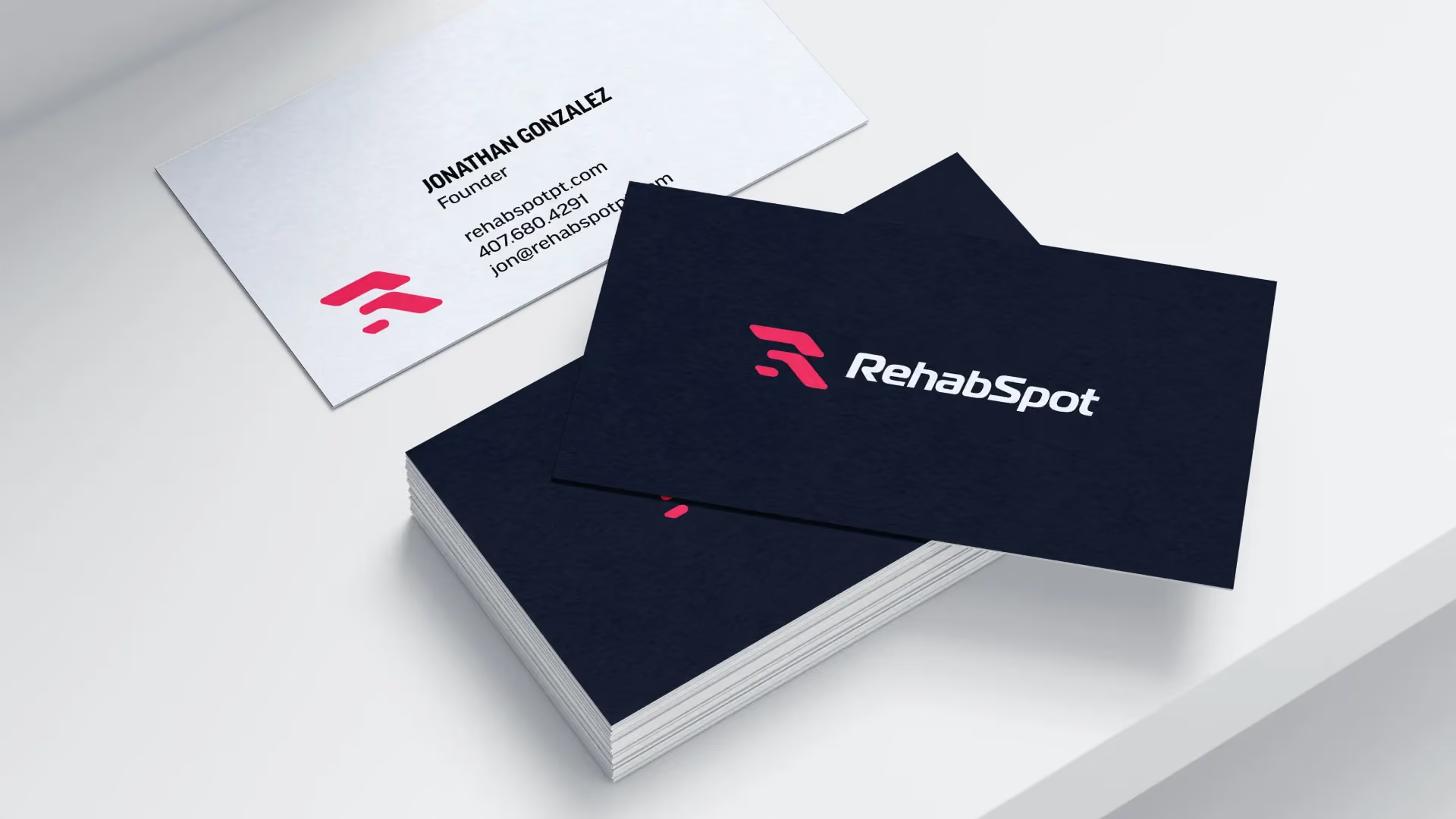
The package also included business cards and letterhead. And it included a complete set of files for web and print. So the practice could show up the same way everywhere a patient finds them.
The Result
Jonathan finally has a brand he is proud of. It reflects the practice he actually built. That mattered to him. Other designers had not taken the time to understand his business. The finished logo matches what the practice stands for.
The look says something most PT clinics never manage to say. Patients here are treated as people, not numbers on a schedule. Since the rebrand, RehabSpot has attracted clients who are looking specifically for the focused, 1-on-1 care Jonathan has always delivered.






Most places did not take the time to get to know me and truly understand what I wanted for my business. I was lost before working with them and now have a product I am proud of.