Truecalcs
Truecalcs turns complex HVAC energy formulas into efficient residential cooling and heating plans.
What Wasn’t Working
Truecalcs founder Tony Amadio built software that strips the complexity out of HVAC engineering. It turns lengthy energy calculations into fast, accurate cooling and heating plans.
But the brand was not keeping pace with the product. It needed a look and a way of talking that felt professional to experienced engineers. It had to feel approachable to newer ones, too. And it had to be built to grow, so it could fit cleanly into a future website and into the software itself.
How We Solved It
Building the brand started with a crash course in HVAC. Tony Amadio walked us through the engineering basics. That shaped every design decision.
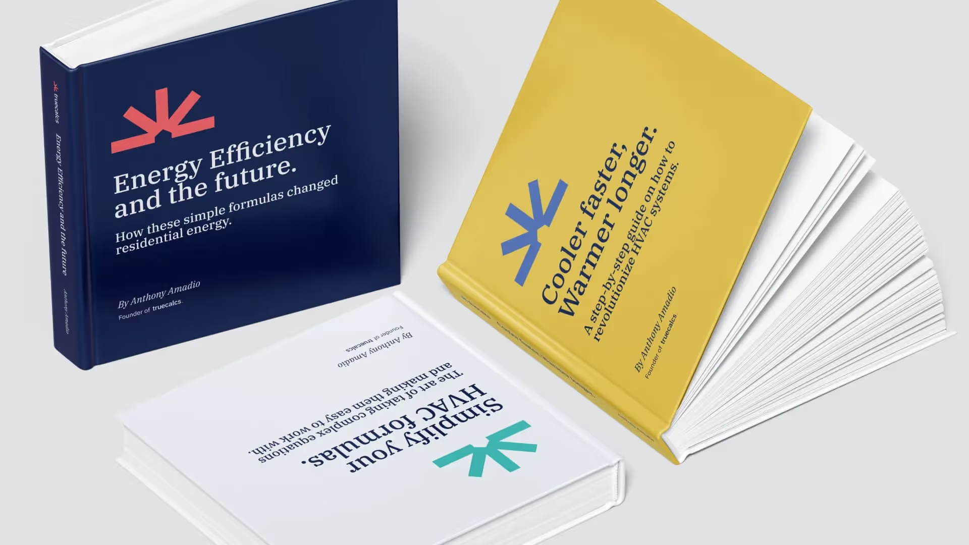
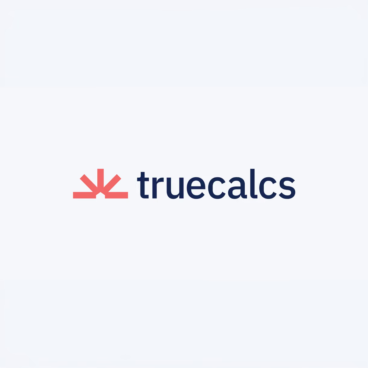
The symbol became the centerpiece. A rising sun stands for energy. Duct pathways run through the shape. A crosshair stands for precision. And a home sits at the core. It captures the full truecalcs world in a single mark.
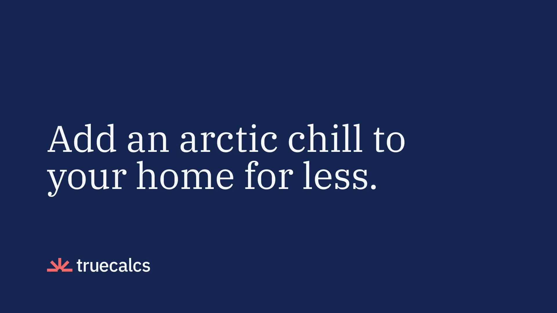
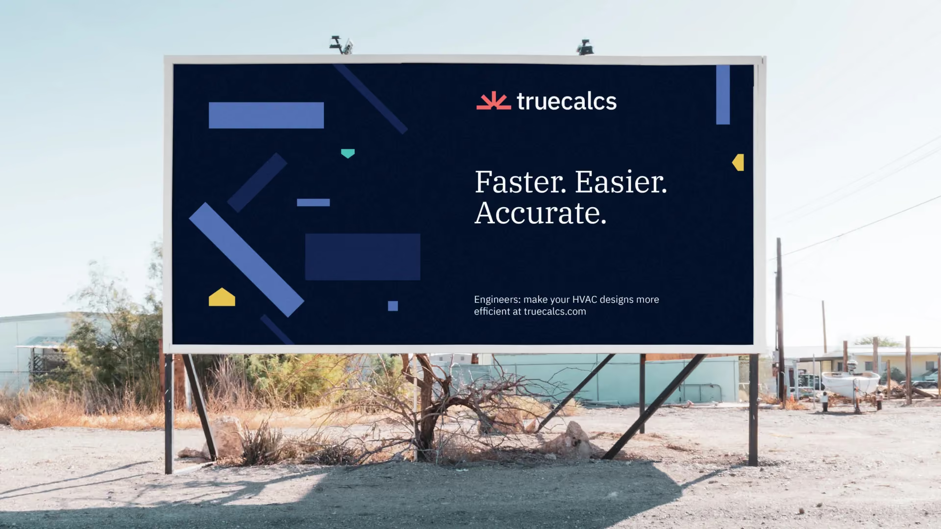
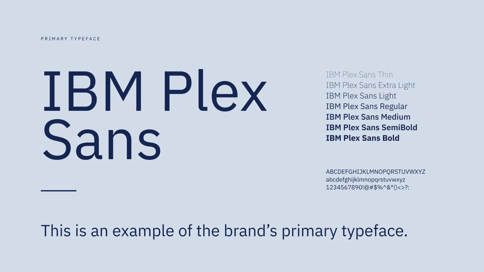
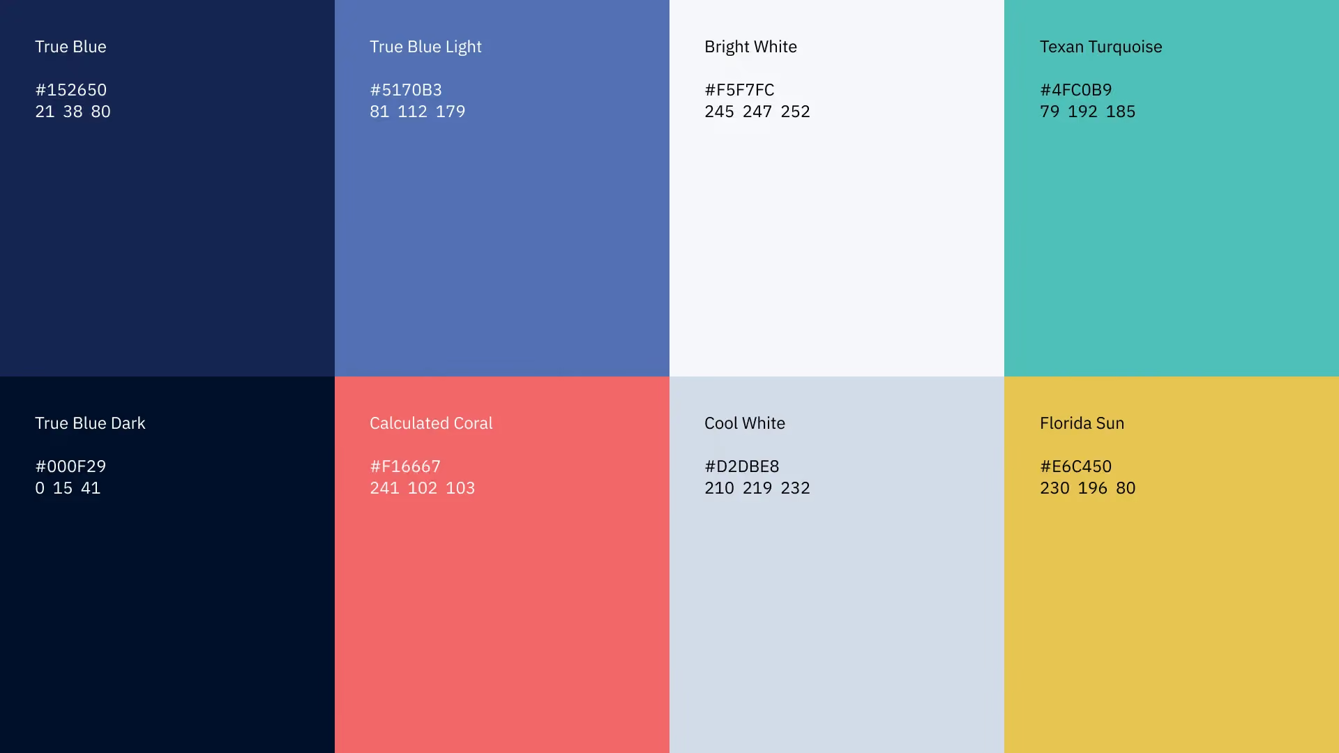
The colors balance warm energy tones against cool system tones. The fonts stay modern and clean, approachable for engineers at any level. The whole look was designed to grow into a software screen, a website, or printed pieces without any changes.
What We Delivered
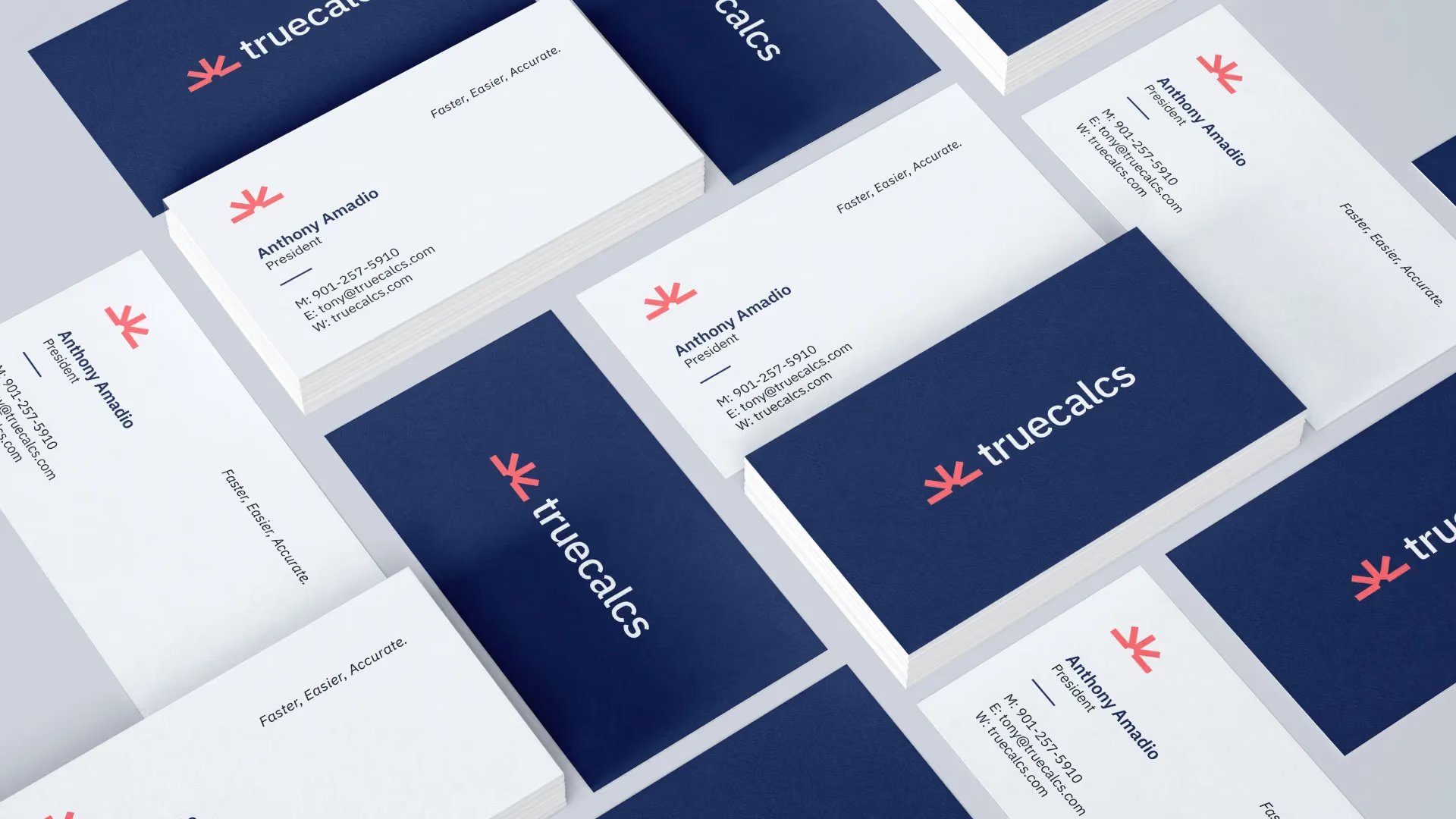
Truecalcs received the full look of the business. That means logo design, a symbol, colors, and fonts, all designed to work as one.
They also got a brand strategy: a clear plan for how the product explains itself, in words engineers trust. The look was built to fit smoothly into both a website and the software itself. So the product and the brand never feel like two different companies.
The Result
The rebrand gave truecalcs an identity as precise and well engineered as the software itself. The new look communicates expertise without being intimidating. It makes the product approachable for engineers at every level.
Truecalcs now has a brand that stands apart in the market. More importantly, it is built to grow alongside the product as the software grows, instead of needing to be redone when it does.


Greg gave me exactly what I was looking for. It was so perfect and so right - it was my new logo and brand that I always wanted and would never have come up with on my own.