Process

Your input drives everything.
The heavy lifting is ours.
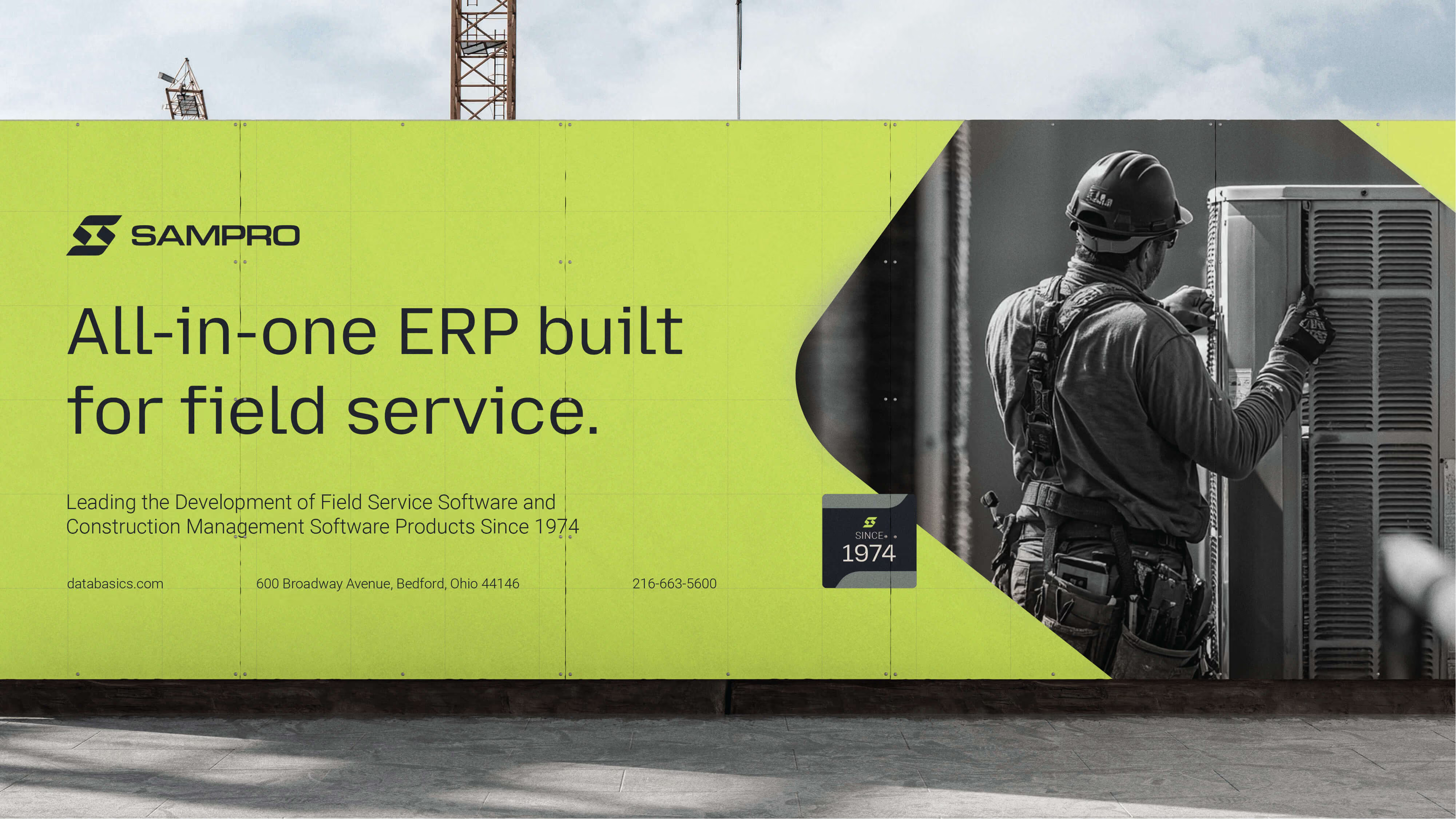
Outdoor advertising banner on a construction site featuring SamPro, promoting an all-in-one ERP built for field service, with a black-and-white image of a worker inspecting an air conditioning unit on the right side.

Four steps.
Your Brand identity.

(  )

Discovery

We learn your business, your market, your competitors, and your vision. By the end, we know your business almost as well as you do.

(  )

Stylescape

Before we design anything, we show you the direction visually. You react, we adjust. No surprises later — because you shaped it now.

(  )

Presentation

The full identity presented. Most clients approve with minimal revisions — not luck, but the work we did upfront together.

(  )

Delivery

Every file, every format, brand guidelines, and clear instructions. You leave equipped, not just delivered to.

By the time we present the brand, you already know you’re going to love it.
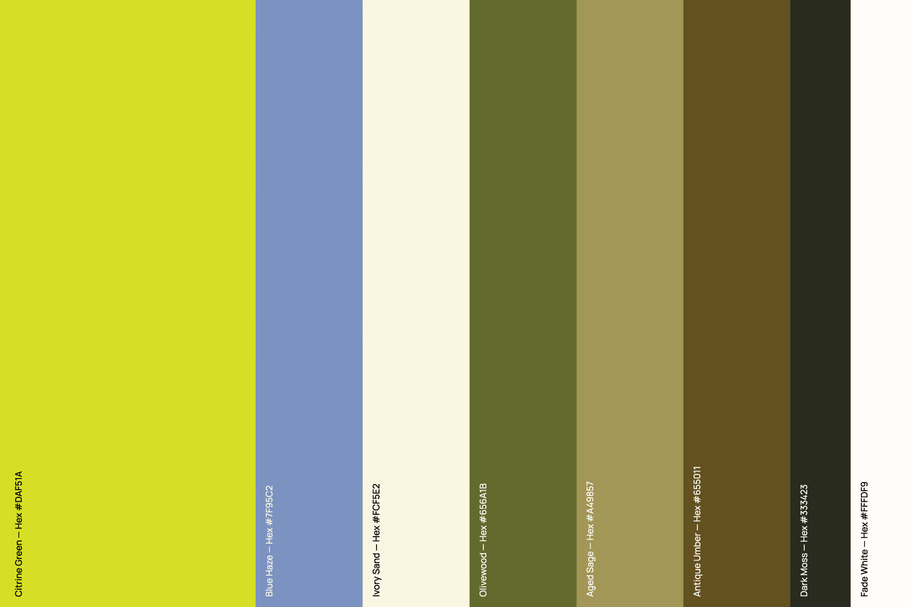
Vertical color palette bars from left to right: Citrine Green (#DAF51A), Blue Haze (#7595C2), Ivory Sand (#FCF5E2), Olivewood (#656A1B), Aged Sage (#4A9857), Antique Umber (#655011), Dark Moss (#333423), and Fade White (#FFFD F9), with hex codes labeled on each color.
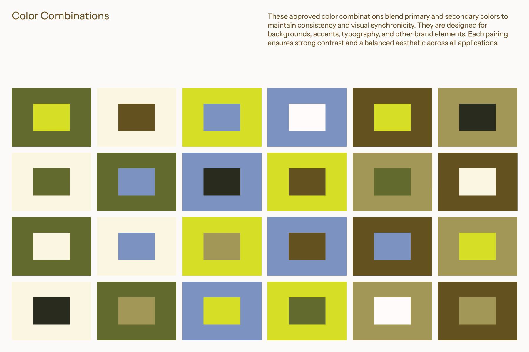
Grid of 24 squares showing approved color combinations with primary and secondary colors including shades of green, yellow, blue, brown, and beige, illustrating consistent high-contrast pairings for backgrounds, accents, and typography in branding.
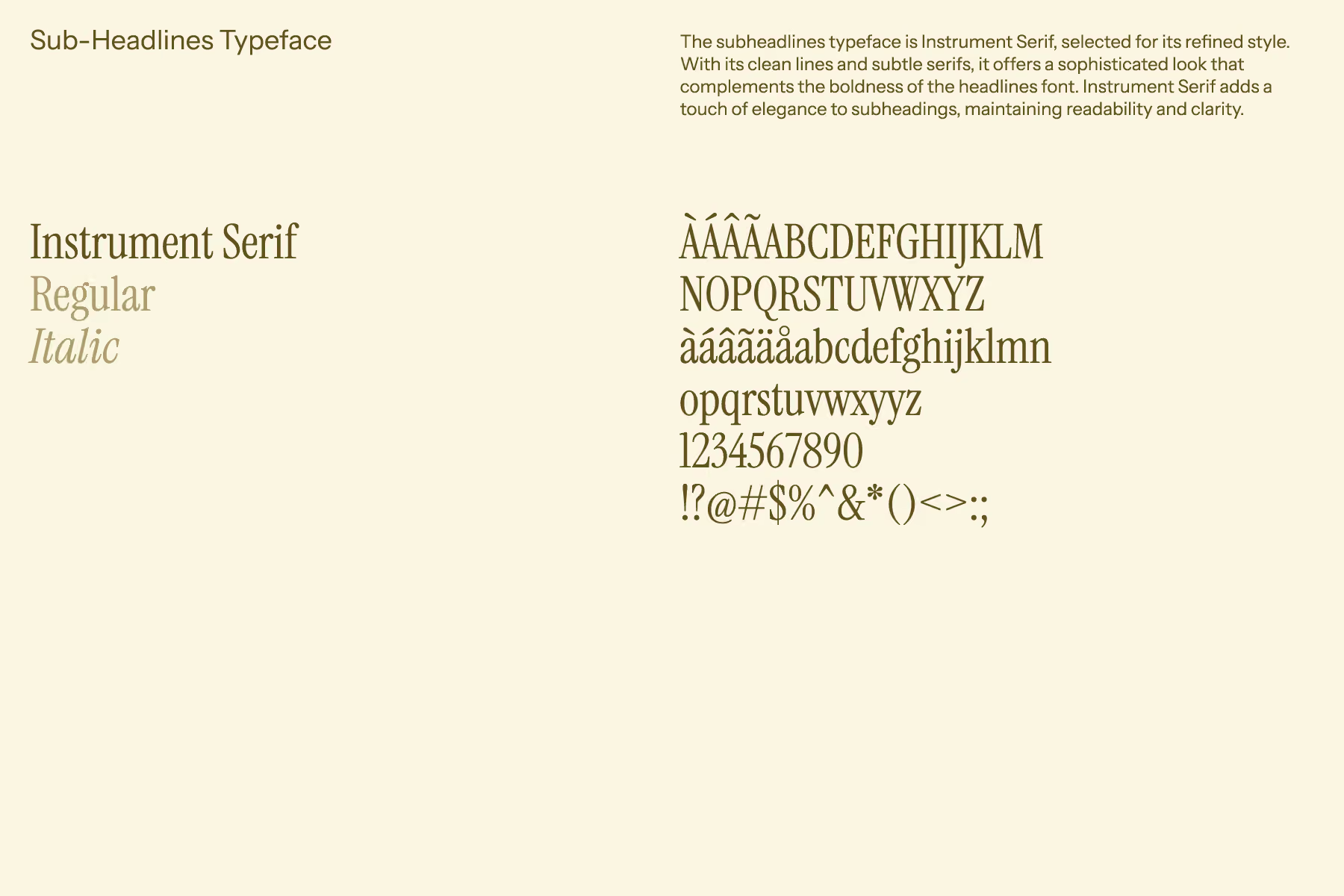
Typeface sample for Instrument Serif showing regular and italic styles, including uppercase and lowercase letters, numbers, accented characters, and common punctuation on a beige background with text explaining the font’s refined style, clean lines, subtle serifs, elegance, readability, and clarity.
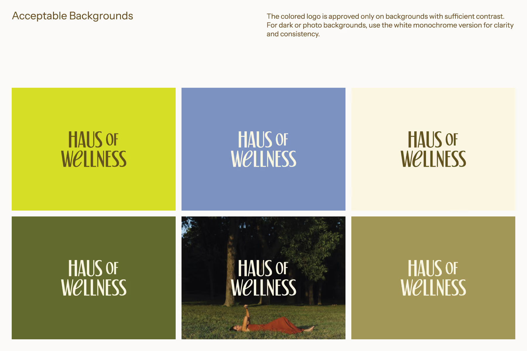
A grid of six squares displaying the 'HAUS OF WELLNESS' logo on different acceptable background colors and a photo background. The logos show contrast variations with dark brown text on light backgrounds, white text on medium dark backgrounds, and white text on a dark photo background of a woman lying on grass with trees behind her. Text at the top explains that the colored logo is approved only on backgrounds with sufficient contrast and for dark or photo backgrounds, the white version should be used for clarity and consistency.

Four steps.
Your website.

(  )

Discovery

A full session focused on the website — your goals, your audience, what the site needs to do, and how it should feel on first landing.

(  )

Wireframe

We map the structure — page layouts, content hierarchy, user flow. How the site works before we figure out how it looks.

(  )

UI Design

Every page, every section, every detail. Your brand identity is the foundation — the design makes it come alive on screen.

(  )

Build & Launch

Developed in Webflow. Fast, mobile-optimized, and built so you can manage it yourself without calling us to change a word.
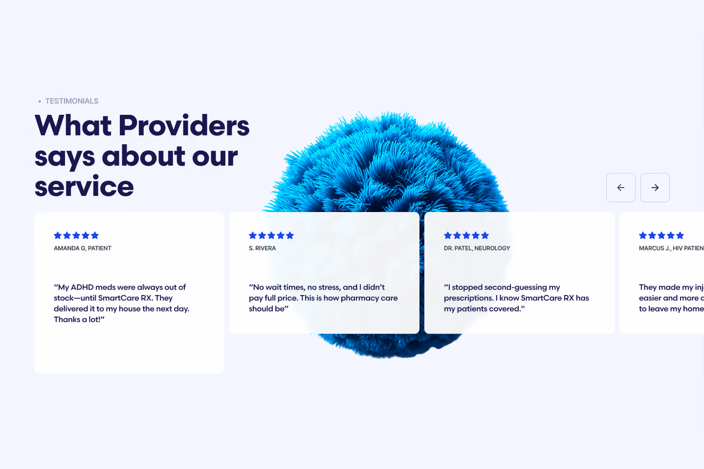
Webpage section titled 'What Providers says about our service' with four testimonials from users including Amanda G., S. Rivera, Dr. Patel, and Marcus J., praising SmartCare RX for reliable ADHD medication delivery, no wait times, prescription confidence, and easier injection process.
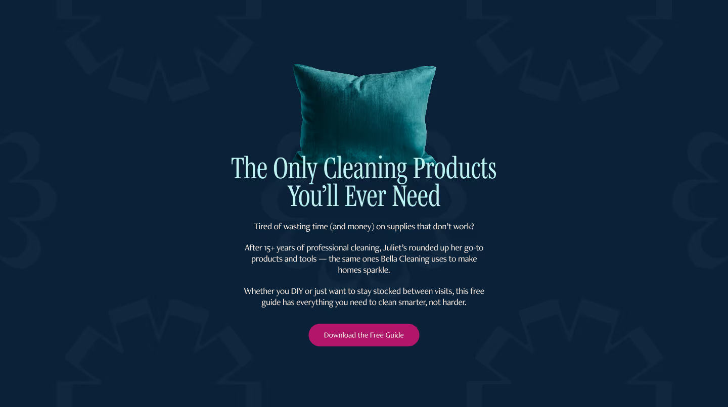
Teal pillow above text that promotes a free guide titled 'The Only Cleaning Products You’ll Ever Need,' offering professional cleaning tools and tips to clean smarter and save time and money, with a magenta button to download the guide.
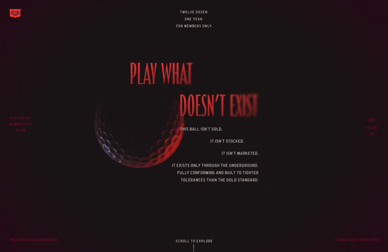
Dark-themed image with a partially visible, red-lit golf ball and red text reading 'PLAY WHAT DOESN'T EXIST'. White text explains the ball isn't sold, stocked, or marketed; it exists only through the underground, meeting tighter tolerances than the gold standard. Additional small red text mentions 'Exclusive membership club', 'Sound on', 'The underground MMXXV', 'Terms and conditions', and 'Scroll to explore'.
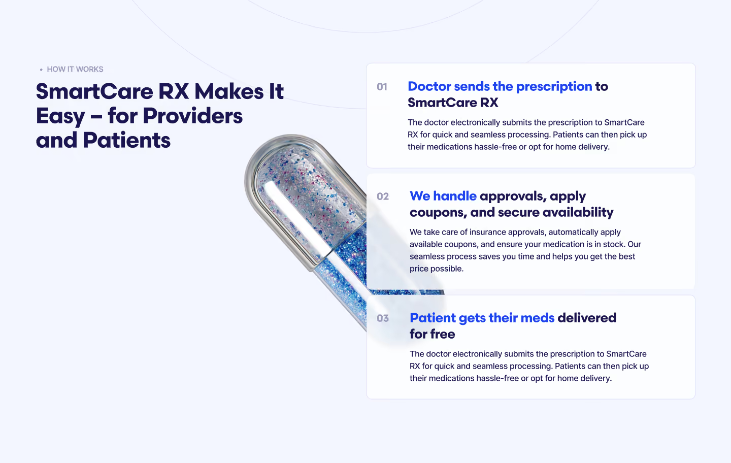
Infographic titled 'SmartCare RX Makes It Easy – for Providers and Patients' showing a capsule-shaped pill and three-step process: 1) Doctor sends prescription to SmartCare RX for quick processing and patient pickup or home delivery; 2) Handling of insurance approvals, coupons, and securing medication availability; 3) Patient gets medications delivered free with hassle-free pickup or home delivery option.
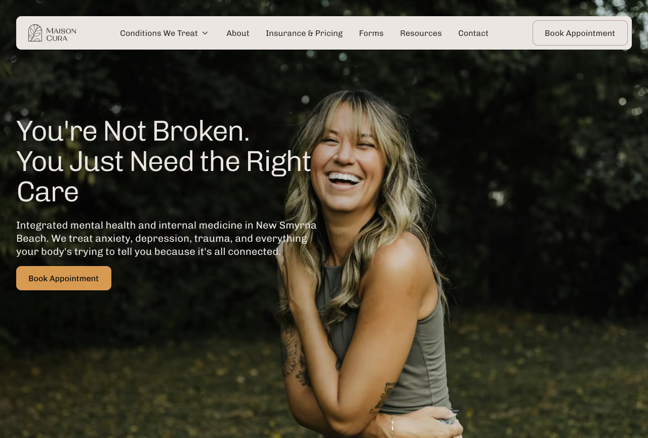
Website header with menu options and a smiling woman with blonde hair wearing a sleeveless top in an outdoor setting, featuring text about integrated mental health and internal medicine care in New Smyrna Beach.
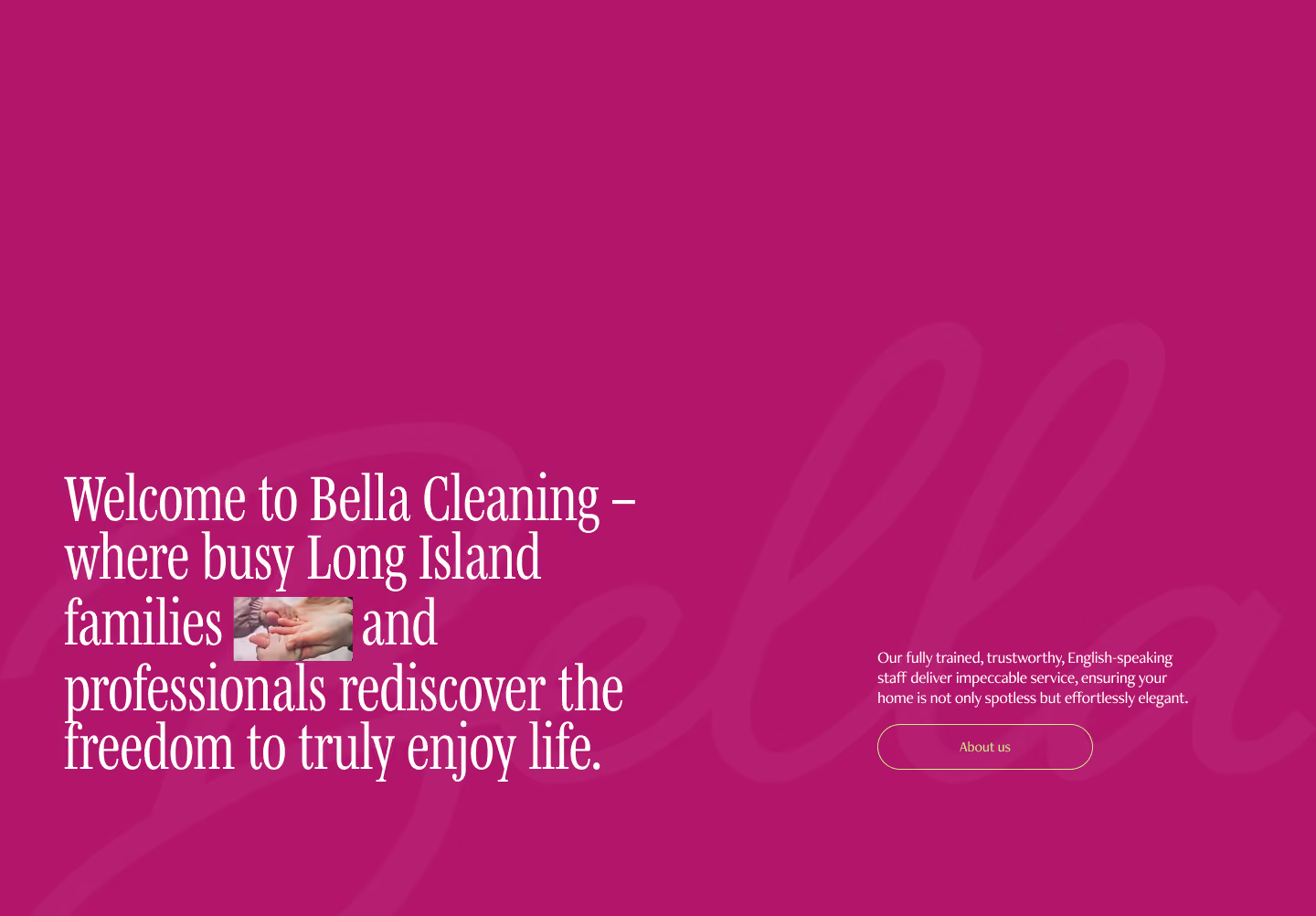
Welcome message for Bella Cleaning on a purple background with text about serving busy Long Island families and professionals, alongside a small image of adult and child hands touching. A note about trained, trustworthy, English-speaking staff offering impeccable service and an 'About us' button appear on the right.
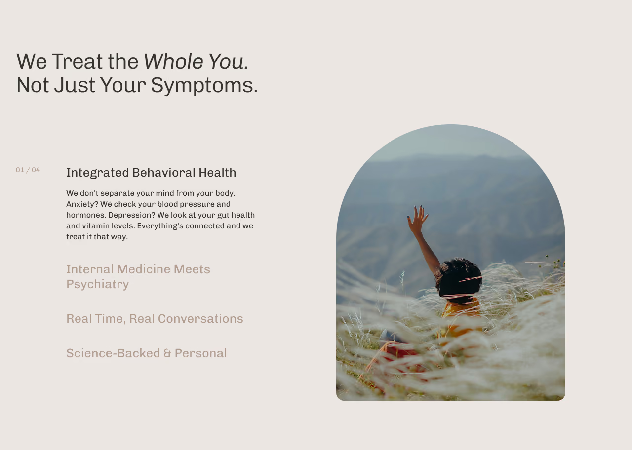
Text emphasizing treating the whole person, not just symptoms, with a focus on integrated behavioral health and connections between mind and body. To the right, a person sitting in tall grass on a hillside raises one hand, with a blurred mountainous landscape in the background.
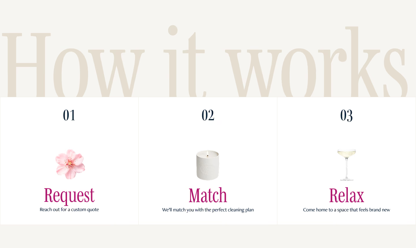
Three-step process titled 'How it works': Step 1, Request with a pink flower icon and text 'Reach out for a custom quote'; Step 2, Match with a white candle icon and text 'We'll match you with the perfect cleaning plan'; Step 3, Relax with a champagne glass icon and text 'Come home to a space that feels brand new.'

What about revisions?

Every project includes revision rounds built into the scope. But honestly - because of how collaborative the process is from the start, most clients get to presentation and love what they see. The stylescape phase exists specifically so there are no surprises. You've already weighed in on the direction before we commit to it.

And if something isn't right, we make it right. Every project is backed by our 100% satisfaction guarantee - no argument, no hassle.

Common questions

FAq

Most brand identity projects take 4-6 weeks from discovery call to final delivery. Timeline depends on scope and how quickly feedback comes in on both ends. If you have a hard launch date, tell us upfront and we'll scope around it.

Website projects typically run 6-10 weeks after the brand identity is in place - wireframe, design, development, and launch. Again, if there's a deadline driving things, we'd rather know early.

Yes - and we won't build a website without one. The brand is the foundation. Building a website without a brand identity is like designing a room before you know what it's for. If you need both, we scope them as a combined project.

Just your thoughts. The more you can tell us about your business, your customers, what you love and hate visually, and where you want to take things - the better. You don't need a brief or a deck. That's what the call is for.

Trusted and Featured
Alchemy

Ready to start?

Book a free 15-minute consult. We’ll talk through your project, answer any questions, and figure out if we’re the right fit.