
Mental Health
For most patients, reaching out is the hardest part. We build identities and websites for practices and telepsychiatry services that communicate safety and trust before the first appointment.
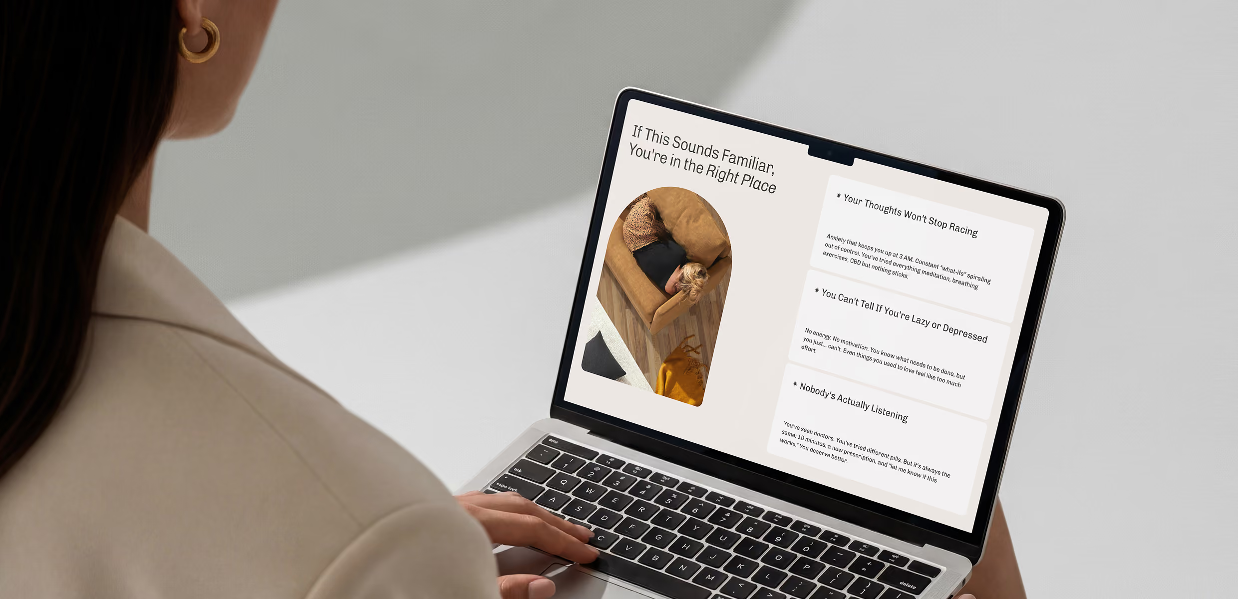



Trusted by mental health practices that make safety and trust visible before the first appointment.

If your practice looks like a hospital,
patients won’t feel safe.
If your practice looks like a hospital,
patients won’t feel safe.
You look exactly like everyone else
Soft gradients and sage green. When every practice uses the same visual language, nothing feels personal. Sameness makes it impossible for a patient to know if you’re the right fit.
Your brand is too clinical
A brand that looks institutional creates a barrier. Mental health patients aren’t looking for a hospital; they’re looking for a personal connection. If you look cold, you look unapproachable.
Your brand ignores your specific focus
A neurodivergent-focused practice should not look like a trauma clinic. Generic branding fails specific audiences. If you try to speak to everyone, you speak to no one.
We make reaching out feel like the right call.
We build "anti-clinical" brands for telepsychiatry services. We use bold, optimistic aesthetics to make treatment feel like empowerment rather than an intimidation.
Mental health and primary care under one roof. We build brands that treat integration as a feature, communicating that physical and mental health are connected.
We bridge the gap between clinical professionalism and human warmth. We create identities that make your specific therapeutic approach visible and trusted.
Built for specific patient populations. We create visual systems that resonate with the unique needs of your audience, ensuring they feel seen before they ever call.
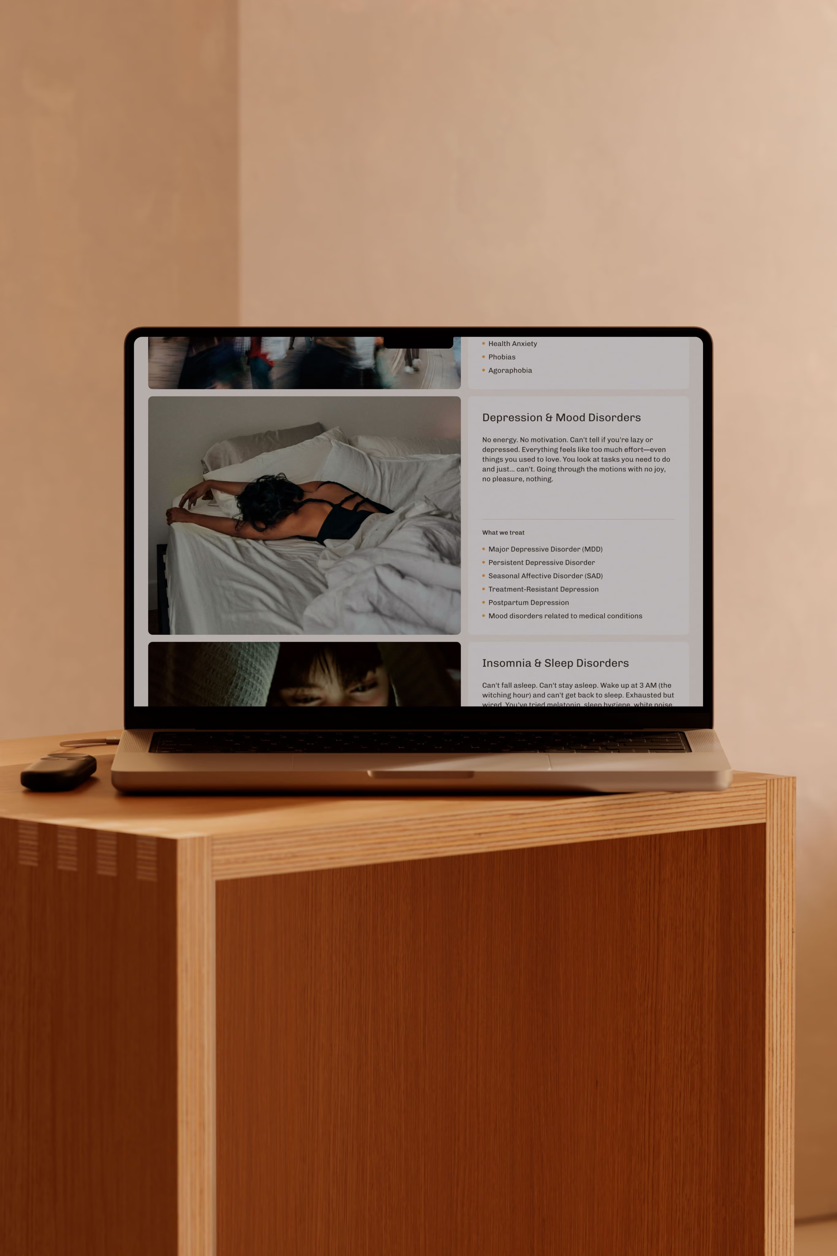
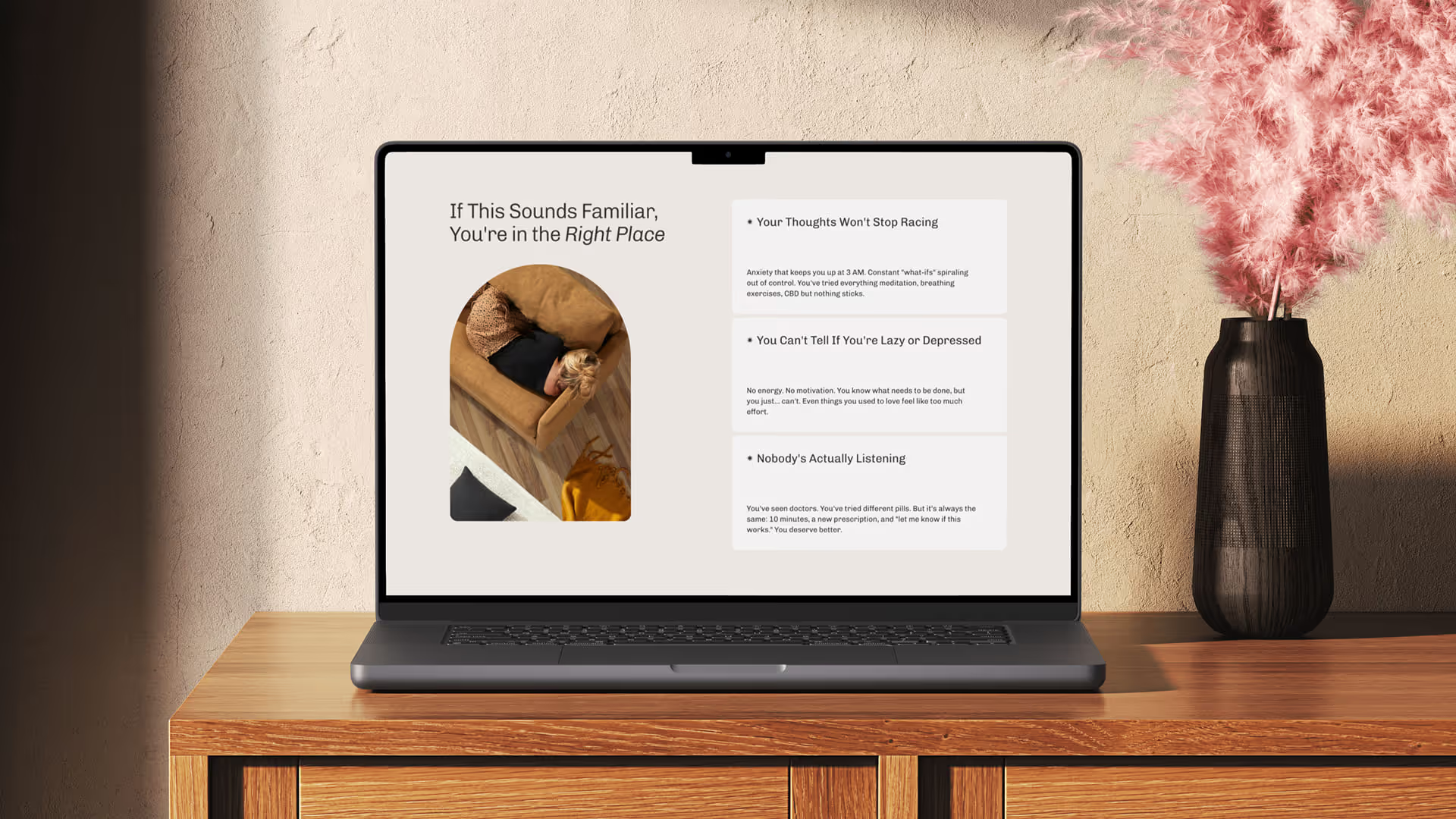
Mental health projects

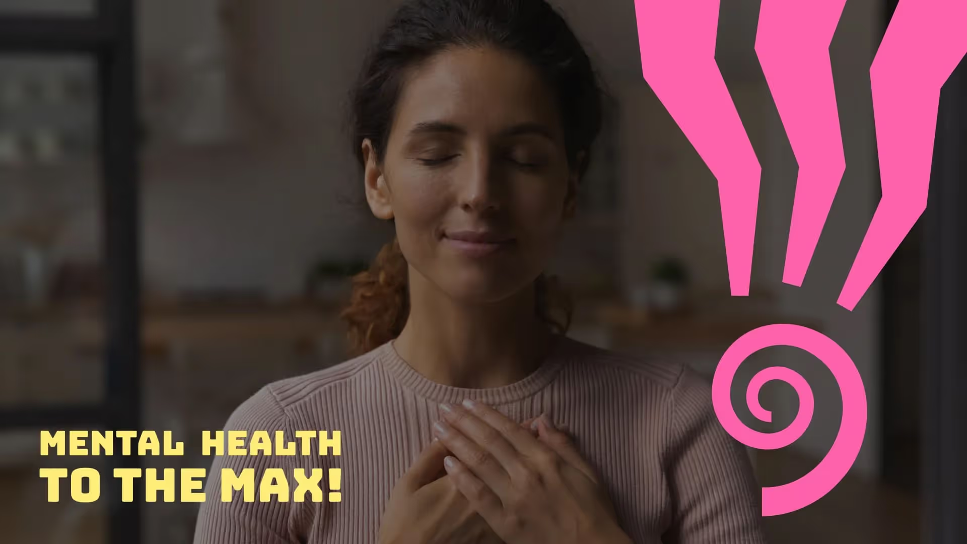

Every aspect of my engagement with Greg, from his deep understanding and research of my vision to his remarkable design work, was nothing short of impressive.

A brand that starts the healing process

Lower the
barrier to care
A brand built for approachability reduces the stigma and hesitation that keeps patients from booking that first appointment.

Attract the right
patients
A brand that reflects your specific care philosophy speaks directly to the people most likely to benefit from your expertise.

Stand out from
sameness
In a category of “watercolor logos,” a distinct and intentional brand is memorable—and memorable practices get the referrals.
How we help?





Does your brand make patients feel safe enough to reach out?
Most mental health brands look too cold or too generic. Answer a few questions to see if your brand is building trust or quietly reinforcing the hesitation that keeps patients from booking.
Takes 3 minutes. Free. Results straight to your inbox.
FAq
By treating them as complementary. We build brands that use color and warmth to reduce anxiety while using precise typography and layout to signal medical professionalism.
Absolutely. Approachability doesn't mean trivializing. A warm, human brand can coexist with clinical depth - it just makes the conversation feel more accessible to the patient.
We treat the integration as a benefit. Most brands look like one or the other; we build systems that communicate "whole-body health" so patients feel they can get everything they need in one place.
Usually 4-6 weeks for the identity. If we are building a patient-facing website as well, we typically add 6-10 weeks to ensure the conversion architecture is perfect for patients in high-stress moments.
Trusted and Featured
From the studio



Ready for a brand that patients actually trust?
Stop looking like just another institution. Let’s build an identity that makes the first step easier for your patients.