Is Your Brand Sending the Wrong Signal? The Pharmacy That Wanted TRON
An Orlando pharmacy owner wanted a neon TRON look for a senior clientele. A designer builds what you ask. A strategist checks if it fits your buyers.

Article
An Orlando pharmacy owner came to us knowing exactly what he wanted.
His words: I want it to feel like TRON.
A cool look, a wrong audience
Sleek, neon, futuristic. And honestly, a really cool visual look.
But before we touched a single design element, we did what we always do first. We mapped out his target audience and the market.
Turns out, his primary clientele was seniors.
A glowing, high contrast, neon drenched brand aimed at people who struggle to read small print wasn't going to be optimal. Style is never just style. It lands on real eyes, in real lighting, in a real moment of need.
Picture the actual scene. An older customer at the counter, glasses on, trying to read a label or a sign while they're not feeling well. Neon on black might look incredible on a designer's screen. In that moment, it's just hard to read.
And it isn't just the sign over the door. It's the bags, the labels, the website, the text reminder. His customers don't experience his brand in a portfolio. They experience it squinting, in a hurry, often feeling lousy.
The moment he saw it himself
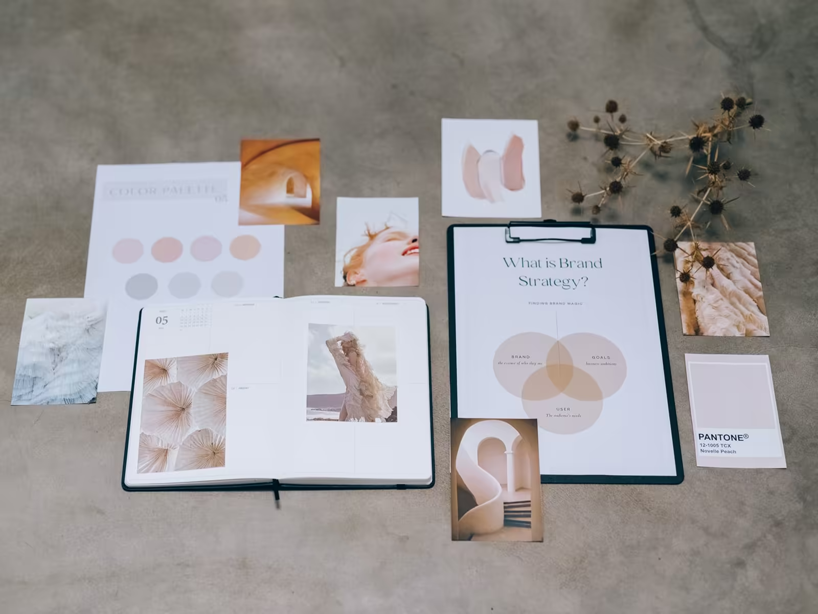
We showed him the stylescapes, a visual tool we use to pressure test the direction of a brand before anyone spends time designing anything.
And he saw the mismatch immediately.
That's the value of pressure testing a direction visually instead of arguing about it in words. Once he could see his future pharmacy brand sitting next to the customers who actually walk through his door, the answer was obvious. And it was his answer, not ours imposed on him.
That's a step worth stealing, whatever you hire someone for. Before you commit to a look, put it next to a photo of your actual customer and your actual storefront. If they don't belong in the same picture, the look is wrong, no matter how good it is.
Keep the inspiration, fix the fit
Instead, we took inspirational elements from his initial idea and combined them into a brand that actually spoke to the people walking through his door every day.
The point was never to kill his taste. Modern, forward, a little unexpected, those instincts were good for an independent pharmacy competing against chains. They just needed a form his customers could read, trust, and feel comfortable with.
Work like this lives on our pharmacy branding page. Independent pharmacies win on trust and personal care, and the brand has to say that in the customer's language.
Designer vs. brand strategist
That's the difference between a designer and a brand strategist.
A designer builds what you ask for. A brand strategist makes sure what you're asking for is actually right for your business.
At Alchemy, strategy always comes before aesthetics. It's the foundation of our brand identity process, including the stylescape step that caught this mismatch before any real money was spent.
The question behind the question
Owners usually arrive with a style they like, and that style usually comes from an industry they admire, often tech. That admiration is fine.
The risk is borrowing the signals of a business whose customers, needs, and moments are nothing like yours.
A pharmacy is visited by people managing health problems, often older, often in person, often deciding based on whether they trust the human behind the counter. Every branding choice should be run through that scene, not through a mood board of favorite apps.
When the scene and the style disagree, believe the scene.
Have a strong look in mind for your brand? Bring it. Then let's test it against your actual customers before you commit. Book a free brand consult.