How to Update Your Logo Without Starting Over
Your logo does not need a full makeover to stay fresh. Keep what works, simplify, update fonts or colors, make it mobile ready, and test it before you commit.

Article
Your logo doesn't need a full makeover to stay fresh. Sometimes a small update is all it takes to keep your brand looking modern and polished.
This is a refresh, not a rebrand. The goal is to bring the logo back to life without confusing the loyal customers who already recognize you.
Here's how to update your logo the smart way. It's a narrower job than a full rebrand, and it should be treated that way.
Step 1: keep what works, and simplify the design
If your current logo has strong elements, like a unique icon or a recognizable font, keep them. Small tweaks go a long way.
Throwing away recognition you spent years building, just to feel new, is the most expensive mistake in a refresh. And clean, minimal logos are easier to read. They look better on websites, signs, and merch around Orlando.
Simplifying is usually the highest value move in the whole job, because it fixes real world use without changing what people remember.
Quick test before you touch anything: cover up half your logo. Can people still tell it's you? The part they recognize is the part you don't get to throw away.
Step 2: update your fonts or colors, and make it mobile ready
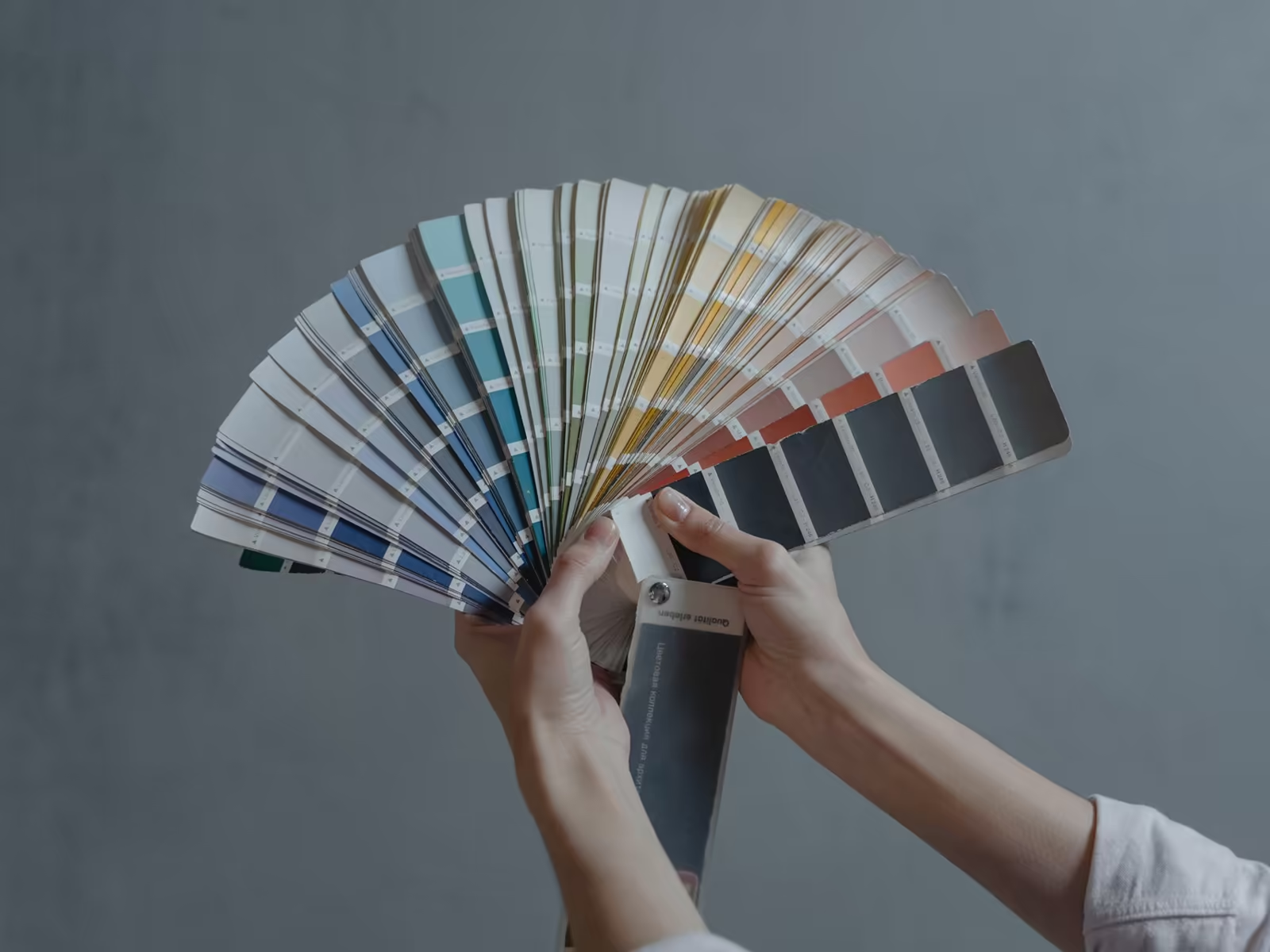
A fresh font or a modern color palette can give your logo a brand new feel while keeping it familiar. That's the sweet spot of a refresh: new energy, same business.
And your logo should look great on a phone screen, a business card, or a billboard. Resizing shouldn't hurt the quality or the legibility. Most older logos were never designed for a phone screen at all, so this step alone can make a brand feel current.
Do it in that order, by the way. Fonts and colors are the cheap, reversible changes. The icon and the name are the expensive, recognition carrying ones. Refresh the cheap layer first and you might find you never needed to touch the rest.
Simplifying, concretely, usually means this. Drop the small details that disappear at small sizes anyway. Flatten gradients and effects that only existed because software made them easy. And give yourself permission to retire the tagline from the small version of the logo, even if it stays in the big one. None of that touches your identity. It just removes the parts that were never surviving contact with the real world.
Step 3: test it before you go all in
Preview your updated logo on social media profiles, your website, and print materials. Make sure it feels right everywhere before the official switch.
Then do the regulars test. Show the old and new versions to a few loyal customers, side by side, for about three seconds each. If the reaction is "oh, you cleaned it up," you nailed it. If the reaction is "wait, is that the same company?", you went too far.
Roll it out in the right order too. Digital first, because it's free to change: website, social profiles, email signatures. Print and signage last, as the old stock runs out. A refresh doesn't need a dramatic launch day. Quiet and consistent beats loud and half finished.
Step 4: hunt down every old version
This is the step everybody skips, and it's why refreshes look sloppy for a year. Your old logo lives in more places than you think. Your Google profile. Your invoices and proposals. The truck. The uniforms. The favicon on your site. That one social account you opened in 2019 and forgot about.
Make the list before you launch the new version, and work through it in a week. A refresh only reads as intentional when the old mark is actually gone. Two versions floating around at the same time doesn't look refreshed. It looks like two different companies, and one of them stopped caring.
Whether you're based in Windermere or downtown Orlando, a modern logo shows you're growing, not standing still. Thinking about a refresh? Call Alchemy Design in Orlando at (407) 900-9499. And if the problem is bigger than a refresh, the rebrand signs will tell you honestly.
Related reading: Is It Time to Rebrand? 5 Signs to Look For.
If this sounds like your business, book a free brand consult. Fifteen minutes, no pitch, no pressure. We'll tell you what we'd do, even if that isn't hiring us.