Logo Stylescape: Why It's Important Before Any Logo Project
Before any logo project starts, your designer should build a stylescape. Think mood board for your brand, and the thing that prevents costly revisions.
Article
Before you start any logo project, make sure your designer is using a form of stylescape.
But why is this important? Because it's the cheapest place to discover you and your designer are picturing two completely different brands.
What a stylescape actually is
Think of a logo stylescape as a mood board for your brand logo. Imagine you're creating a character for a movie. You'll want to know their look, their style, their vibe, right?
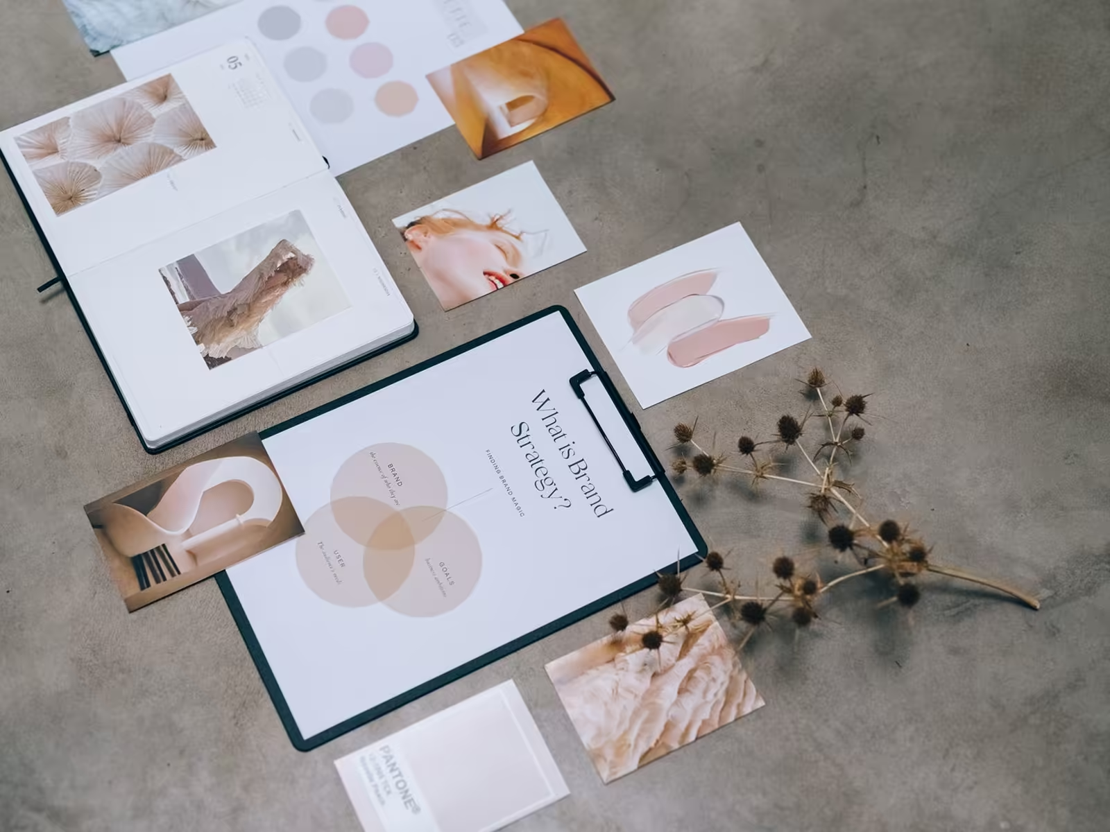
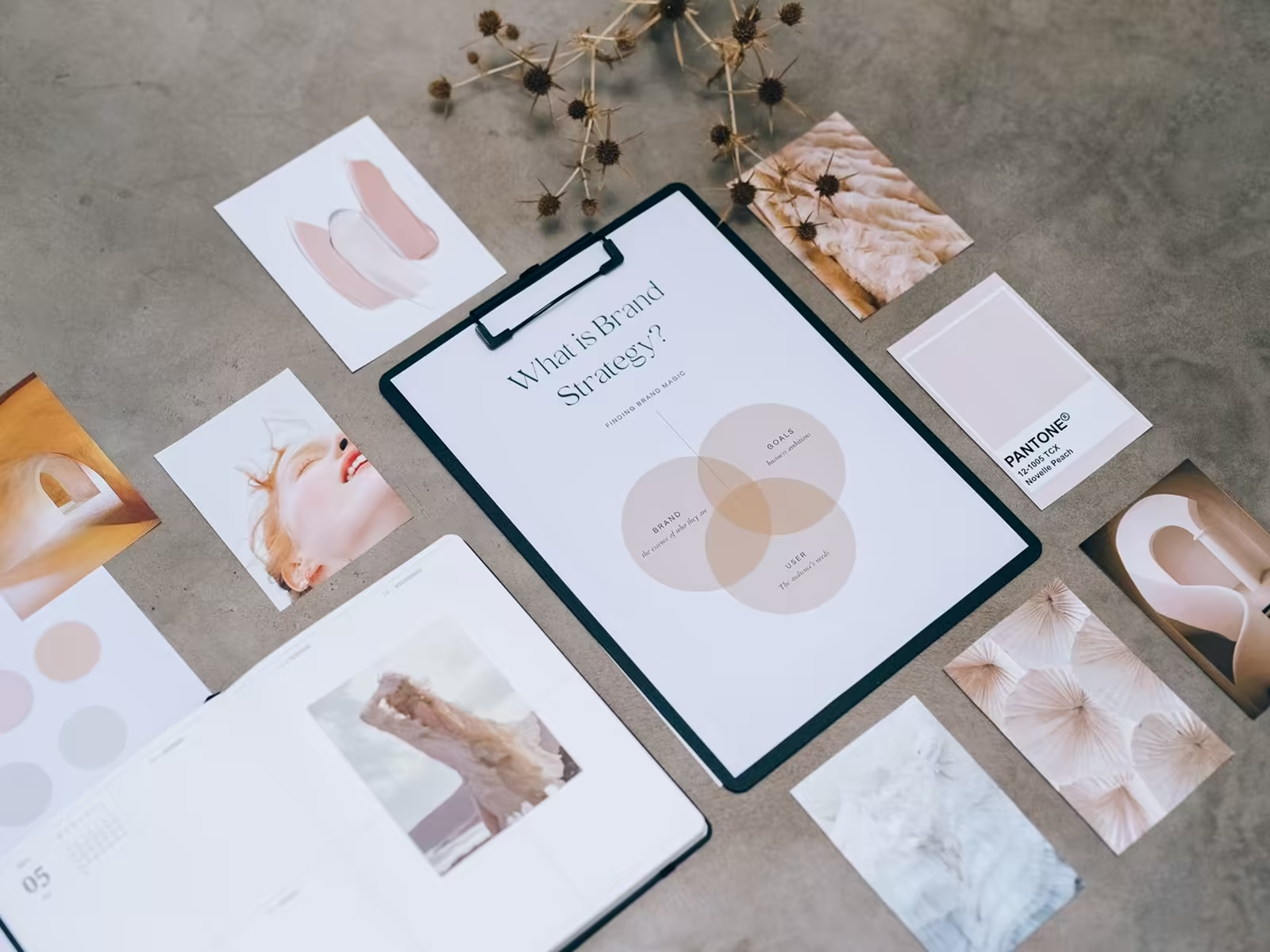
A logo stylescape does just that for your brand. It's a collage of colors, fonts, images, and textures that says, this is us. It's like a sneak peek into your brand soul, before anyone spends hours designing a mark in the wrong direction.
Here's what actually goes on one. A handful of colors, shown big enough to judge. Two or three type directions, in real words, not the alphabet. Photos or imagery in the style the brand would use. Textures or patterns if the brand has that kind of energy. And usually a few logo references in the neighborhood of the direction, there to show flavor, not to be copied. One board, one direction, everything on it chosen to argue for the same feeling.
What it prevents
- Costly revisions, because the direction gets agreed before the detailed work starts.
- The classic mismatch, where the client pictured classic and traditional and the designer delivered modern and minimal, and both think the other one changed the brief.
- Decisions made in a vacuum. You react to a full visual world, not a single logo floating on a white page.
That mismatch deserves a second, because it's the most common way logo projects go sideways. Words are the problem. "Modern" means one thing to an owner who's picturing a tech startup and another to a designer picturing Scandinavian furniture. "Professional" is even worse. Everybody nods at the words, everybody pictures something different, and nobody finds out until the first logo concepts land and the owner says the sentence every designer dreads: "This isn't what I pictured." A stylescape makes you find out with pictures instead, while finding out is still cheap.
How to actually review one
When a stylescape lands in front of you, don't just ask whether you like it. Run two questions.
First: does this feel like my customer? Not you. Your customer. A stylescape that thrills the owner but confuses the buyer is a miss wearing nice clothes.
Second: could my closest competitor put their name on this board and call it theirs? If yes, the direction is category wallpaper. Push for something with a point of view.
And react to the whole board, not individual pieces. You aren't approving every photo on it. You're approving a direction. The details get built later, inside that direction.
It leaves you with the logo you actually envisioned
A stylescape doesn't guarantee taste. It guarantees alignment. You approve the world the logo will live in, then the logo gets designed to belong in that world.
Every logo project at Alchemy starts with a logo stylescape or moodboard. It's step two in our logo design process, right after discovery, and it's a big part of why our brand identity projects need fewer revisions than most.
Thinking about your own logo? Book a free consult with Alchemy Design in Orlando and get an honest read on where it stands.