What Makes a Logo Look Expensive?
Expensive looking logos are not about budget. They are about clean design, smart fonts, balance, and consistency. Here is what gives a logo a high end feel.
Article
Ever seen a logo and thought, that looks high end?
It isn't the price tag. It's the design choices. Whether you're in Winter Garden or downtown Orlando, your logo gives off a vibe the second someone sees it.
Here's what makes a logo feel polished instead of cheap.
Five things high end logos get right
1. Clean, simple design
Luxury logos are never cluttered. They use space well and let the design breathe.
Nothing is fighting for attention. That restraint is the point. Cheap logos try to say everything at once. Expensive ones pick one thing and say it cleanly.
2. A thoughtful font choice
Expensive looking logos often use custom or elegant fonts with real character.
And no, not Comic Sans. Ever. The font alone can move a logo up or down a price tier. It's usually the first thing that gives a cheap logo away, because the lettering is doing a job it wasn't built for.
3. Balanced proportions
Everything lines up. The text, the icon, the spacing. It feels intentional, not rushed.
When proportions are off, people feel it even if they can't explain it. They just know something looks homemade. They can't name it, but they price you off it anyway.
4. A timeless color palette
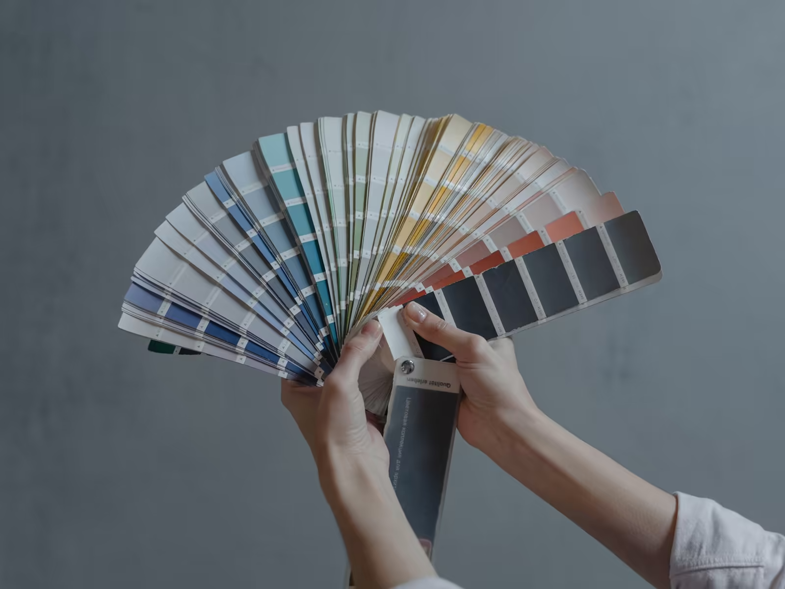
Classic black. Deep navy. Golds. Those show up in high end branding again and again.
The right colors speak before a single word gets read. And notice what's missing: trendy gradients and whatever color is having a moment this year. Expensive brands don't chase the moment. They look like they've been here a while.
5. Consistency everywhere
On your website. On a business card. On your store sign in Dr. Phillips. The logo looks sharp and scales well in every spot.
A logo that falls apart in one place drags the whole brand down. One blurry version on one sign is the version people remember.
What gives a cheap logo away, fast
Run down this list against yours. Too many effects fighting at once, dropshadows and gradients and outlines. Letters spaced unevenly, like nobody ever looked at them twice. A stock icon you've already seen on three other businesses this month. Colors that only work on a screen and fall apart in print.
One of those is a slip. Three of them together is a price signal, and it's pointing the wrong way. Customers can't name a single item on that list. They just feel the total, and the total says budget, even when your prices aren't.
You don't need a huge budget
A luxury feel doesn't mean you need a huge budget. But it does mean hiring someone who knows the difference between a trendy template and timeless design.
Templates chase what's popular this year. Timeless design is still working five years from now.
The dime test, luxury edition
Here's a fast way to check your own logo. Shrink it down small, strip the color out, and look at it in black and white.
Expensive looking logos survive that test. The spacing still breathes. The letters still read. Nothing turns into a blob.
Cheap looking logos usually fail right there. The detail that looked impressive on a big screen becomes mud at real world size. Restraint is what passes the test, and restraint is a decision, not an accident.
If you want help putting this into practice, our logo design work is built for exactly this, especially if you're dealing with looking more established. Related reading: the psychology behind your logo design.
Want a second set of eyes on yours? Book a free brand consult with Alchemy Design in Orlando. Fifteen minutes, no pitch, no pressure. Just an honest read on what's working and what isn't.