What the Nike Swoosh Actually Means (It Isn't the Swoosh)
Nobody fell in love with just a swoosh. They fell in love with what it stood for. A logo is a container, what fills it is everything else you build.

Article
Every week someone comes to us and says some version of the same thing.
I want something cool. Something recognizable. Something like Nike.
And we get it. Nike is one of the most powerful brands ever built.
Nobody fell in love with a check mark
But here's what most people miss. Nobody fell in love with just a swoosh.
They fell in love with what it stood for. The attitude. The culture. The feeling that wearing it meant something about who you are.
The symbol is just the container. What fills it is everything else.
Put that same swoosh on a brand nobody knew, with no athletes, no stories, no decades of meaning, and it's just a check mark. A nice one. But a check mark.
Try it as a test. Cover the name of any famous logo and show it to someone who's never seen the brand. The shape alone tells them almost nothing. Everything they feel about it was poured in later. This is the same truth behind asking why you even need a logo in the first place.
What we actually sell, and it isn't logos
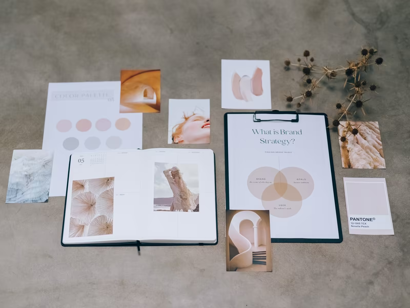
At Alchemy Design, we don't sell logos. We build the entire framework around your business.
The visual language. The positioning. The personality. So the right customers don't just recognize you, they feel something when they do.
Because a logo can't do that alone.
A logo with nothing behind it is a sticker. A logo with a clear position, a consistent look, and a business that delivers is a shortcut to everything customers believe about you. Our brand identity work builds that framework on purpose.
An idea goes in, a brand comes out
Clients come to us with an idea. They leave with a brand that attracts the exact people they want to work with for the next 10 years.
That's a completely different thing.
Thinking in decades changes the design choices. Trendy type and gimmicks look great this year and embarrassing in three. A brand built around who you are and who you serve has a chance to still be working when the trends have rotated twice.
Ask a Nike customer what the swoosh means and they'll tell you a story about themselves, not a shoe. That's decades of pouring talking. Your brand can earn the same thing at your scale, but only in the same order they did.
The honest takeaway
Wanting a Nike level mark is a good ambition. Just order it correctly.
Build the meaning first, or at least at the same time. Give the symbol something real to carry. Then keep carrying it, consistently, until the container is full.
A reality check for your own mark
Hold your logo up against this idea honestly. If it disappeared tomorrow, what would customers actually miss?
If the answer is nothing yet, that's normal for a young brand, and it isn't a design failure. Meaning takes time and repetition.
The failure mode is expecting the mark to skip that process and deliver instant recognition on its own. It can't.
What design can do today is give you a distinctive, consistent container and a clear story to pour into it. Then your work does the pouring, one customer at a time.
Pouring looks boring from the outside. Same mark, same colors, same tone, everywhere, for years. The truck matches the site matches the invoice. Most brands quit that routine in year one because nothing seems to happen. Then year three arrives, and people start finishing your sentences. That's the container filling up.
If all you've got right now is the idea, that's a fine place to start. Book a free brand consult and let's talk about the brand, not just the mark.