How Color Affects Your Business Logo Design
Color does a lot of quiet work in a logo. It sets the feeling, builds recognition, and separates you from competitors before anyone reads a word of copy.
Article
Color isn't decoration in a logo. It's one of the first things people register, often before they've read your name or figured out what you sell.
Pick it on a whim and you can end up sending the wrong signal for years. Pick it with intent and it starts working for you every single time your logo shows up.
What color is actually doing
It evokes emotions
Colors trigger feelings and associations. Blue tends to convey trust and professionalism. Red tends to bring excitement and urgency. Neither one is right or wrong on its own. It depends on what you need a customer to feel when they find you.
That's the question to start with. Not "what's my favorite color?" What should a stranger feel in the first few seconds?
It builds recognition
Consistent use of color is a big part of why some brands are recognizable at a glance. Think of Coca-Cola or Starbucks. You know them by color before you read anything. That only happens when the same palette shows up the same way, over and over.
It doesn't happen in year one. It happens because nobody at those companies gets bored and swaps in a new shade every spring.
Your customers need the repetition more than you do. You see your logo daily. They see it for two seconds, weeks apart. Consistency is how those two seconds add up to recognition.
It communicates personality
Bright, vibrant colors can suggest a fun, energetic brand. Muted tones can read as sophisticated and reliable. Your palette is personality, whether you planned it that way or not. A customer who's never heard of you is already forming an opinion from the colors alone.
It separates you from competitors
If every competitor in your market uses the same two colors, matching them makes you invisible. A distinct palette, chosen on purpose, is a simple way to stop blending into the category.
Try this. Line up the logos of your five closest competitors. Now drop yours into the row. If it disappears, your palette isn't a brand asset. It's category camouflage.
This is also why the palette needs to be built as part of a full brand identity, not picked off a color wheel in isolation.
It carries cultural meaning
Colors don't mean the same thing everywhere. A color that reads one way to your audience may read differently to another. Check that your choices say what you think they say to the people you actually serve.
How to choose the right colors
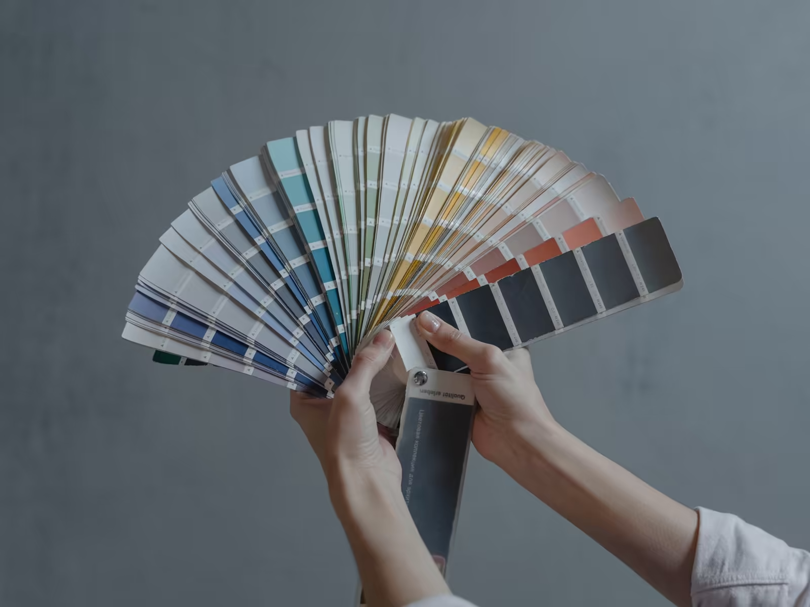
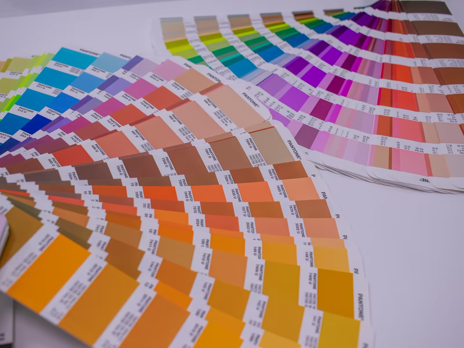
- Start with your brand. Define your personality, your values, and the message you need to send, before you look at swatches.
- Learn the basics of color psychology. You don't need to become an expert. You do need to know what the colors you like tend to signal.
- Test combinations. Pairings change everything. A color that feels off alone can work perfectly next to the right second color.
- Print it in black and white. If the logo dies without color, the design was leaning on the palette. Color should add the feeling, not carry the whole logo.
Color is also only one part of the system. Our guide to choosing colors for your brand logo covers the black and white test that should come first, and our logo design process builds the palette and the mark together so they support each other.
And keep the palette small. Most logos that work have one color doing the talking, one supporting, and neutrals doing the quiet work. Five competing colors isn't a palette. It's an argument.
Thinking about your own logo? Book a free consult with Alchemy Design in Orlando and get an honest read on where it stands.