Designing Your Brand: Choosing Colors
Choosing logo colors is not about your favorite color. Start in black and white, think about the feelings colors create, and check everyone can see it.

Article
When designing your brand logo, choosing the right colors is very important. It's also where a lot of businesses rush, picking favorites instead of thinking about what the colors do.
Slow down. Color is a decision you'll live with for years. It'll be on your truck, your site, your shirts, your invoices. Choosing it because it's your favorite color is like naming the business after your dog. It means something to you. It says nothing to a customer.
Start in black and white
Before adding color, make sure your logo looks good in black and white. If the mark only works because of its colors, the mark itself is weak.
A strong shape first, color second. That order will hold up in one color printing, embroidery, engraving, and every awkward use case that comes later.
Here's why this order matters. Color can rescue a weak mark in a presentation. It looks alive, it pops, everyone nods. Then the logo has to run in one color somewhere and the shape gets exposed. It was never a strong logo. It was a weak logo with good lighting. Build the shape so it survives naked, then let color dress it.
Colors create feelings
Different colors create different feelings. Red carries energy. Blue reads as more serious and trustworthy.
Neither is better. The question is which feeling matches your business and your audience.
Say you run a financial firm and your favorite color is bright orange. Orange says energy, bargains, and fast food to most people. Your clients are buying calm and careful. The color isn't wrong in general, it's wrong for the feeling you're selling. That mismatch costs you before a word gets read.
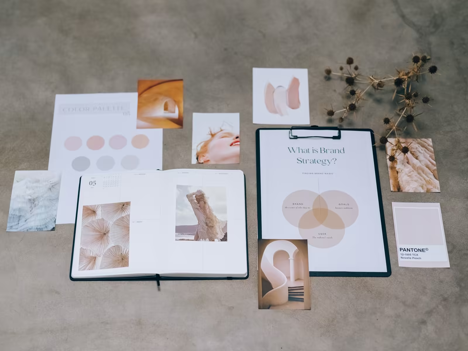
Picking a palette can feel overwhelming, but the goal is simple. Choose colors that work well together and are easy for everyone to see.
That last part matters more than people think. Low contrast combinations exclude customers without you ever knowing. Light gray type on white looks elegant on a designer's monitor. To a customer in bright Florida sun on a phone screen, it just looks like nothing. If people have to squint, the palette failed, no matter how sophisticated it felt indoors.
And keep the palette tight. Most strong brands run on two or three main colors, not seven. Every color you add is another thing to keep consistent, another chance for print and screen to drift apart, and another decision for whoever makes your next piece. A short palette is easier to own, easier to remember, and much harder to mess up.
Let the palette support the personality
Your color palette should enhance your brand personality without being too distracting. Color is seasoning, not the meal.
When it shouts over everything else, the brand gets remembered for a color and forgotten for everything else.
There's a simple test for this too. Describe your brand to yourself without naming the color. If there's nothing left to say, color was carrying the whole identity. The fix isn't a new color. It's a clearer personality for the color to support. One main color doing a clear job beats five colors each doing a little of everything.
For the deeper psychology behind specific colors, read how color affects your logo design. At Alchemy Design, we make sure your logo color palette fits your brand, your audience, and is accessible to everyone, as part of a full logo design package.
Thinking about your own logo? Book a free consult with Alchemy Design in Orlando and get an honest read on where it stands.