Orlando Web Design Tips That Actually Help Your Site
Responsive layouts, clear calls to action, fast images, and simple navigation. Practical Orlando web design tips that keep visitors around and buying.
Article
If you're searching for web design in Orlando, you already know the basics. Your site has to look good and load fast.
But knowing it and building it are different things. Here are the tips that actually move a site from fine to working.
Build for how people really browse
1. Design for every screen
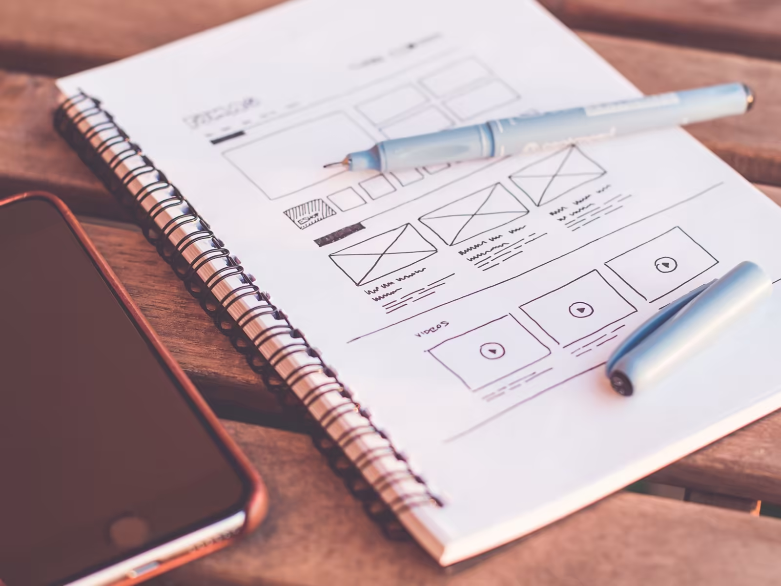
Make layouts that work on phones, tablets, and desktops. Not one layout squeezed down and hoped for the best.
You've probably seen the stat. Google's research says 53 percent of mobile users leave a site that takes longer than three seconds to load. Don't swear by the exact decimal. Swear by the direction. Speed on phones is where visitors are won or lost. Responsive design is key to modern Florida web design.
2. Highlight your calls to action
Use bright colors or bold buttons so visitors can see where to click right away.
And make the text clear. Contact Us, Shop Now, Learn More. High contrast helps these buttons stand out instead of blending into the page.
Quick check: squint at your own homepage. The button should be what your eye lands on. If it's the photo of your building, the page has its priorities backwards.
3. Balance image quality and speed
Big, beautiful images that take forever to load help nobody. Use tools or next generation file formats like WebP to shrink file sizes.
Your phone photos are usually the worst offenders. They're huge, and your site only shows them small. Compress them before they go up and this problem mostly disappears.
The faster your site loads, the more likely visitors stick around. Pretty and slow loses to good and fast.
4. Keep navigation simple
Use easy to read labels and maybe a short drop down menu. People want to find what they need fast, not hunt around like it's a puzzle.
If a first time visitor can't describe your menu after five seconds, it's doing too much.
Here's the practical version. If somebody needs more than a couple of taps to reach your phone number or your booking page, the menu failed, no matter how organized it looks on your desktop.
5. Stick to a clean look
Keep fonts and colors consistent across the whole site. A simple style builds trust and helps users focus on your content instead of your design choices.
Every page that invents its own look makes the business feel smaller than it is.
Enjoyable sites get revisited
When customers enjoy using your site, they stay longer and come back more often. That means higher sales, more trust, and a better future for the brand.
Nobody bookmarks a chore.
For a local business that's the whole game. People come back to the site that made the first visit easy.
The order to do these in
If you're starting from a rough site, don't start with a redesign mood board. Start with speed, then navigation, then your call to action.
Those three decide whether people stay long enough to care about how the site looks. Design polish on top of a slow, confusing site is wasted money.
Once the structure works, the visual layer finally has something solid to sit on, and small design upgrades start producing visible results instead of just looking nicer to you.
If you want help putting this into practice, our Orlando web design work is built for exactly this, especially if you're dealing with a website that is not converting. Related reading: why you need professional web design.
Want a second set of eyes on yours? Book a free brand consult with Alchemy Design in Orlando. Fifteen minutes, no pitch, no pressure. Just an honest read on what's working and what isn't.