Charmed Photography
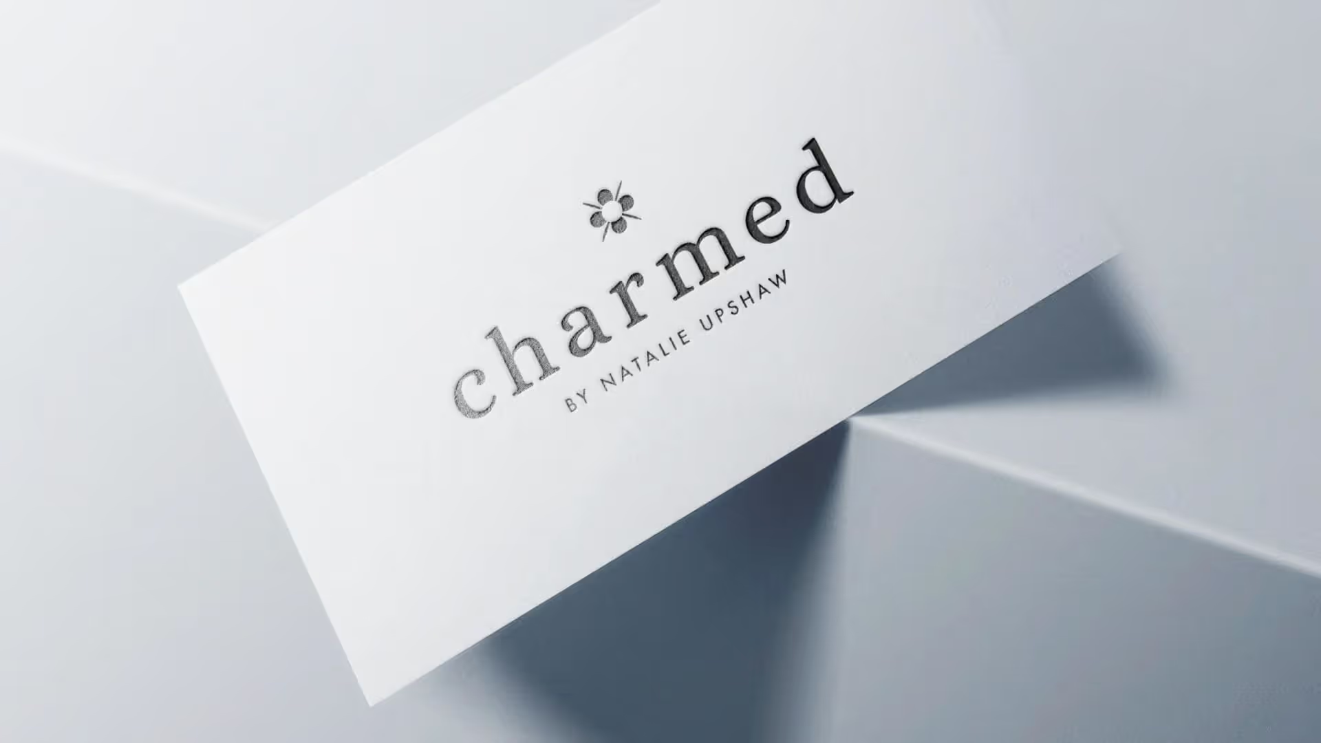
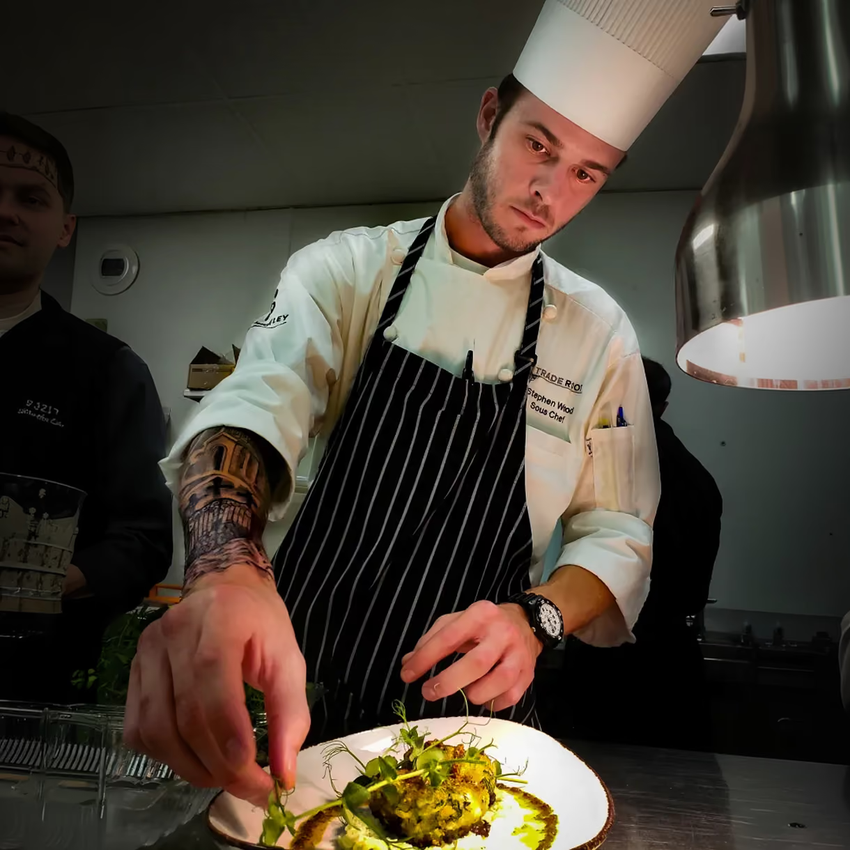
Charmed is Natalie Upshaw's food photography studio, specializing in high-end photos for restaurants.
What Wasn’t Working
Natalie Upshaw built Charmed Photography around one thing she does best: making restaurant food look as good in a photo as it does on the plate. Restaurants hire her when they want photos that do their food justice. The photos spoke for themselves. Her brand hadn't kept up.
She needed a brand that felt as high-end and skilled as the work she does for her restaurants.
How We Solved It
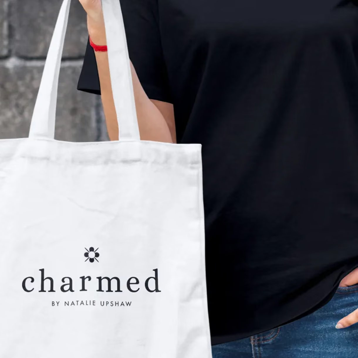
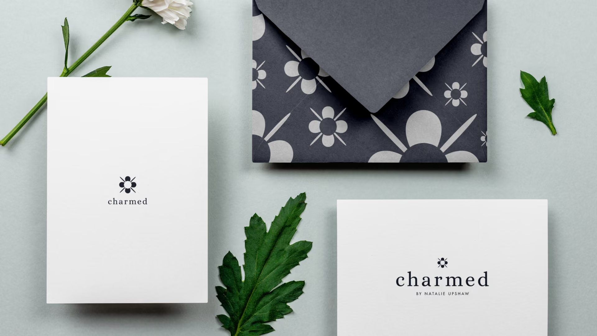
The hard part was making something fancy that still felt loose and warm. The logo had to look good on tote bags, shirts, and cards without losing its polish.
The answer was a symbol that rewards a closer look. At first glance, it looks like a delicate floral earring, like a charm. Look closer, and you see three layers of meaning. From above, it looks like a table set for four, a nod to her restaurant work. The slanted lines look like utensils. Head-on, they look like a camera flash. Every part of it means something.
The result is a symbol with real personality that still feels elegant.
What We Delivered
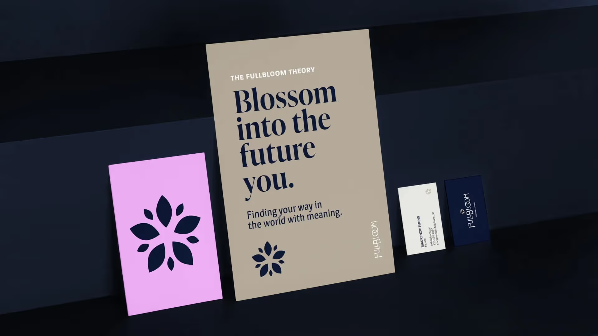
Charmed received a full brand identity: a logo built around the layered symbol, a set of colors, and fonts that carry the same polished feel. The symbol was made to work anywhere, so it keeps its polish on tote bags, shirts, packaging, and cards. The package also included brand strategy: a clear plan for how Charmed presents itself to high-end restaurants.
The Result
The new brand lifted Charmed Photography into the top tier of its field, right alongside the best high-end studios. The logo works at any size and on any material. It gives Natalie's clients confidence in her skill and care before they ever book her. Charmed now looks exactly as good as the food it photographs. For a studio whose clients judge everything by how it looks, the brand couldn't be the weak picture in the bunch.