Mahal Indian Cuisine
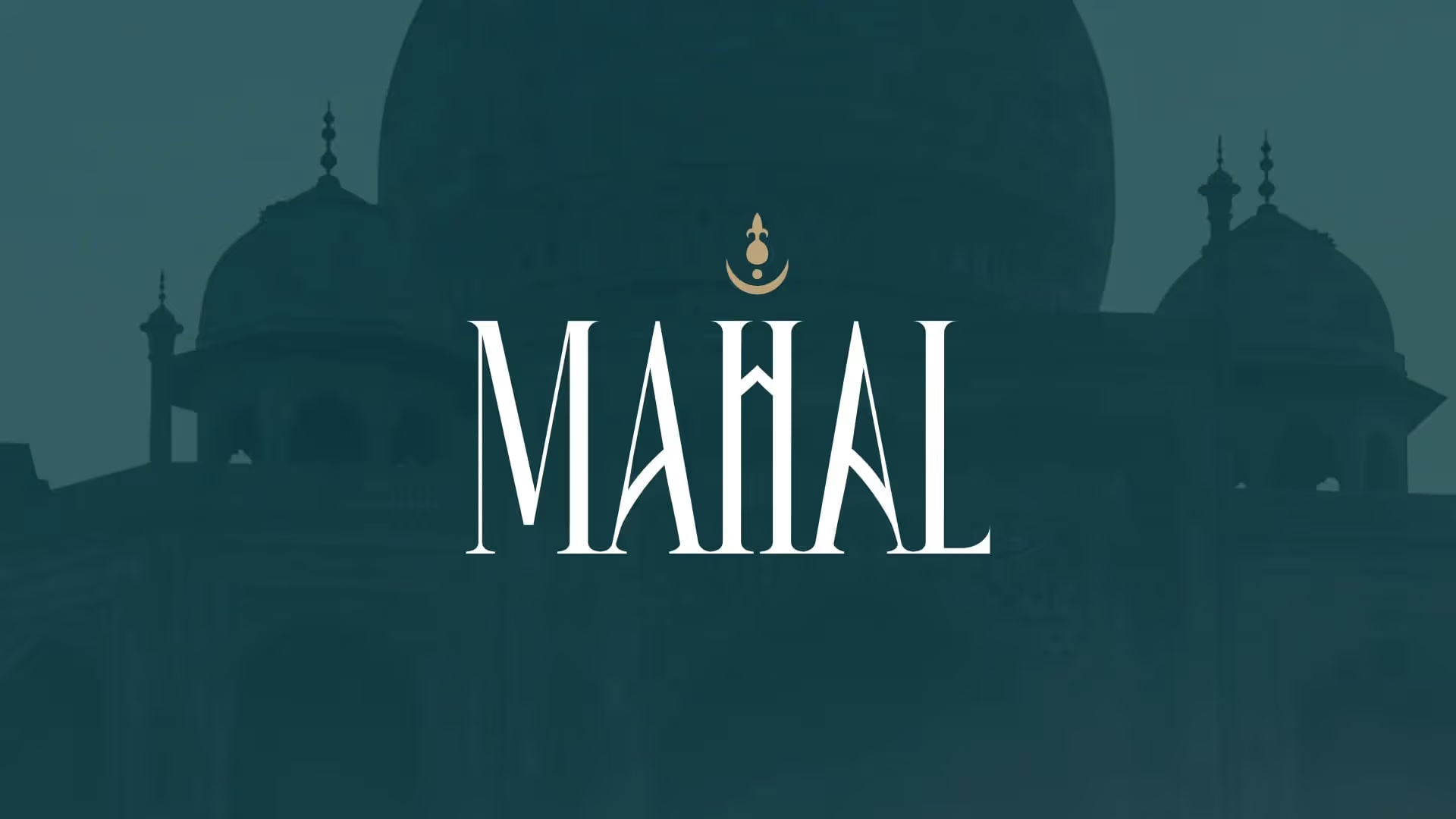
Mahal is Long Island's premier Indian restaurant, offering upscale dining for special occasions.
What Wasn’t Working
Mahal came to us with a clear vision and a restaurant still under construction. They wanted a look that captured the richness of Indian food traditions and lifted it to a modern, upscale level: the kind of brand that says this place is worth a special occasion.
Getting it right meant working closely with the interior designers, so the brand and the physical space would tell the same story from the moment guests walked in.
How We Solved It
The direction came out of an early session with the owners. They talked about growing up in India and what drove them to open the restaurant. That revealed what the name already says: "Mahal" means palace.
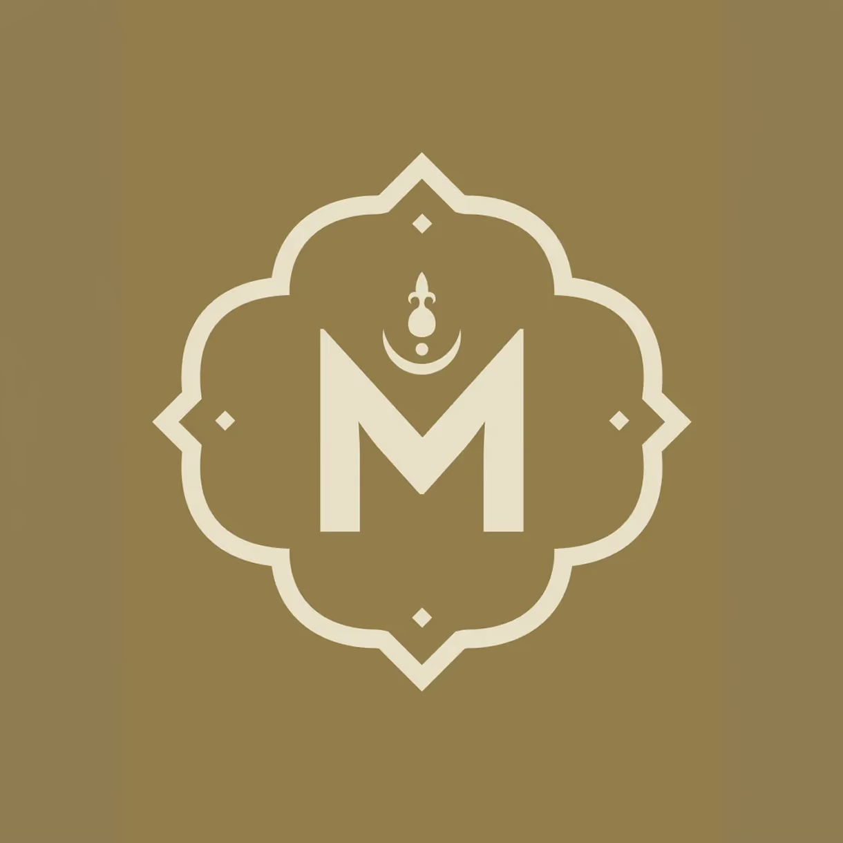
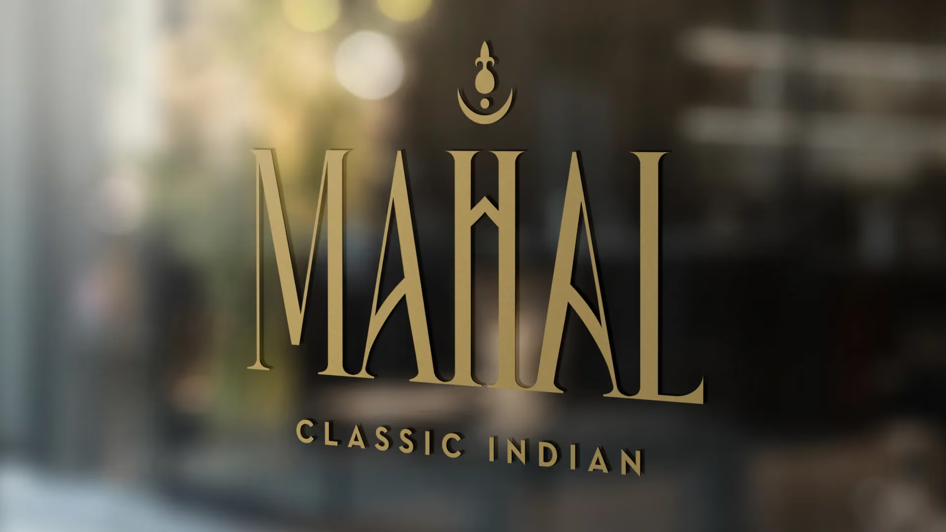
We looked to the Taj Mahal, and its famous dome shape stood out most. That shape was worked into the letters of the logo in a subtle way, with a crescent spear shape drawn from the pointed spires. The owners loved it right away.
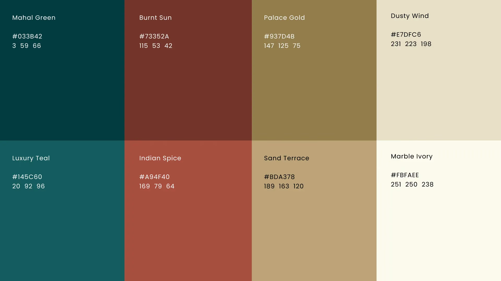
The colors completed it: deep green with shimmering gold and ivory white, a mix that reads royal without feeling heavy.
What We Delivered
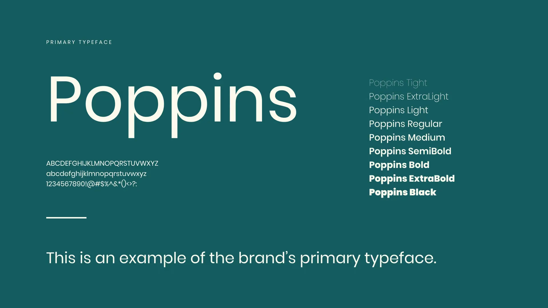
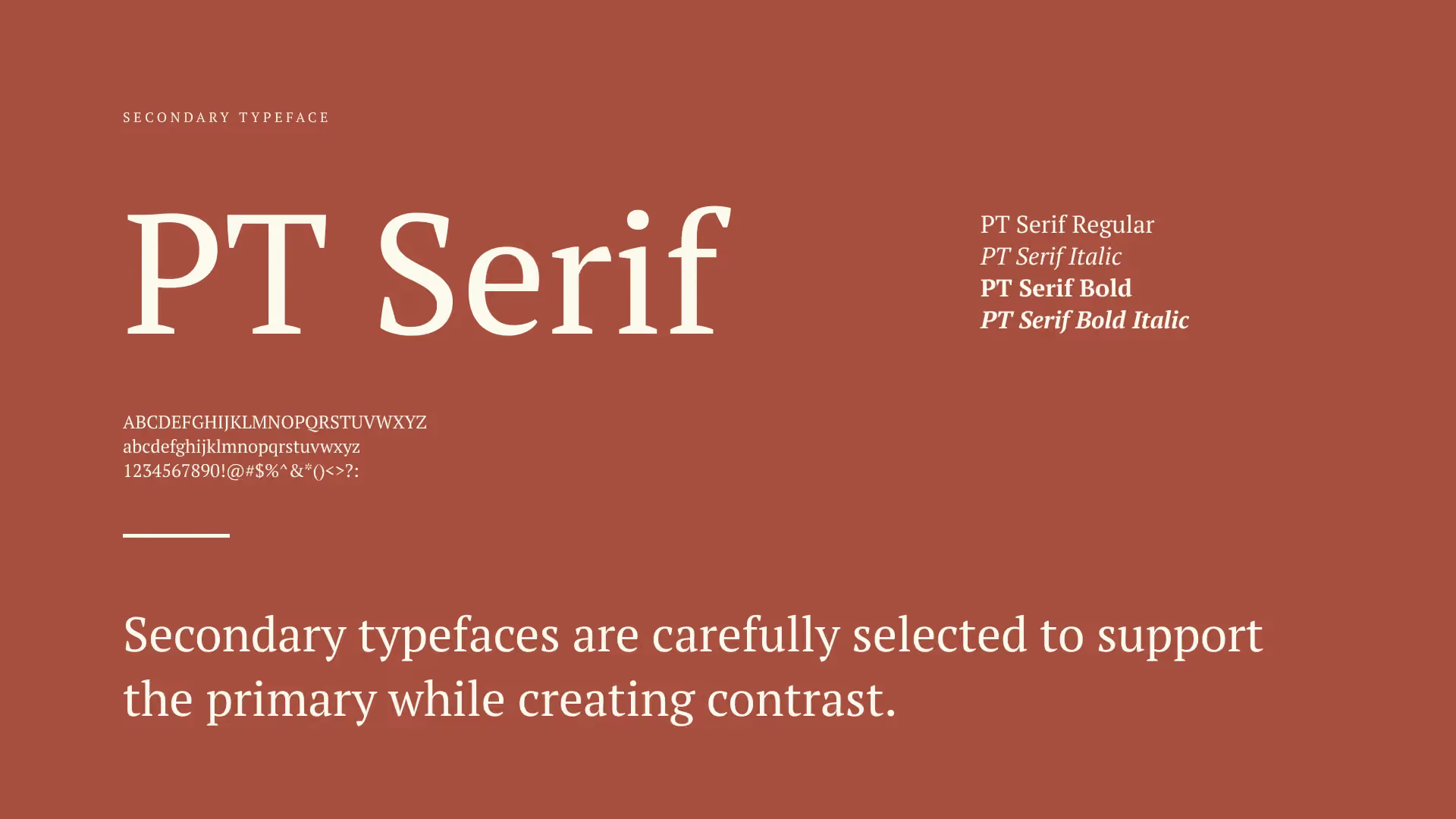
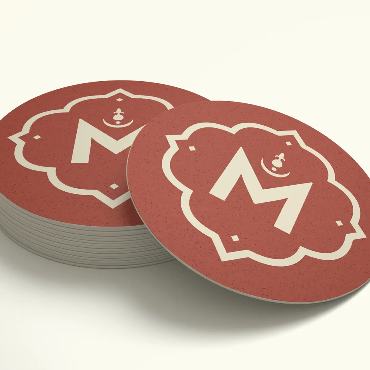
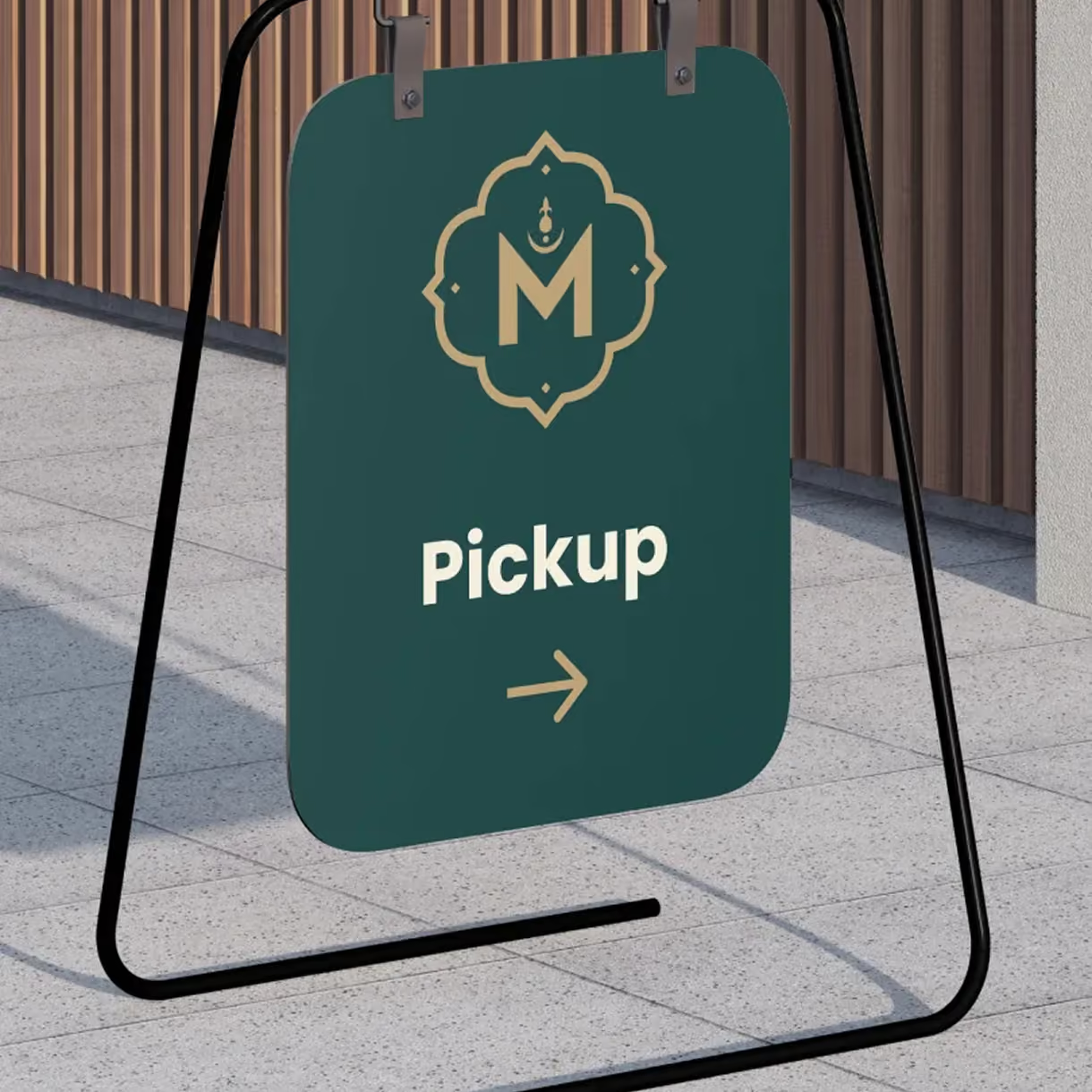
Mahal received a full brand identity: a logo with the Taj Mahal dome worked into its letters, a royal set of colors in deep green, gold, and ivory, and fonts to match. The look was coordinated with the interior design, so the dining room and the brand feel like one place. Signs, window graphics, coasters, and other printed pieces completed the package.
The Result
Mahal quickly became the place on Long Island for romantic dinners, special occasions, and upscale events like weddings and milestone celebrations. Customers get fine Indian dining without the trip to New York City. The brand gave the restaurant a presence that matches the ambition of its kitchen. For a restaurant built for special occasions, that first impression starts long before the first plate arrives.