How to Make Your Logo Look Luxurious
Want your logo to look high end and premium? Simplicity, neutral colors, the right typeface, and generous letter spacing are the four characteristics.
Article
Want your logo to look high end and premium?
In a world where trends change every day, some brands get mistaken for just another fad. Luxury brands work differently.
While luxury brands are meant to distinguish their products from each other, that doesn't mean their logos should all look wildly different. They share a discipline.
Here are four characteristics you can use to make your brand logo appear luxurious, upscale, classic, and expensive. And notice something as you read them. Premium brands never show what they sell. The logo isn't a picture of the product. It's a signal about the level.
The four characteristics
1. Simple and minimal
Not a lot of detail goes into their overall aesthetic. Restraint is the signal.
A mark that doesn't try too hard reads as confident, because it is.
Think about what busy logos are usually doing. They're trying to convince you. More detail, more effects, more proof that they're worth the money. Luxury does the opposite. It assumes the value and lets the quiet do the talking. If your logo is explaining itself, it already doesn't feel expensive. Expensive things don't argue.
2. Neutral color palettes
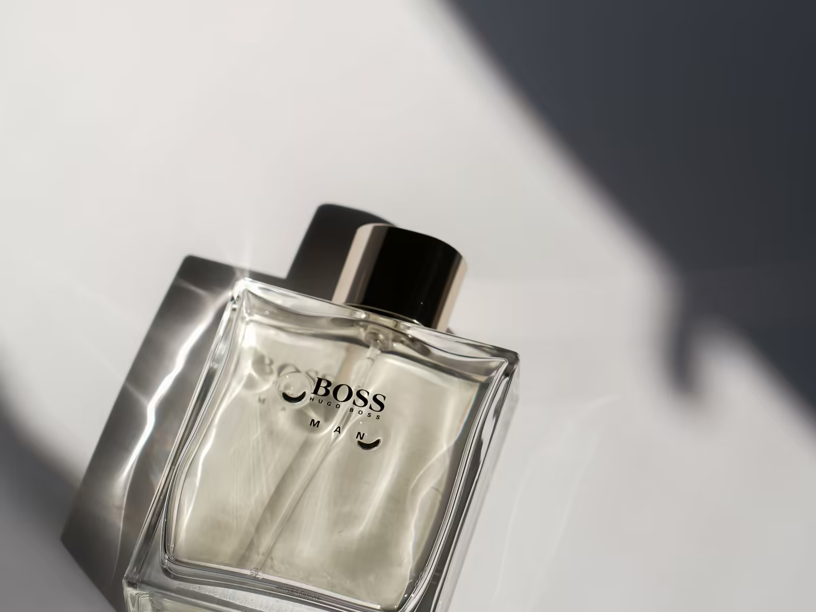
For the most part, these are kept black and white. They don't want any color word association to influence your mood.
What red means to you might mean something different to another person. Neutral swatches avoid that risk entirely.
There's a practical benefit too. A black and white logo works everywhere without adjustment. Foil, embossing, engraving, a dark photo, a light one. It never clashes, never needs a special version, never looks dated when color trends rotate. Bright and trendy can be beautiful. It just has an expiration date printed on it, and luxury doesn't do expiration dates.
3. The right typefaces
Serif vs sans serif fonts, it doesn't matter, as long as it's legible. Serif typefaces tend to evoke a more classic aesthetic, while sans serif fonts are seen as more modern.
That choice is explored in serif vs sans serif.
What matters more than the category is the quality of the letterforms and how they're set. A classic serif set carelessly looks like a wedding invitation template. A clean sans set with care looks like a gallery. Pick the type like it has to represent you with no picture and no color helping it. Because at small sizes, that's exactly the job it has.
4. Letter spacing
Increased, expanded tracking. Careful typographical kerning to allow breathing room between characters.
Space reads as expensive because cramped reads as cheap, almost everywhere in design.
It's the same reason luxury stores are mostly empty space with a few pieces in them, while discount stores are packed floor to ceiling. Density signals desperation to sell. Space signals you don't have to. Your letter spacing makes that same argument in miniature. Give the letters room and the whole mark calms down and stands taller.
Put it to work
By using these four characteristics, you can help refine your new luxury brand identity logo to look upscale, lavish, and appropriate for your high end audience and demographic.
None of them cost money. All of them take discipline.
And be honest about the fit before you start. Luxury restraint only works if your price, your service, and your experience back it up. A quiet, expensive looking logo on a business that competes on discounts doesn't read as luxury. It reads as a costume. The logo can set the expectation. The business still has to meet it.
If your market is premium, our logo design process builds that restraint in from the start, and simplicity is best explains the principle underneath it.
Thinking about your own logo? Book a free consult with Alchemy Design in Orlando and get an honest read on where it stands.