Type Tips and Basics: Serif vs Sans Serif
Serif or sans serif? One reads classic and traditional, the other modern and clean. Here is how to choose, and how designers actually use both.
Article
Serif vs sans serif: choosing the right typeface.
Ever wondered about the differences between serif and sans serif typefaces, and when to use each? It's a small decision with an outsized effect on how your brand feels.
The simple definitions
In simple terms, a serif typeface features accents or small lines stemming from the individual characters, while sans means without. Those little feet are the whole difference, visually.
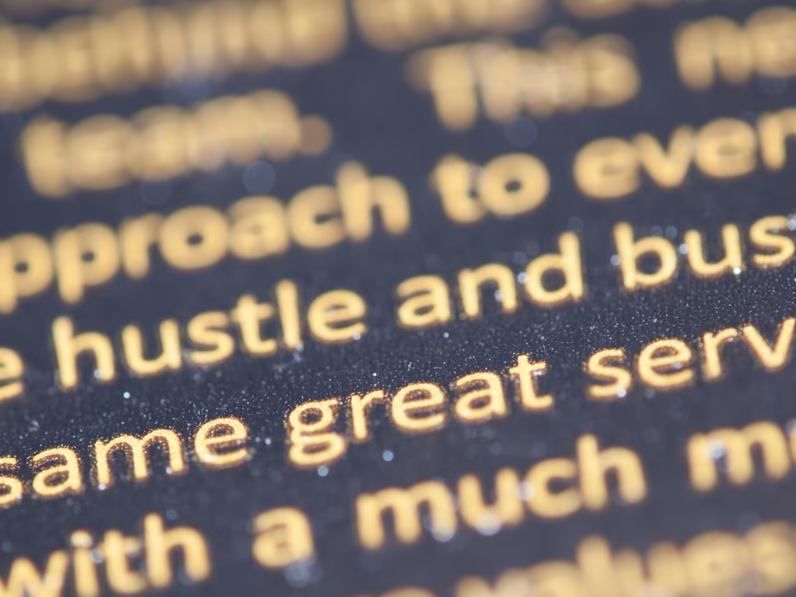
Zoom in on any letter. If it has feet, it's a serif. If the strokes just end clean, it's a sans.
Serifs evoke a classic, traditional aesthetic. Sans serif typefaces are often seen as more contemporary and modern. Neither is better. They're different signals.
Same word, same size, two completely different first impressions. That's the whole game.
What each one is really saying
This is the part owners actually need.
A serif says: established, careful, we've been doing this a while. That's why you see serifs on law firms, financial brands, and anything selling heritage.
A sans says: current, direct, nothing to hide behind. That's why tech companies and modern service brands live there.
Neither signal is a law. But if your font is sending the opposite signal from your business, customers feel the mismatch before they can name it.
How to choose
The choice between serif and sans serif depends on your project and your personal preference, but here are some general guidelines to consider.
As designers, we typically lean toward sans serif typefaces, as they match our style and clientele. However, in some cases we use serif typefaces for headers, where larger sizes showcase the shapes more clearly.
For body text, we almost always go with sans serif typefaces due to their legibility, especially at smaller sizes. Small text is where most reading actually happens, so legibility wins there.
Run the size test before you decide. Set your name at the smallest size it'll ever appear. A business card. A phone screen. An invoice footer. A serif's fine details are the first thing to disappear. If it still reads clean when it's tiny, it's a candidate. If it turns to mush, it isn't.
Distance is the other test. Serifs shine at reading distance: signage, packaging, anything meant to feel established up close. Sans tends to win at a glance and at a distance, on screens and road signs. Where will your name be read most? Start there.
As high resolution screens become more standardized in the future, we may see a resurgence of serif typefaces, since the fine details that used to blur on screen will render cleanly.
And you don't always have to pick one for everything. A serif headline over sans body text is a classic pairing for a reason: the serif carries the personality, the sans does the reading. Just don't pair two fonts that are almost the same. Almost is where brands look accidental.
Where this fits
Typeface choice is one piece of the font decision covered more broadly in choosing fonts for your logo, and it's one of the characteristics that makes a logo read as premium in how to make your logo look luxurious. In our logo design work, the choice gets made on audience and use, not on designer habit.
Thinking about your own logo? Book a free consult with Alchemy Design in Orlando and get an honest read on where it stands.