A Business Needs More Than Just a Logo Design
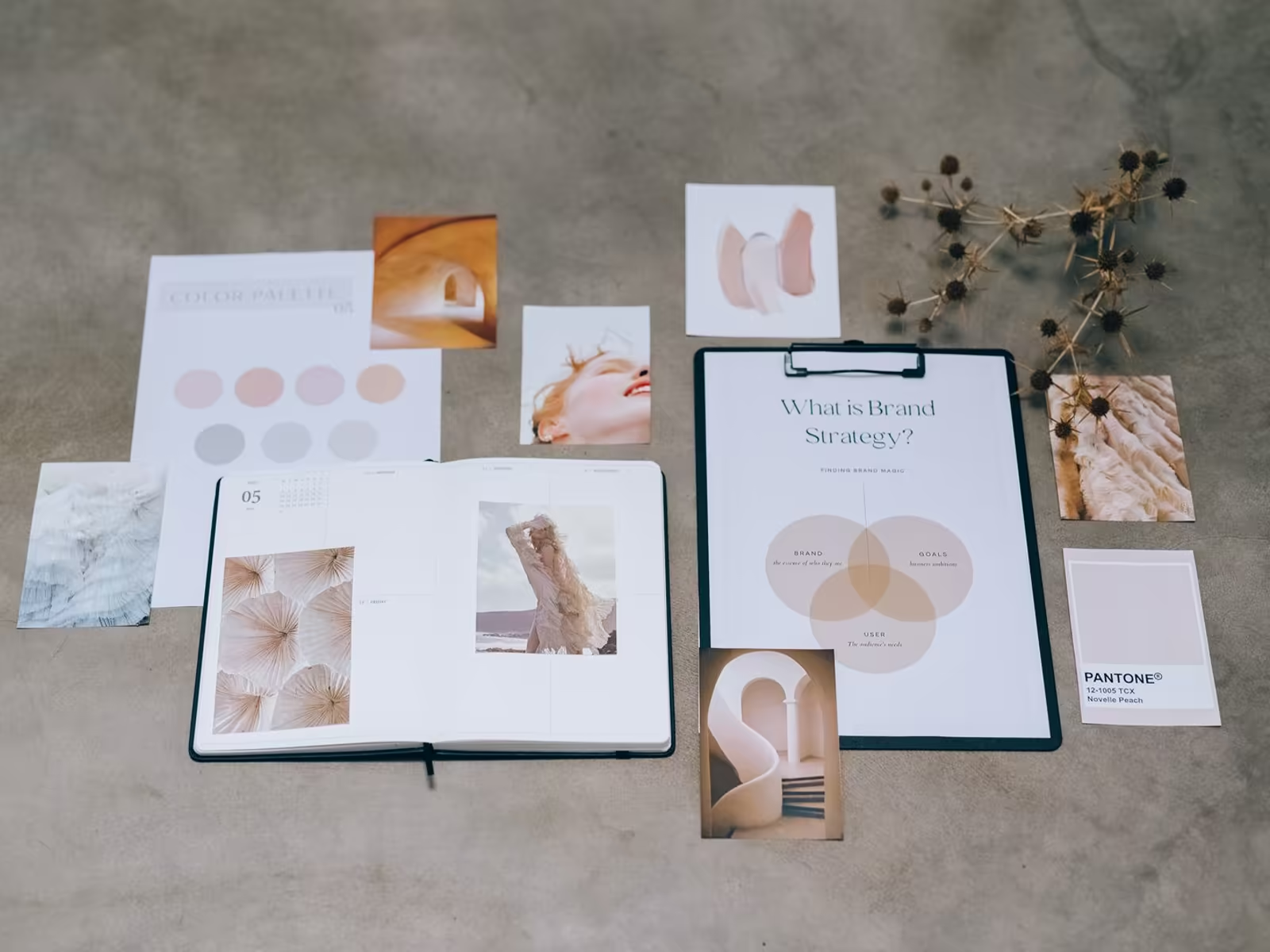
A logo is one piece of the puzzle. Colors, typography, imagery, patterns, tone of voice, and positioning are what turn it into a real brand identity.
Article
A lot of businesses stop at the logo. They get the mark made, put it on the website, and call the brand done.
Then everything else gets improvised. Different fonts on every flyer. Random colors on social. A tone that changes depending on who wrote the post that day.
Your business needs more than a logo to be remembered. A logo design is just one piece of the branding puzzle. Here's the rest of it.
The other elements of a real brand identity
Colors
Colors evoke emotions and shape how your brand is perceived. Pick a palette that lines up with your personality and your message, and then use it consistently. More on that in choosing colors for your brand logo.
Consistently is the hard part. Not similar colors. The same ones, picked on purpose, every single time.
Typography
Fonts carry tone and style. They should be legible, consistent, and matched to your character. A playful script and a serious corporate sans are saying very different things about you.
And your customers read that tone before they read a single word. Pick two or three fonts, assign each one a job, and stop browsing for new ones.
Imagery
Photos, graphics, and icons should be consistent and reflective of your identity. High quality visuals raise the appeal and recognition of everything they sit next to.
It doesn't take much to break this. One cheap stock photo in a feed of clean, real ones stands out for the wrong reason.
Patterns and textures
These add depth and give your materials a look that's yours. Used across platforms and print, they help separate pieces still feel like one brand.
This is the piece most small businesses skip, and it's often the one people recognize fastest. A pattern on your packaging, your site, your social posts. Same fingerprint, everywhere.
Tone of voice
How you sound in writing should be consistent everywhere. Formal, casual, playful, direct. Pick the one that fits your personality and resonates with your audience, then stay there.
Run the blind test on this one. Cover the logo on three of your posts. Can you still tell they're yours? If yes, your voice is doing its job. If no, you're borrowing a personality from whoever posted last.
Positioning
Positioning defines how you're perceived against competitors. It's the reason a customer understands what sets you apart, covered in more depth in brand positioning and how to stand out.
Everything above is decoration without this. Positioning is the sentence a customer would use to describe why they picked you over the place down the street.
Putting it together
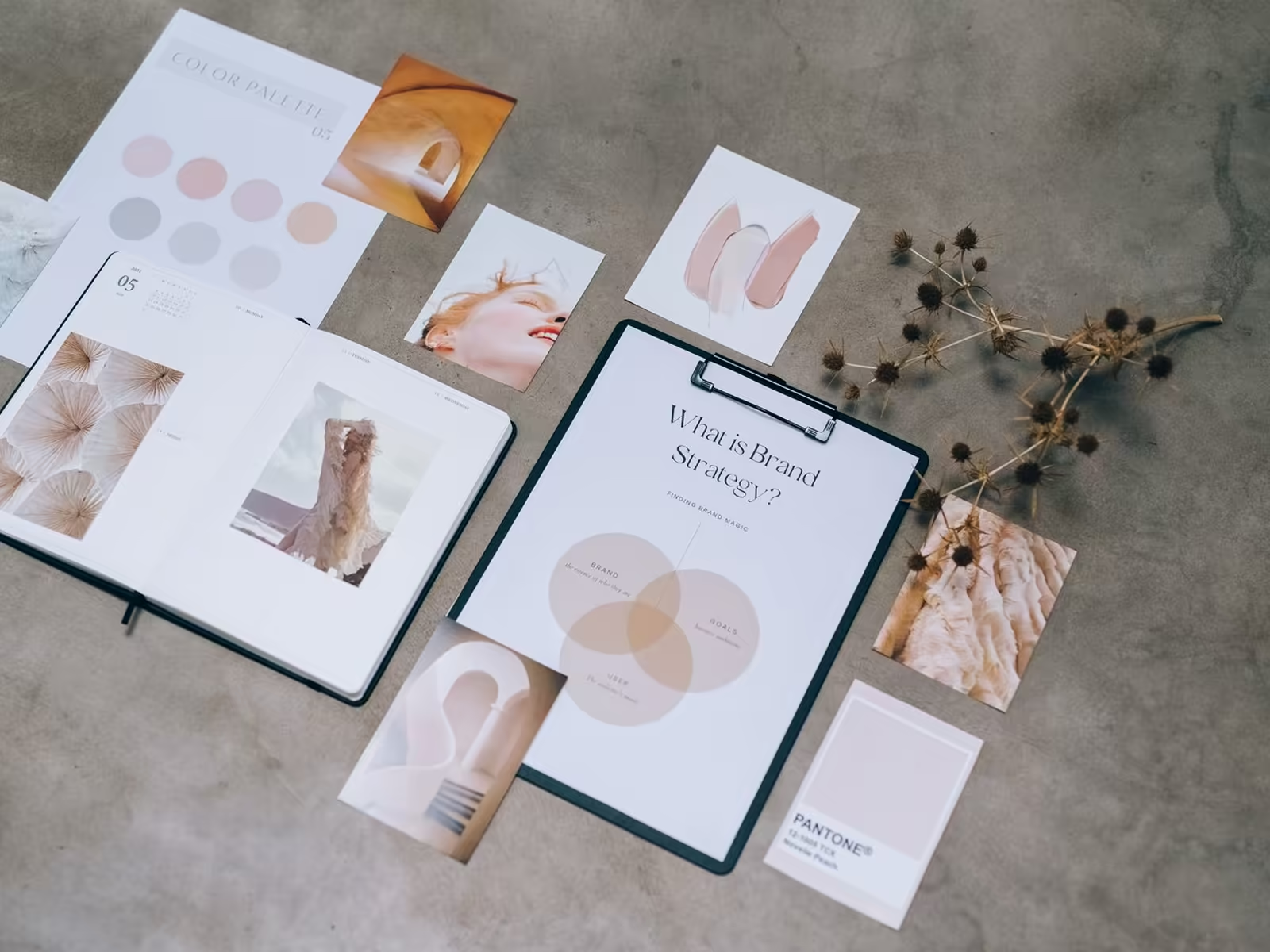
A strong brand identity goes beyond a logo. It's the full system, colors, typography, imagery, patterns, tone of voice, and positioning, built as one brand identity so everything you put out looks and sounds like it came from the same business. Because it did.
You don't need all six perfect on day one. But you do need them decided. Decided beats improvised, every time something new gets made.
And decided is cheaper than people think. Most of these calls get made in the same project that produces the logo, while the thinking is already on the table. It's coming back two years later to retrofit a system around a lone logo that gets expensive.
Thinking about your own logo? Book a free consult with Alchemy Design in Orlando and get an honest read on where it stands.