CORA Loyalty
CORA Loyalty: strategy, technology, rewards and fulfillment under one name, not five separate vendors.
What Wasn’t Working
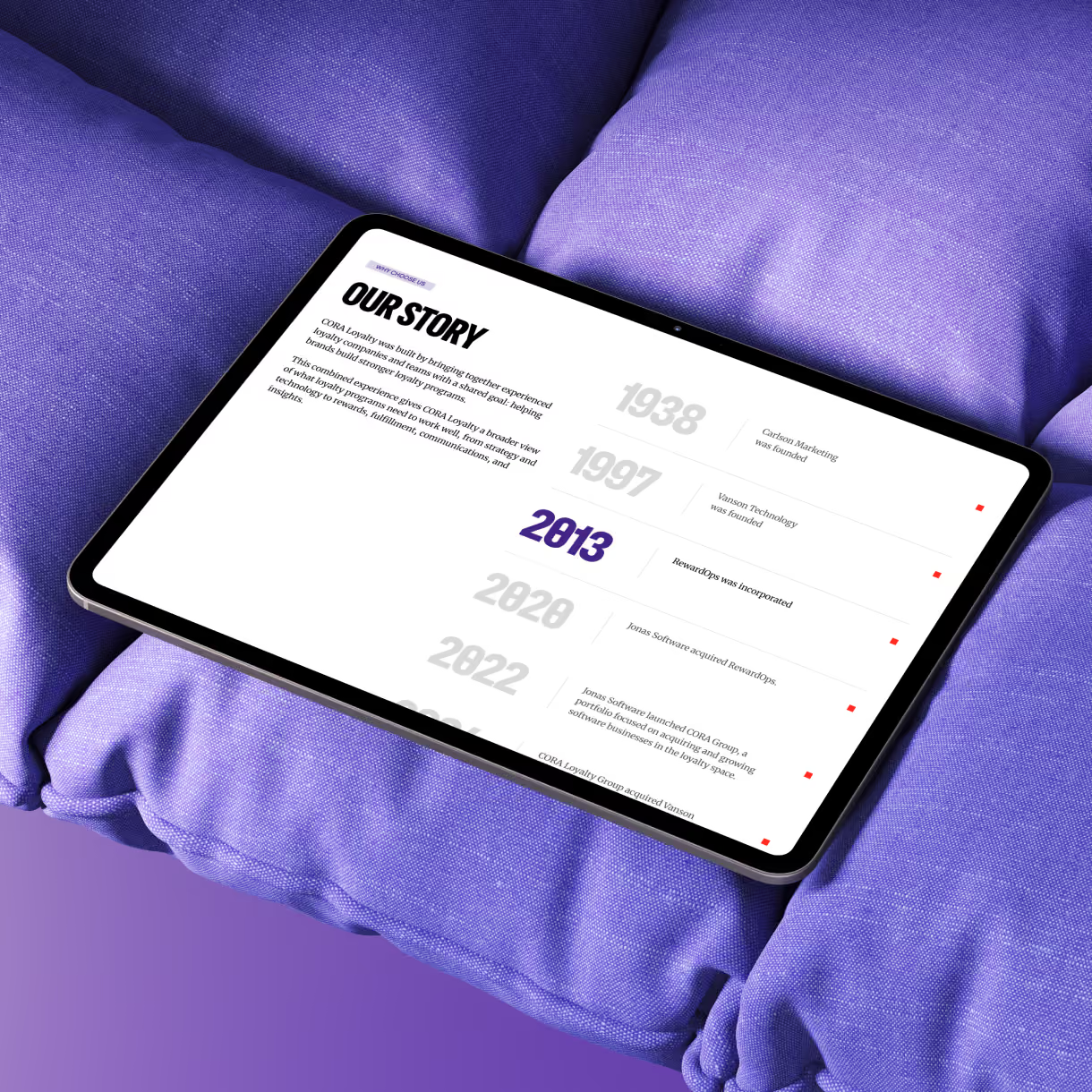
Most big loyalty companies sell the same way: a list of everything they can do, a diagram, and the words "end-to-end." CORA Loyalty had a harder problem underneath. The company wasn't launched. It was assembled. RewardOps, Carlson Marketing Solutions, and Points at Work came together under one name, each with its own history, its own audience, and its own way of describing the same work.
The company truly could do all of it, from strategy and technology through rewards, fulfillment, communications, and analytics. But the website showed the pieces separately. A buyer who knew exactly which piece they needed could find it. A buyer who only knew their program was underperforming had nowhere to start. And the proof, real programs with real results going back decades, lived in a sales deck instead of on the site.
How We Solved It
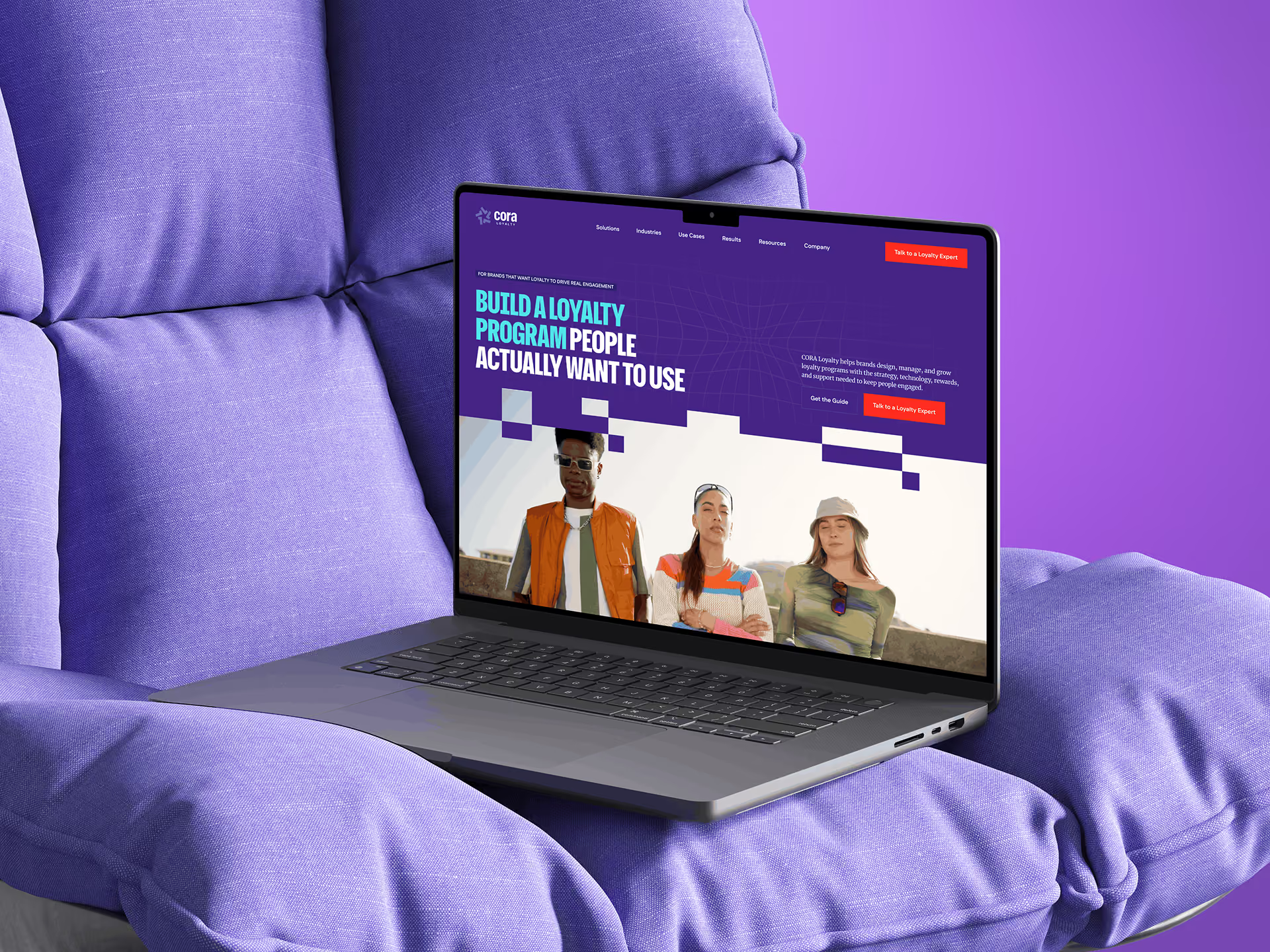
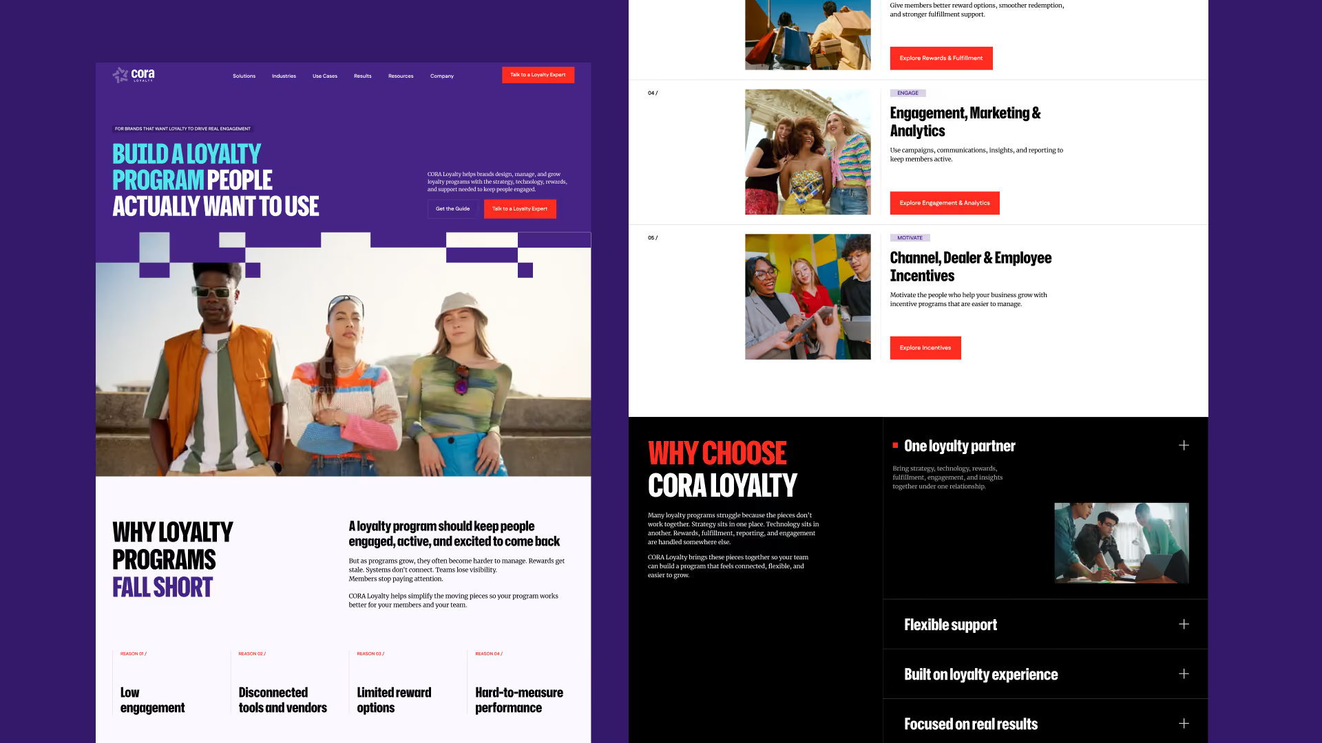
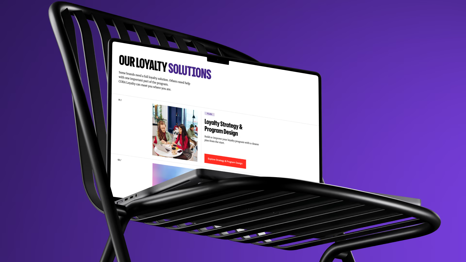
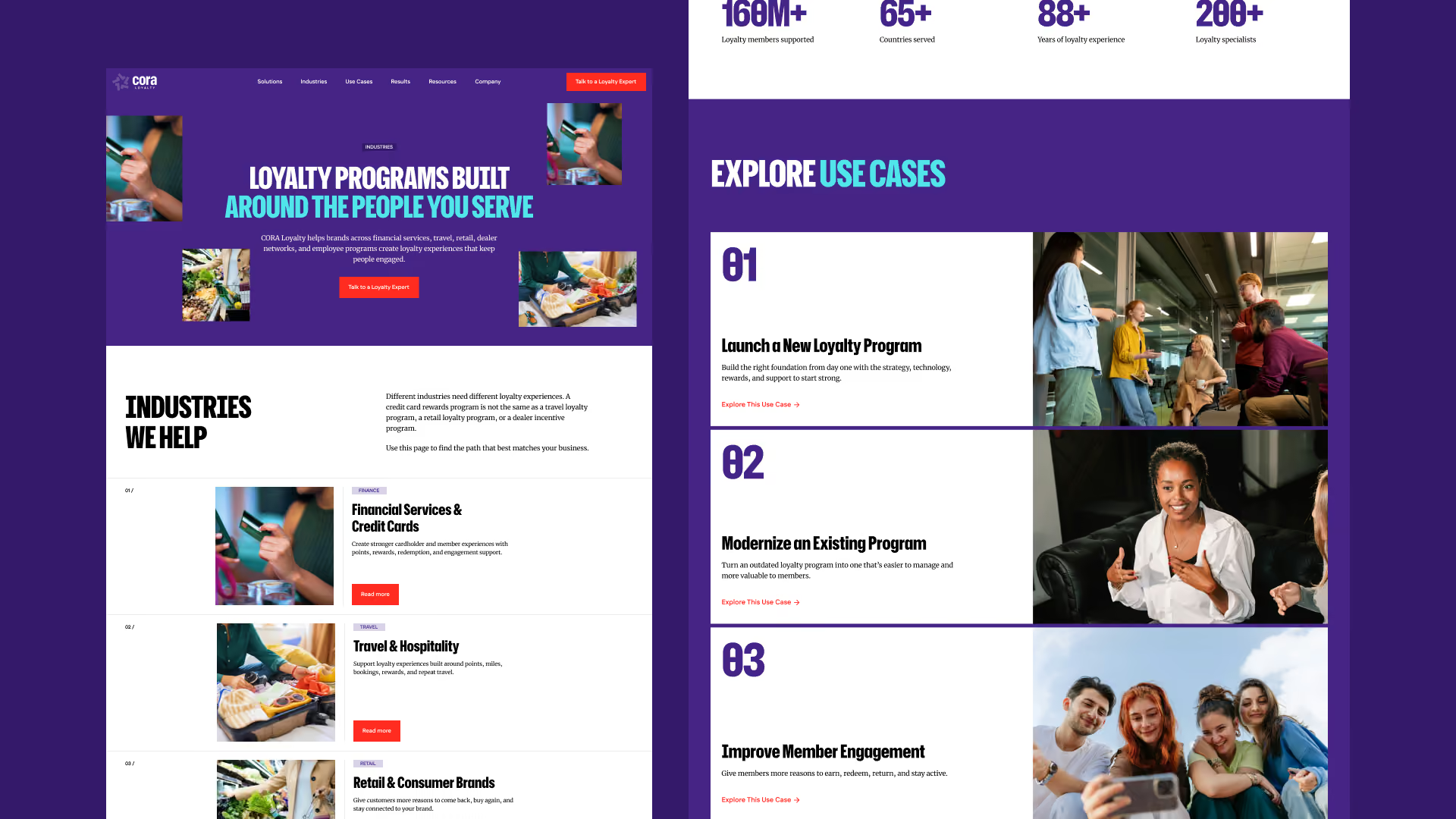
We treated "one connected partner" as a building problem, not a catchy line. The menu gives buyers three ways in: by what they need (Solutions), by their industry (Industries), and by the problem they're actually trying to fix (Use Cases). Most big-company buyers show up knowing the symptom, not the solution.
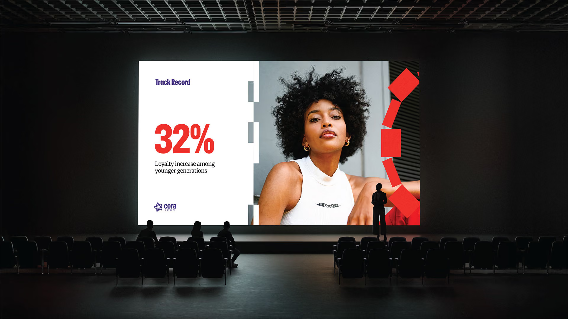
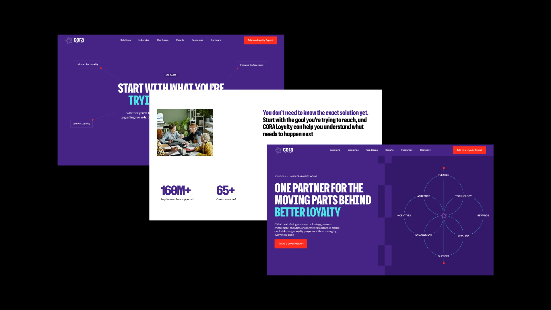
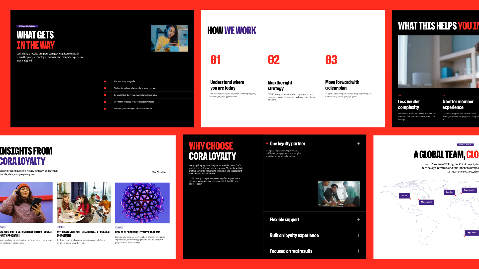
One page, How CORA Loyalty Works, carries the weight the single solution pages couldn't. A Results page pulls the proof out of the sales deck and onto the site, as short outcome cards that are easy to scan.
The writing follows the same restraint. Plain sentences. No loyalty industry jargon. One main next step, Talk to a Loyalty Expert, repeated everywhere instead of five competing offers. The old brand names stay visible, but they move to the footer as supporting names. The CORA Group ownership becomes a reason to trust the company, not a footnote. And every page was written in the same voice, so the company reads as one company no matter where a buyer lands.
What We Delivered
A complete website plan and writing system. The map of the site, the menu, and which next step comes first, plus written copy for the entire site: the homepage, solution pages, industry pages, use case pages, resources, results, company, contact, and legal.
Every page came section by section: headings, body copy, card content, direction for the images, and the page titles and descriptions Google shows. The footer was built so anyone can see how the brands fit together at a glance.
The Result
CORA Loyalty now reads as one company instead of three. A buyer who knows exactly what they need finds it right away. A buyer who only knows their program is underperforming has a way in that doesn't require them to talk like a vendor.
The proof sits on the pages where it does its work. The old brand names support the story instead of competing with it. And every page points to the same next step.