FullReset
Sports recovery and performance brand identity. Canada.
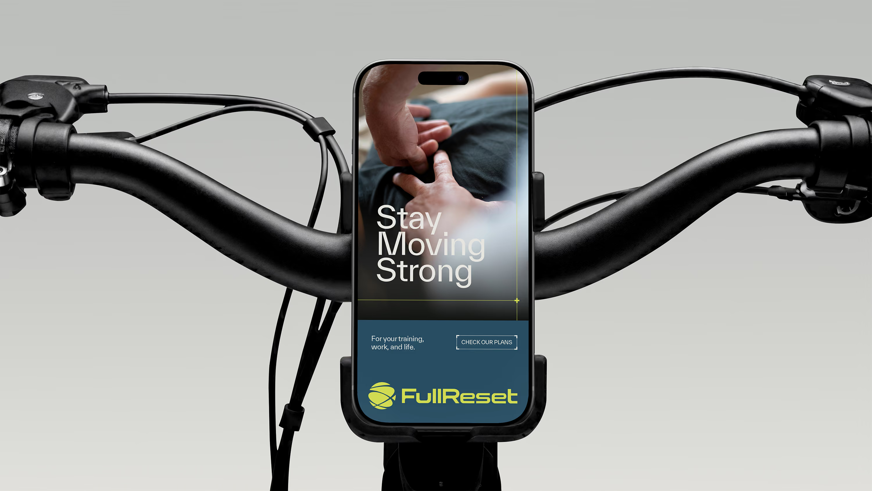
FullReset is a recovery and performance practice built on one idea: treat the system, not just the symptom. The brand had to look the part.
What Wasn’t Working
Recovery and performance brands hit two failure modes: supplement aesthetics (loud, aggressive energy) or clinical health aesthetics (cold, generic, institutional). FullReset needed a third option: controlled athletic energy that reads as precision. The practice treats the whole system, not the immediate symptom, and the brand had to carry that distinction. It had to land on sight, before anyone read a word.
How We Solved It
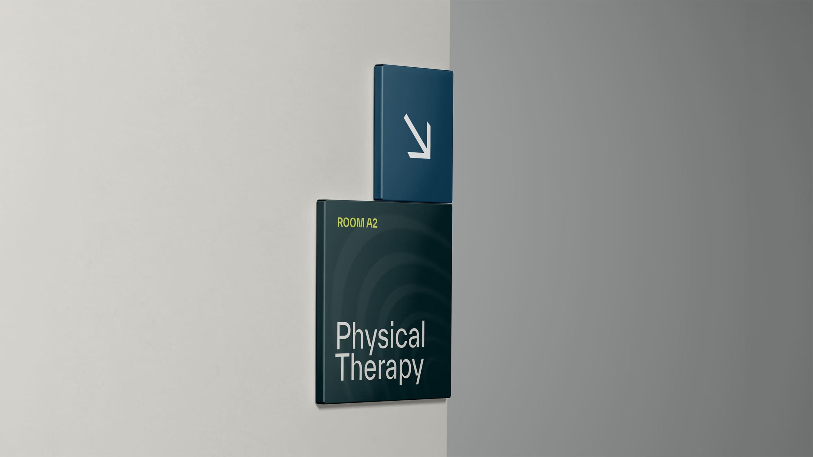
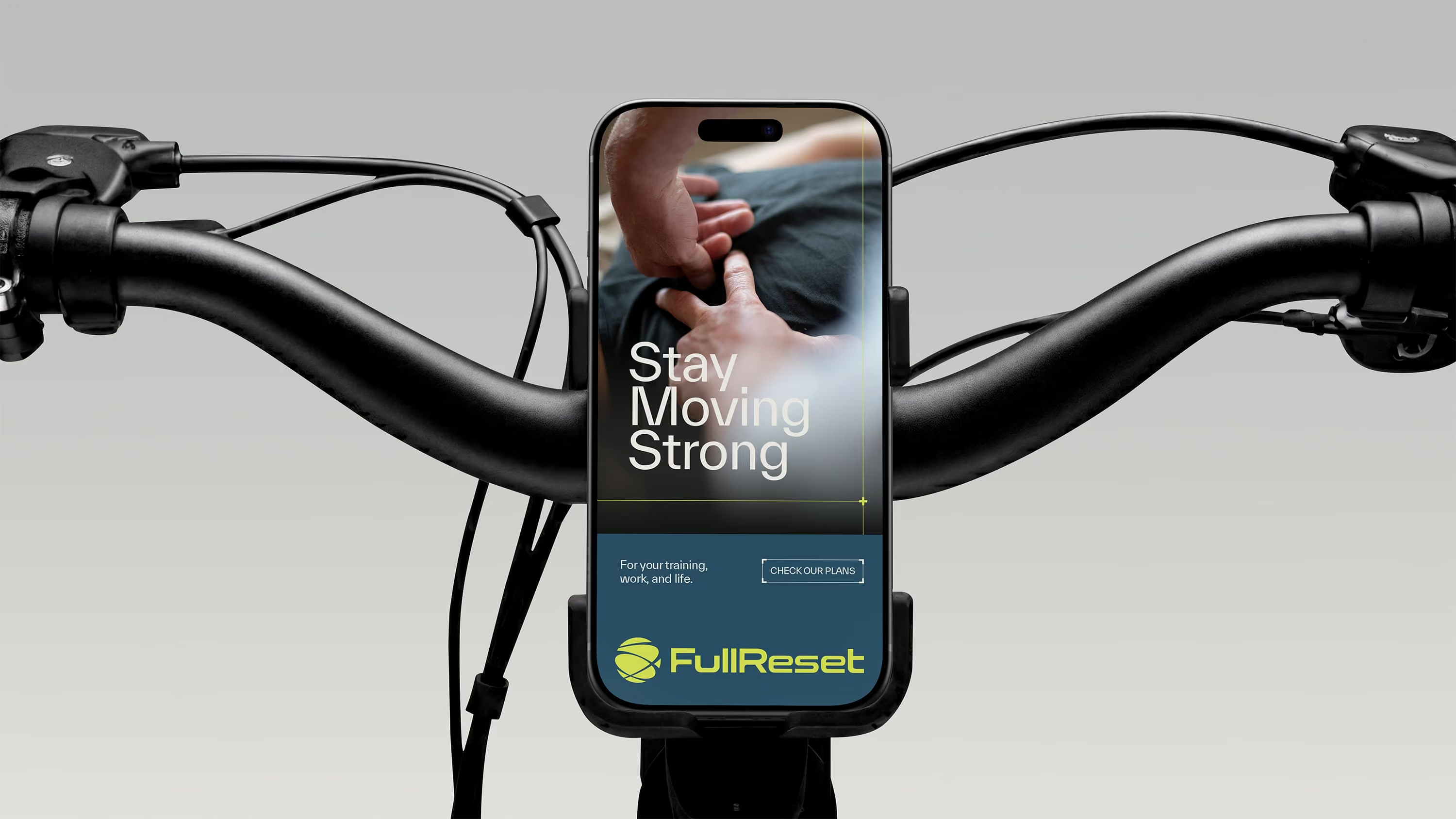
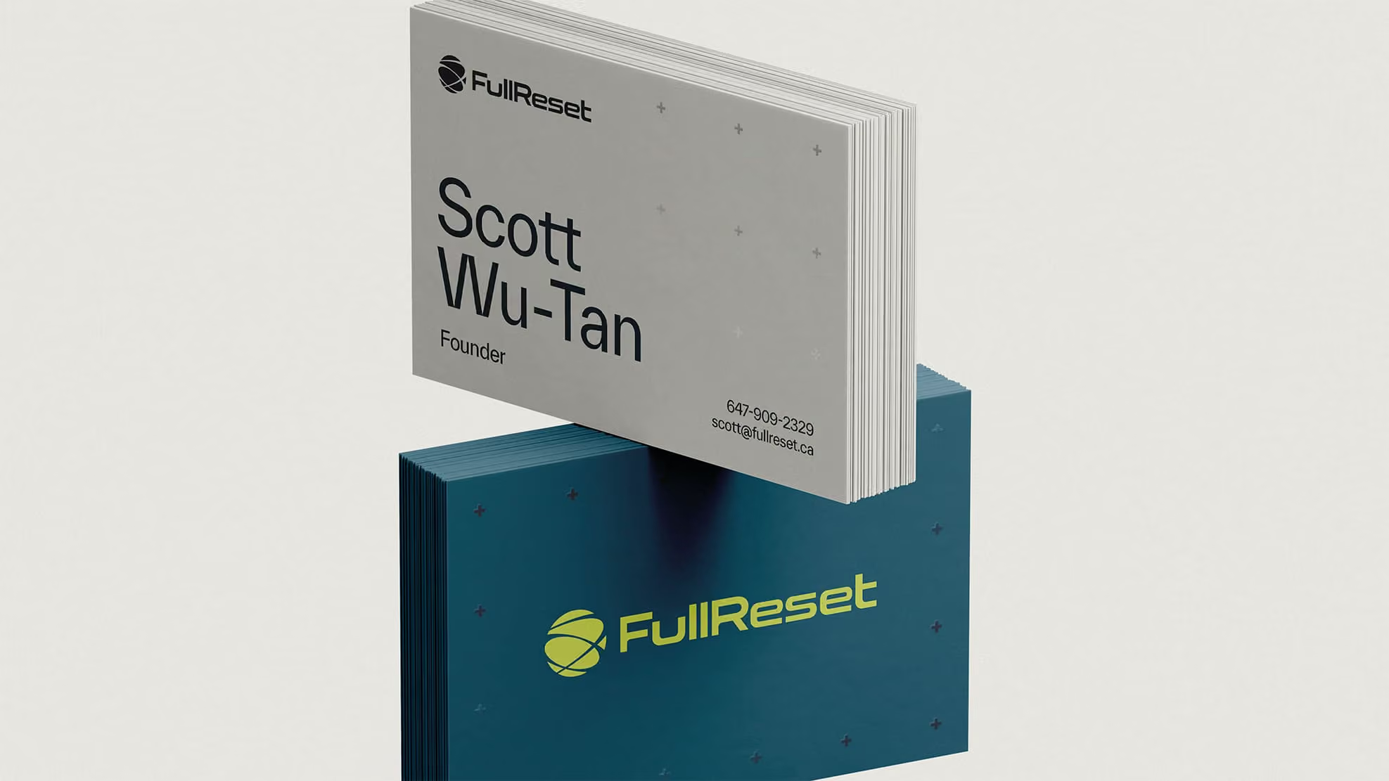
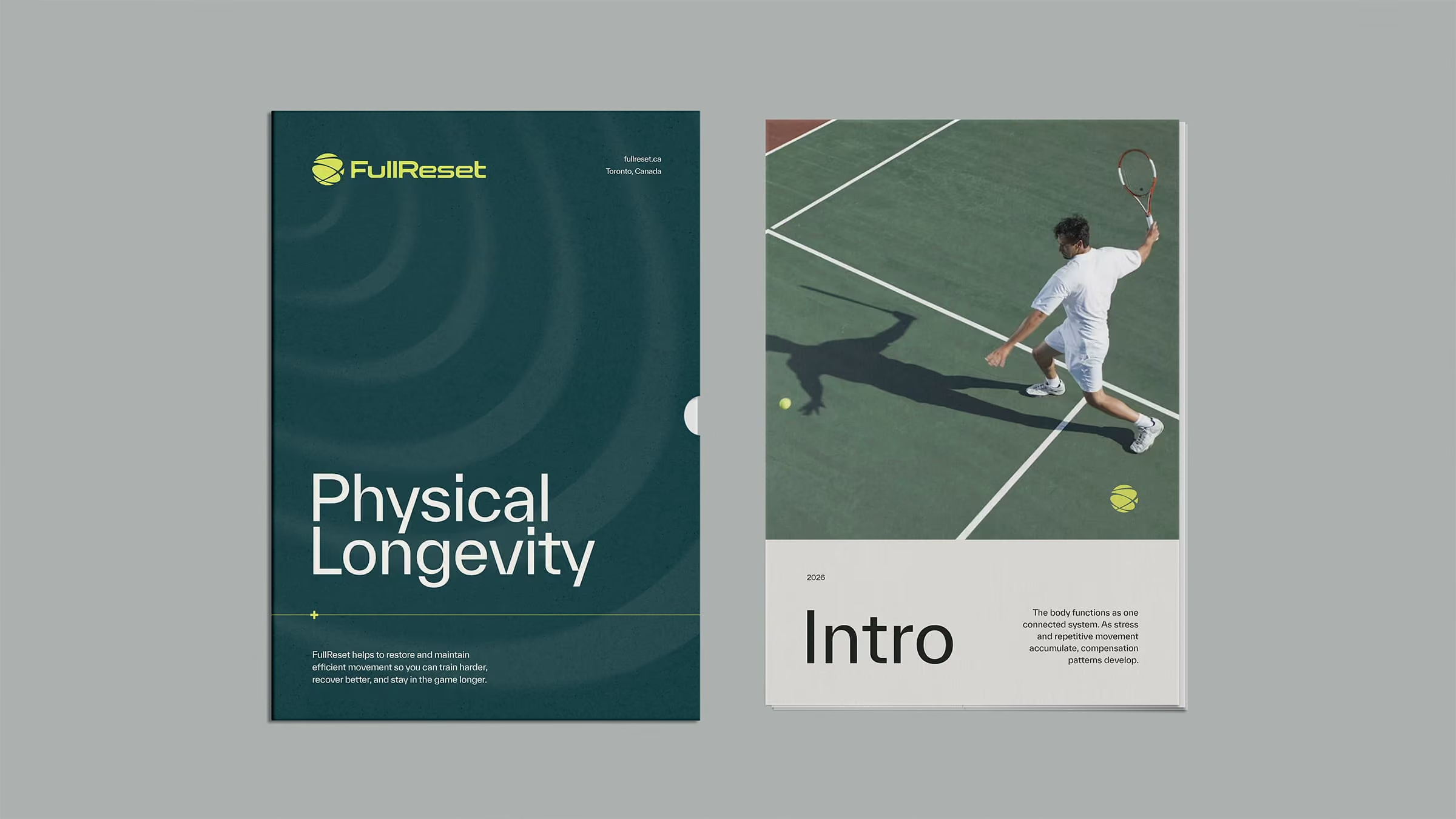
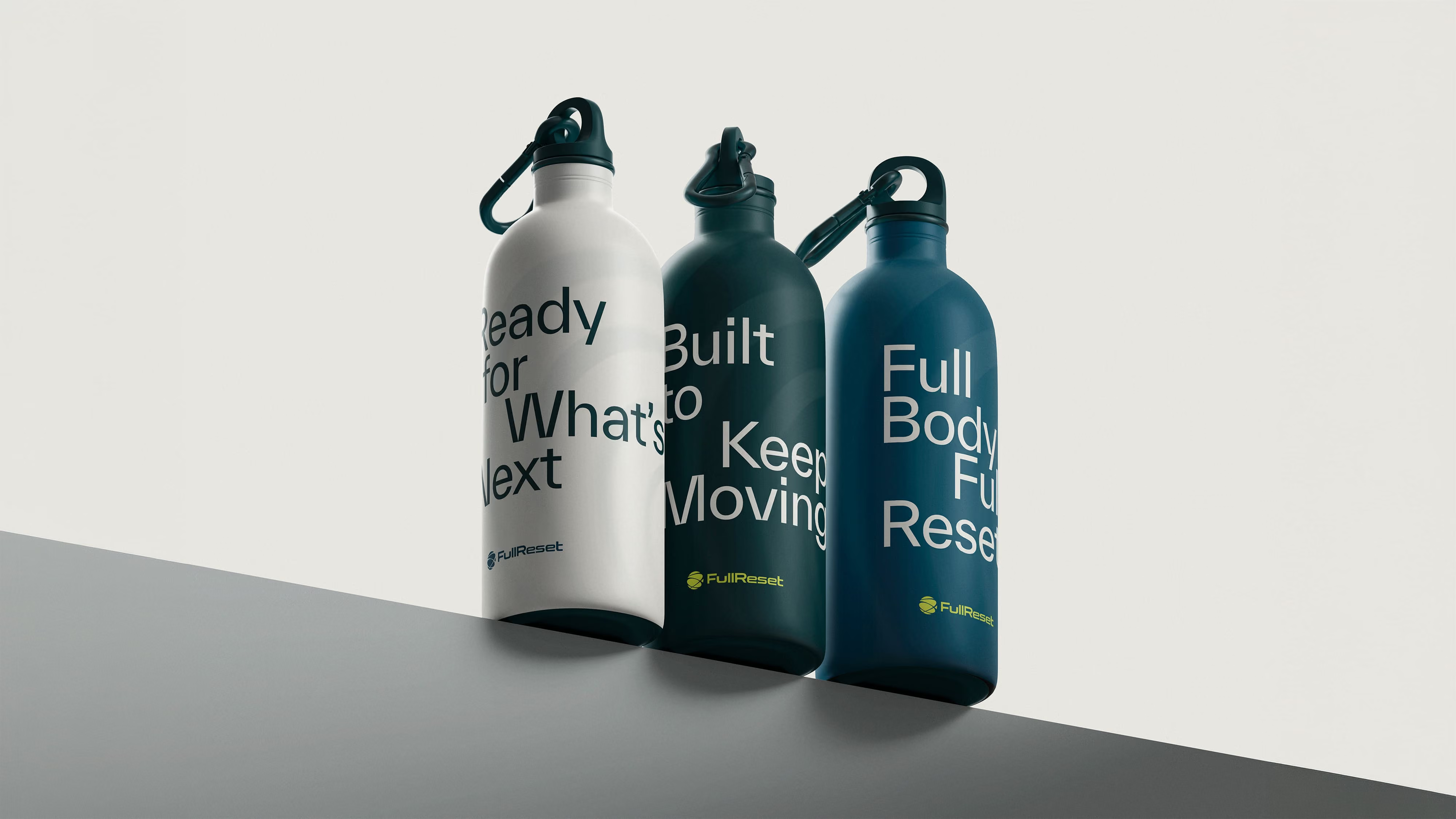
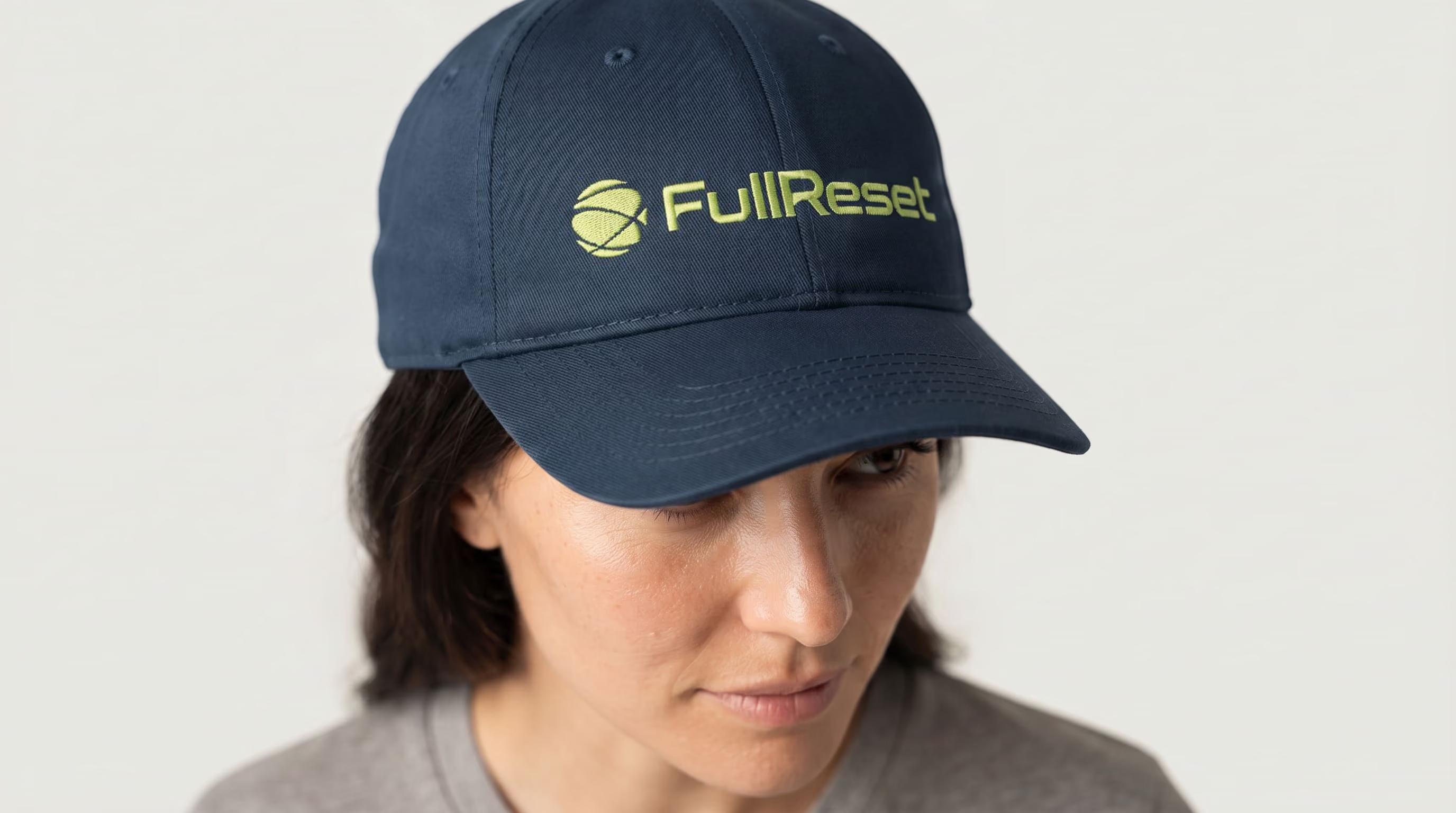
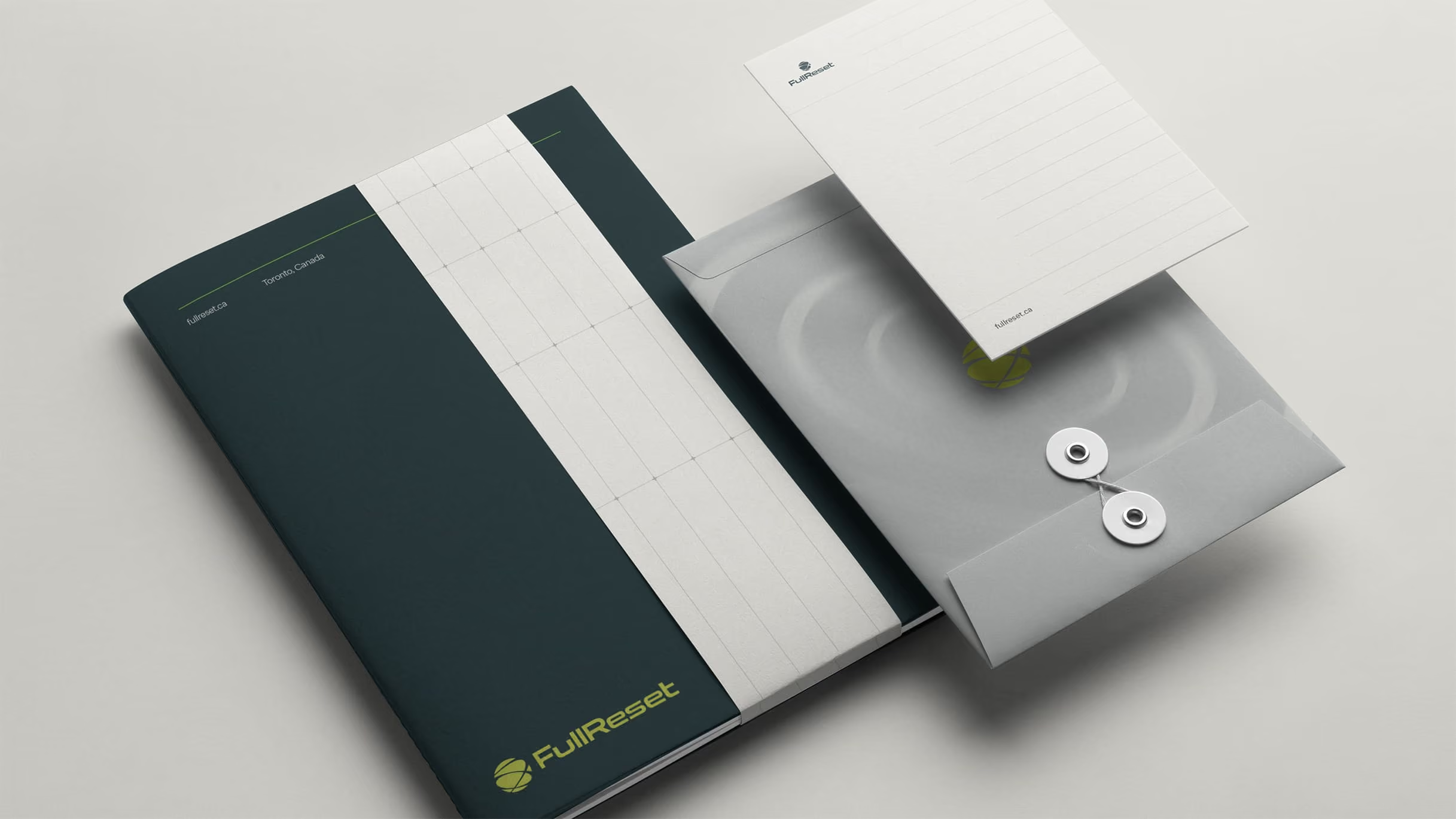
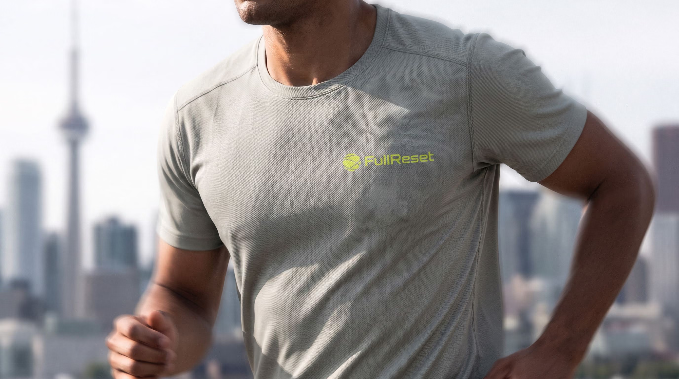
The logo builds the concept into the mark. Intersecting paths from movement trajectories and court geometry suggest the body as a connected system cycling through tension, recovery, and performance. Lime is the primary color: active and sharp, contemporary performance rather than organic wellness. Deep Blue-Green and Court Slate Blue add structure and depth, keeping the energy controlled. Bone, Gray, and Charcoal carry the system across layouts, apparel, and signage without competing with the mark. Everett handles all typography with hierarchy built through weight alone. Movement arcs drawn from the logo's oval forms extend across backgrounds. A growth grid adds precision texture.

What We Delivered
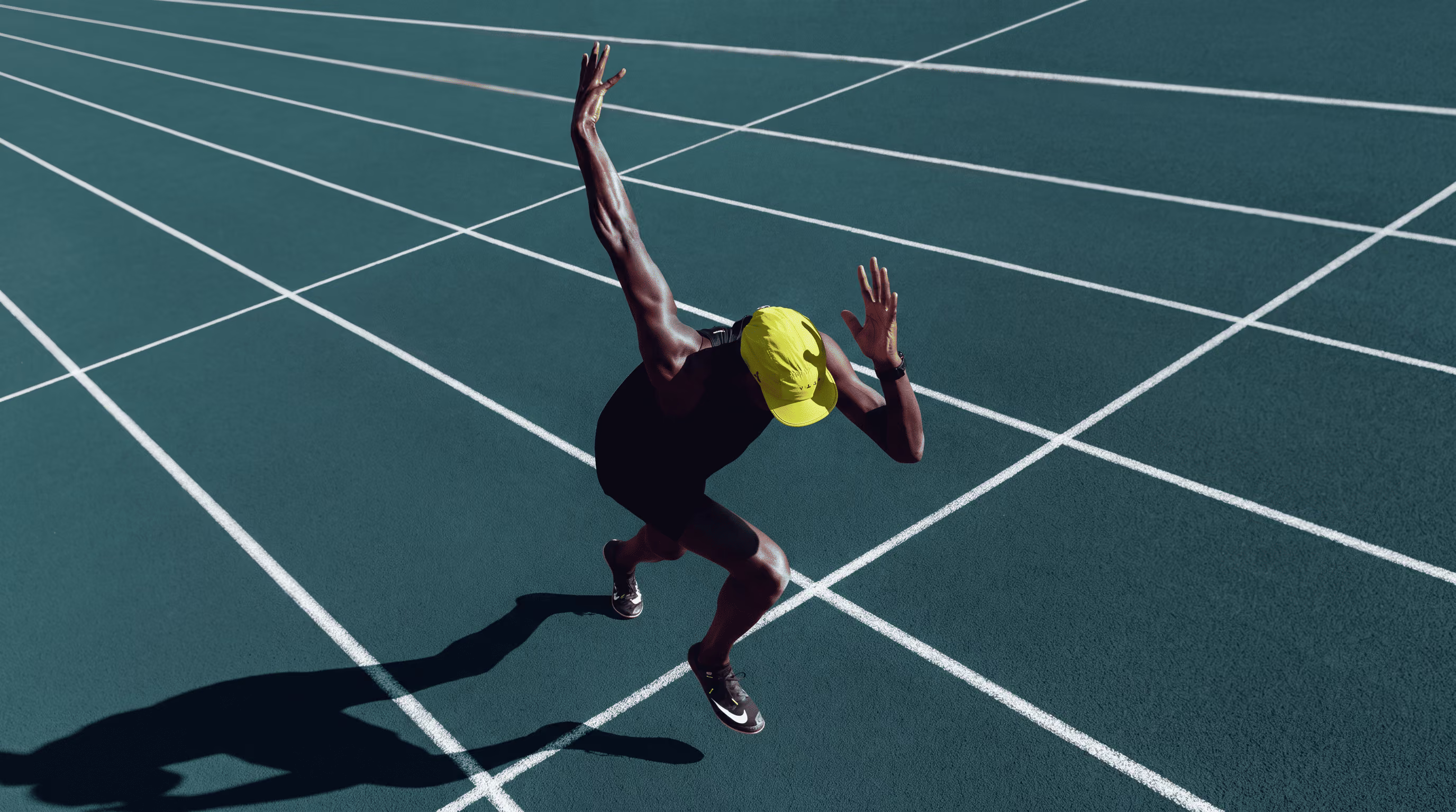
Full brand identity: logo suite with multiple lockups, complete color palette, Everett type system, movement arc and growth grid graphic elements, photography direction, and social media templates.
The Result
FullReset launched with an identity that holds its own against performance and wellness brands without resembling any of them. The system scales from social profile to building signage. For a new practice, that visual coherence signals permanence: exactly what a recovery clinic needs to earn trust from day one.