SAMPRO
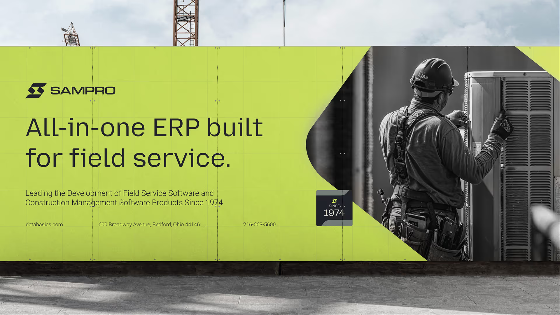
SAMPRO gives construction and HVAC contractors tools to manage projects, time, and teams, backed by a brand that finally matches 50 years of expertise.
What Wasn’t Working
SAMPRO (originally called Data Basics) had two problems feeding each other.
First, a name mix-up. A competitor had the same name and a nearly identical look. At trade shows, the two companies kept getting confused, and resumes landed at the wrong place.
Second, the brand itself was outdated. It no longer matched the quality of the software. A change in leadership gave the team the push to fix both at once.
How We Solved It
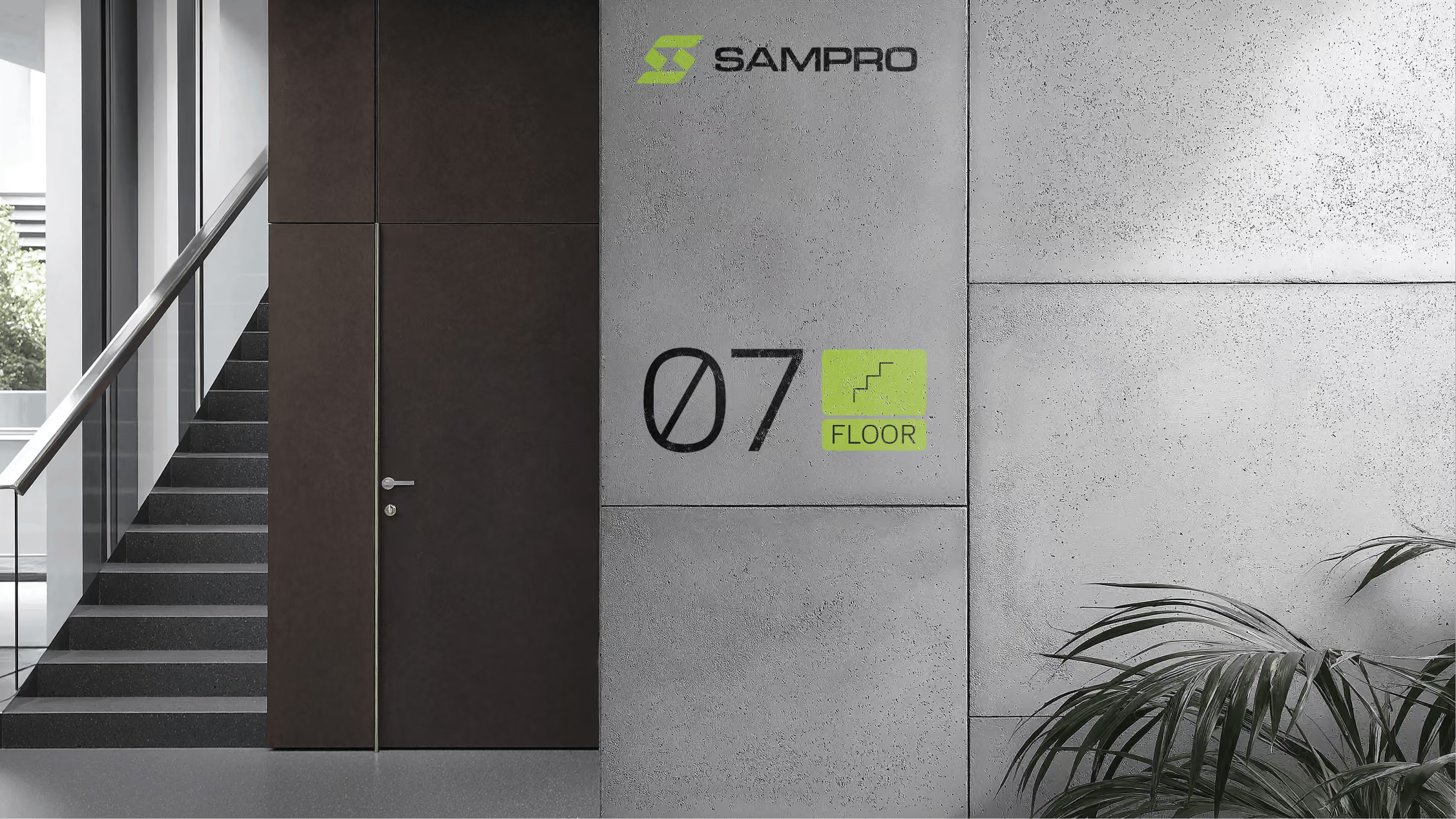
We started with the name: SAMPRO. From there we built a clear system for how the company and all their products are named and organized, so everything sits in a clear order under one name.
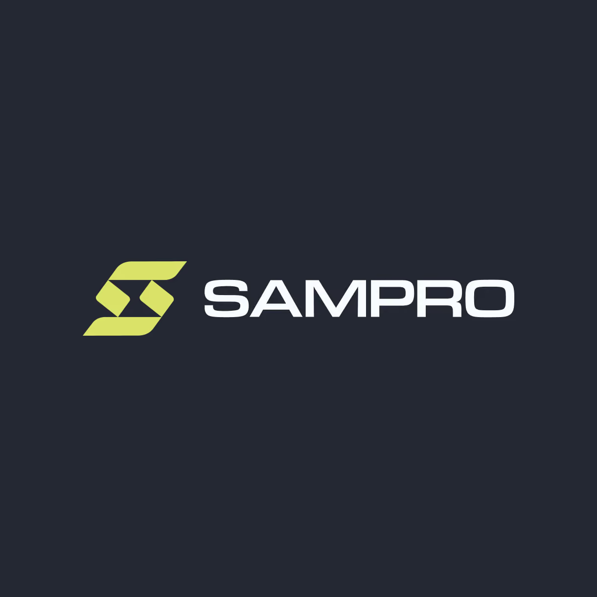
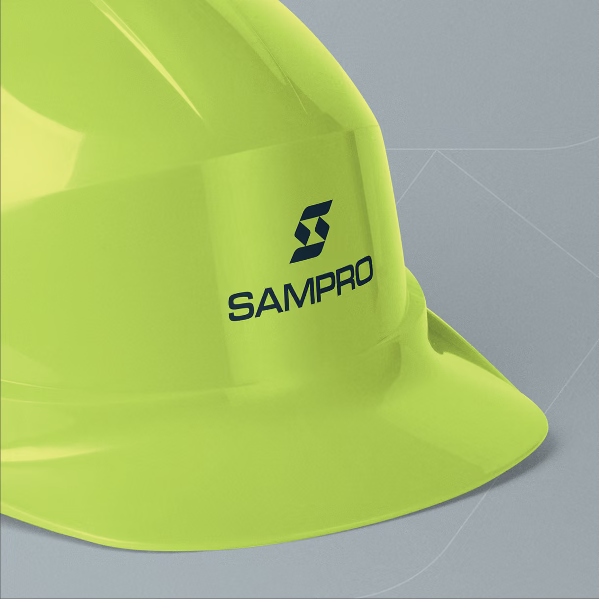
The logo combines an hourglass and a fan. The hourglass stands for time tracking and project management, the heart of what the software does. The fan blades are a direct nod to HVAC contractors, their main industry. Together, the two shapes make a logo that's specific to their world without being obvious. It makes complete sense once you know the story.
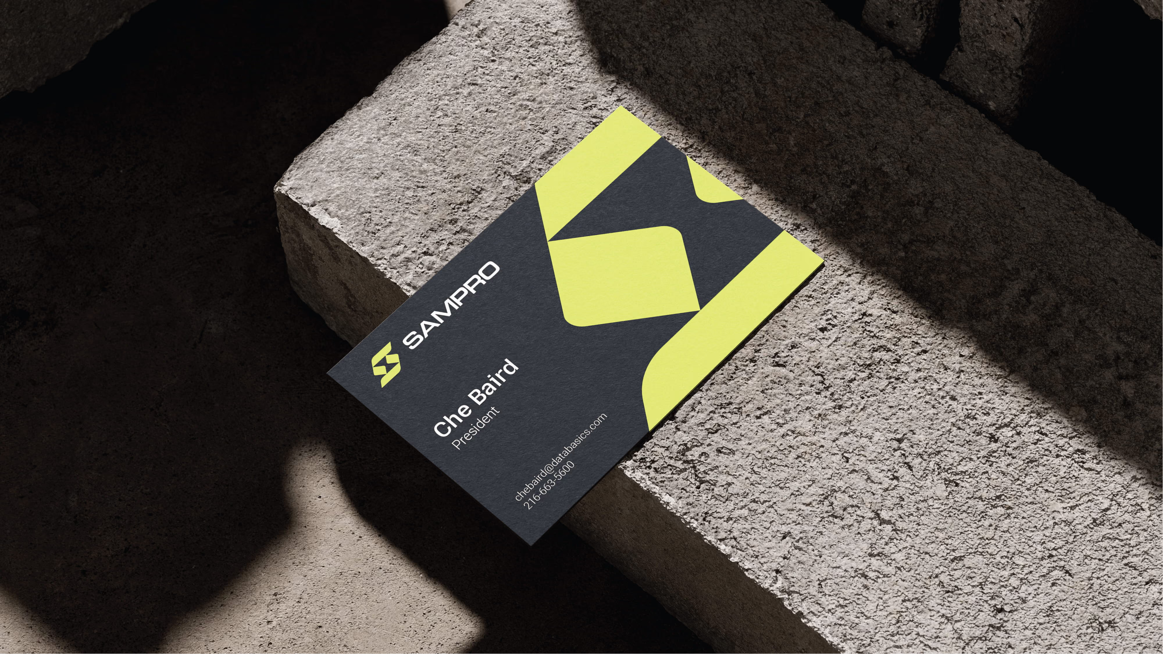
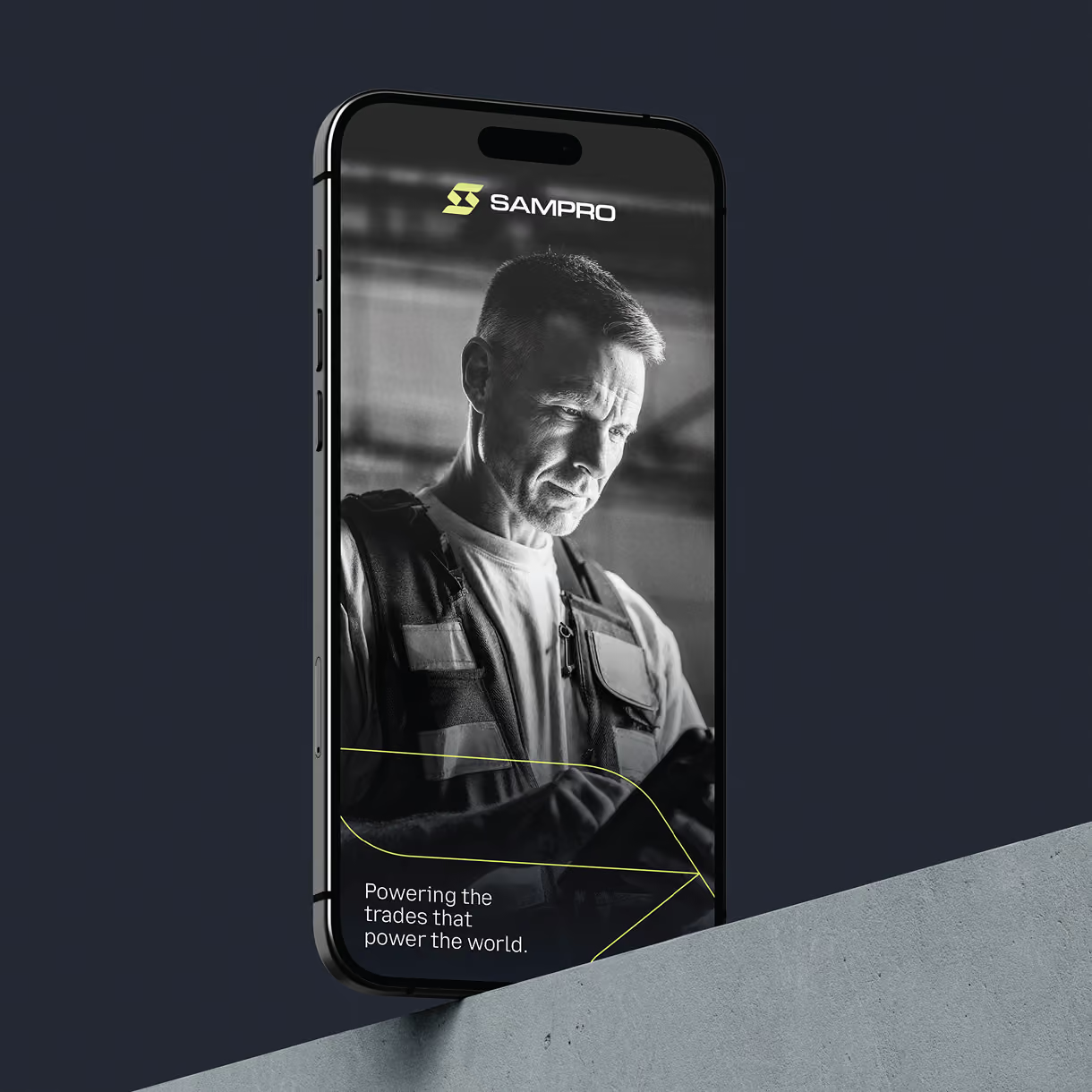
From there, we built a full brand identity that can grow with them: colors that separate SAMPRO from every competitor, clean, precise lettering, and flexible pieces for trade shows, online use, and client materials.
What We Delivered
SAMPRO walked away with a new naming system, a clear order for how the company and its products are named and organized, replacing the old Data Basics name. The package included the new logo, a full identity package and style guide, colors, and fonts.
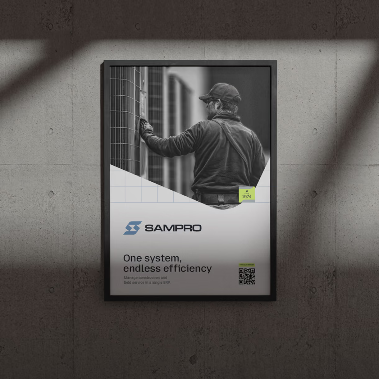
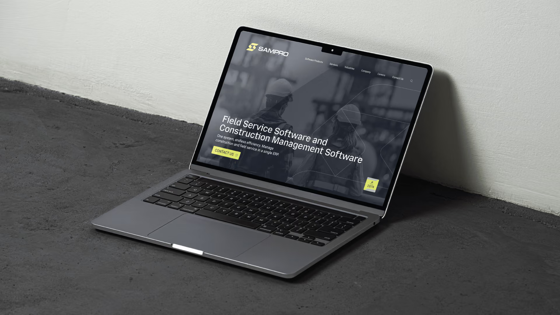
It also covered the pieces the team sells with every day: a fully redesigned website, updated sales materials, a clearer way of describing their products, tradeshow displays, and brochures, all tied together under one vision.
The Result
SAMPRO showed up to their next trade show as a completely different company, because they were. At the first tradeshow with the rebrand, booth traffic was higher than it had ever been. Attendees started asking how long they'd been around. Their answer: 50 years.
The rebrand ended the competitor confusion and gave the business a distinct place in the market. And it directly drove growth in leads, inquiries, and revenue.