Fusionlabs

fusionlabs set out to be the compounding pharmacy Orlando hadn't seen before. Custom medications, real personalization, and a brand built to match.
What Wasn’t Working
Most compounding pharmacies have no real look of their own. They look like generic drugstores. Cold colors. Clinical stock photos. Nothing that signals a personal touch. fusionlabs was building something different.
This was a practice built on custom medications and care tailored to each patient. Their brand had to say that before anyone ever walked in. The risk of blending in with every other Orlando pharmacy on the block was real.

How We Solved It
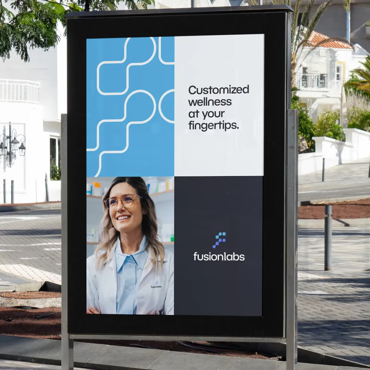
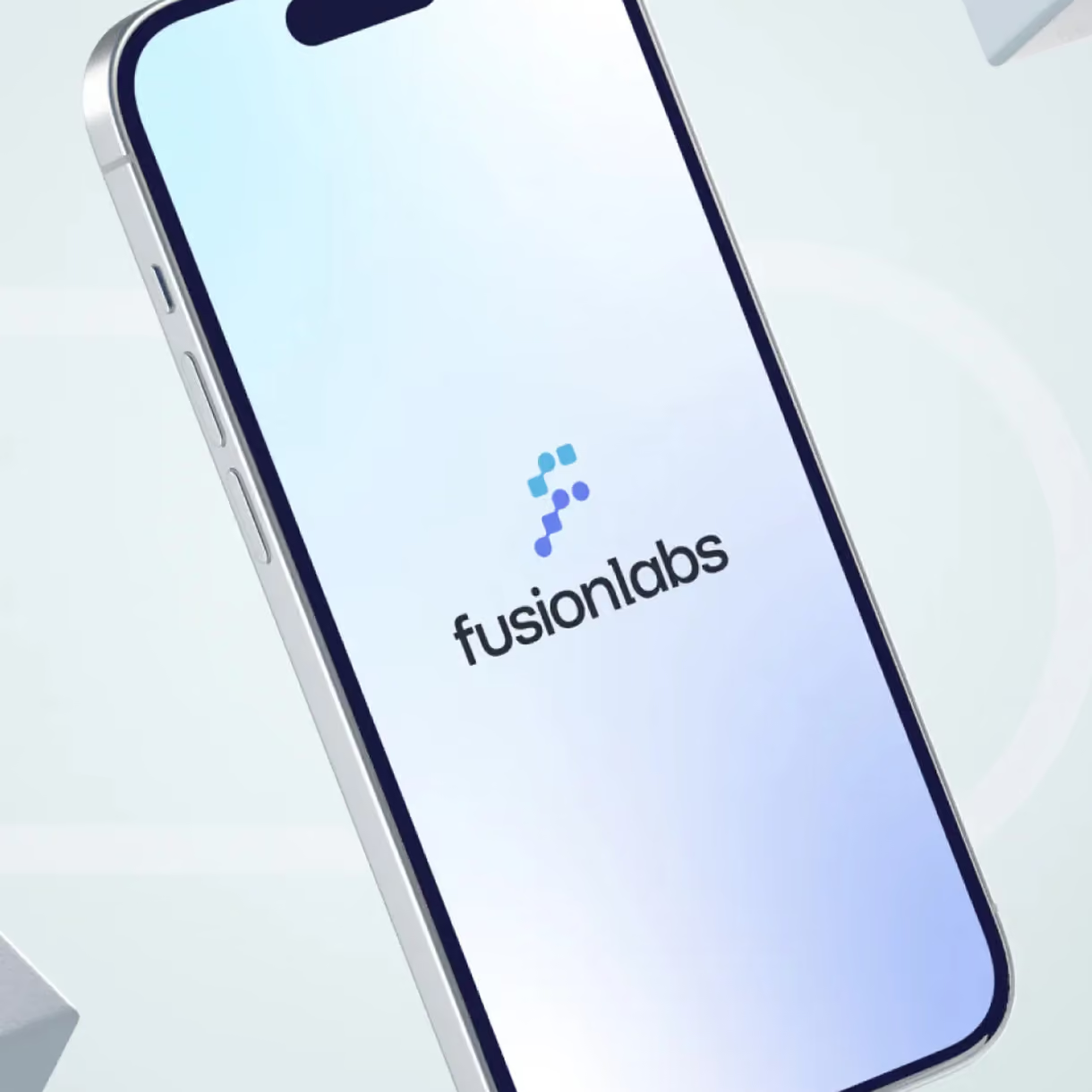
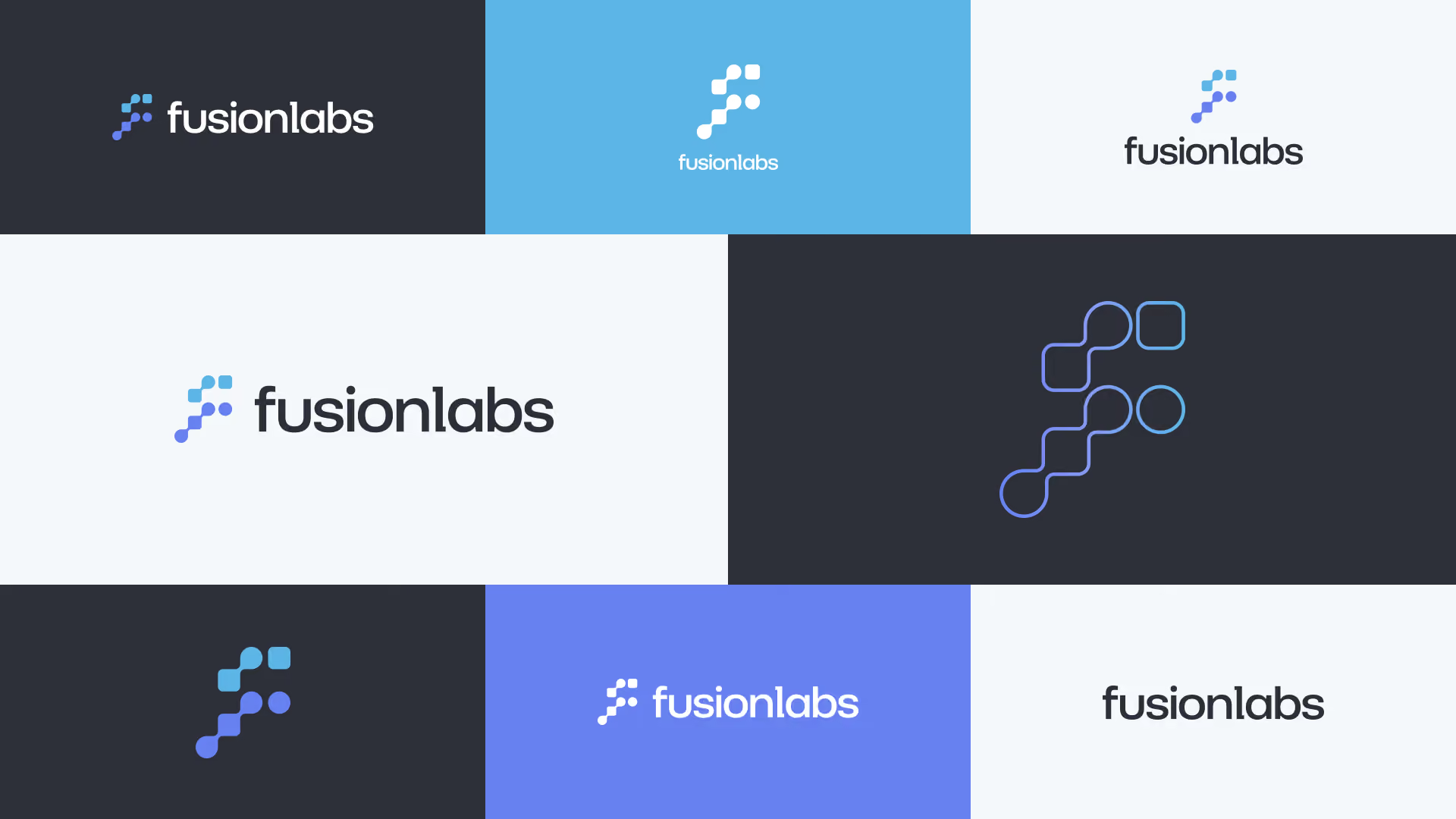
The letter f became the starting point, and we built out from there. Shapes from molecules and pills are woven into the logo. They connect straight to what fusionlabs does: careful compounding, custom chemistry, care made for each patient. The shapes flow smoothly into each other on purpose.
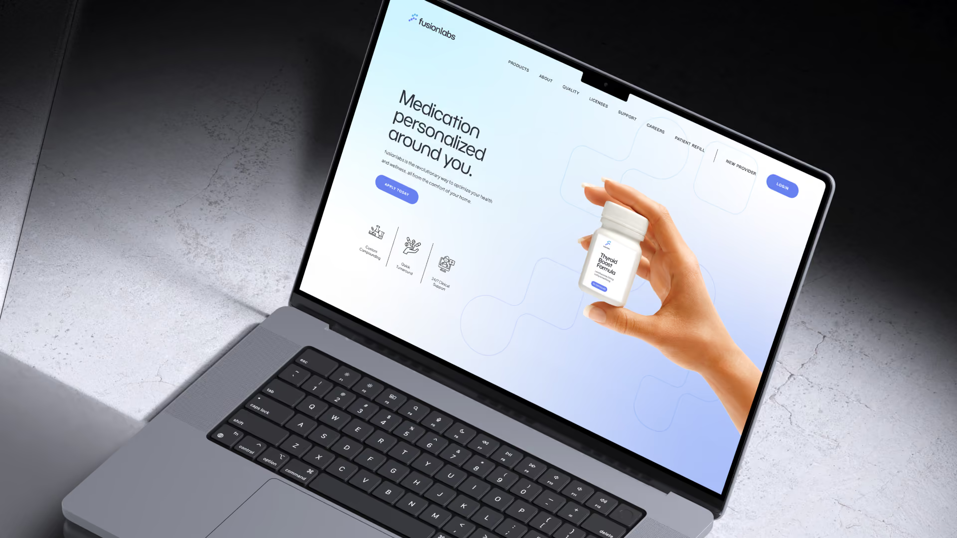
A subtle grid pattern sits behind it. It signals structure and scientific care without going cold. Arrow like shapes suggest forward motion and precision. The colors run cool blues and clean neutrals. Clinical enough to earn trust. Warm enough to feel personal. The fonts are clean and modern, built to work at any size, from building signs to delivery packaging.

What We Delivered
fusionlabs received the full look of the business. That means logo design with a full set of logo versions, colors, fonts, and a simple rule book to keep everything consistent.
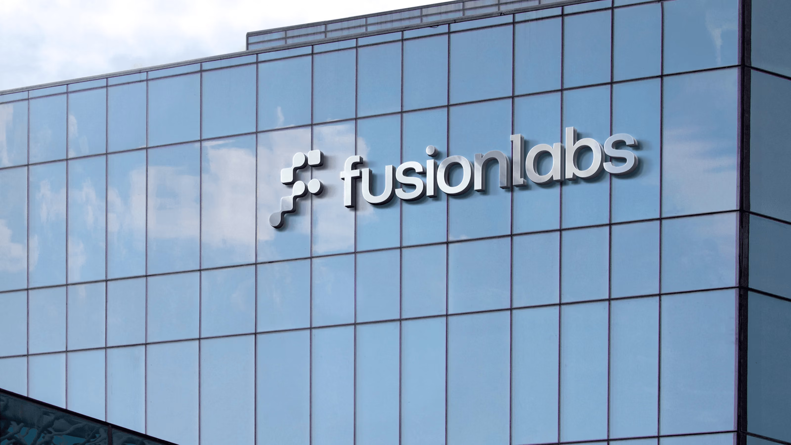
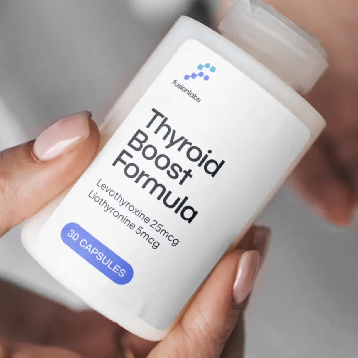
The look was built to work across the whole business. Building signs and uniforms. Packaging and digital. A growing pharmacy gets one clear look everywhere a patient or partner sees it.
The Result
fusionlabs launched with a brand that set them apart in the Orlando compounding pharmacy market. Patients and partners now meet a business that signals precision and personal care in equal measure. That is exactly the promise the business makes.
The look grows with the business. It makes fusionlabs look like the modern option in a space where most providers still look the same.



Finally, someone that can read minds. My company has used Greg multiple times when we were in desperate need of a logo and brand identity.