StarLite Cruises
Starlite operates dining yachts along Clearwater and St. Pete. Fine dining on the water at a price people can actually afford. The brand had to match that promise.
What Wasn’t Working
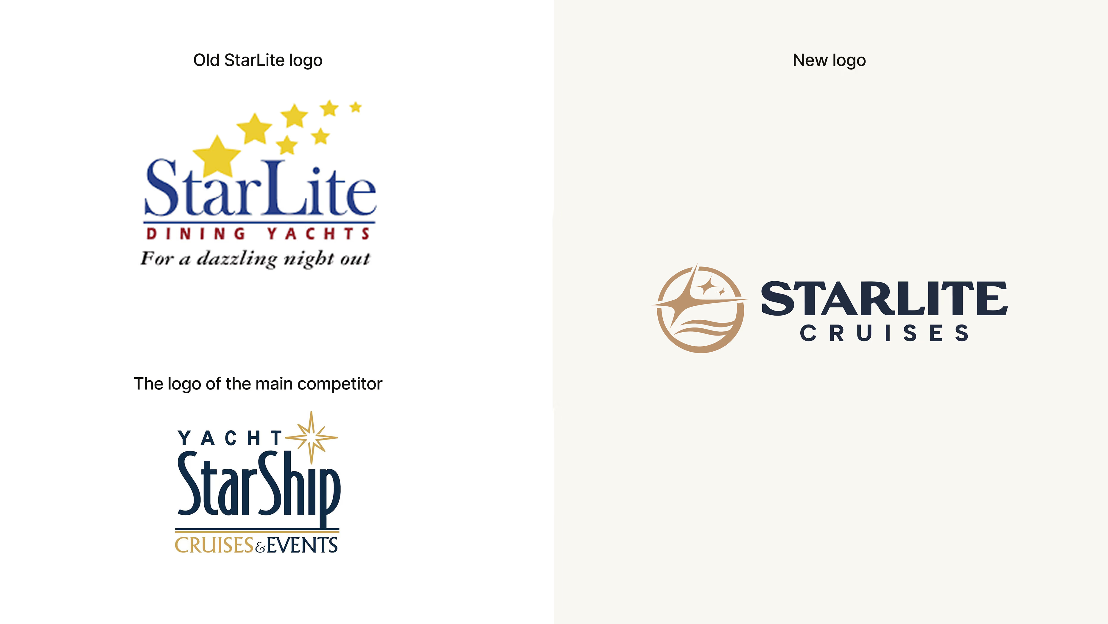
The old Starlite logo didn't match the premium experiences they sell. The royal-themed names, princesses and kings, felt like a different era. They had nothing to do with the real product: fine dining at sea, stars overhead, a Clearwater sunset.
New ships were coming, and each one needed its own spin-off brand. The logo had to work on a ship hull 100 meters long and in every logo version. And it had to feel premium but still welcoming to the price-conscious guests who made Starlite their first choice.
How We Solved It
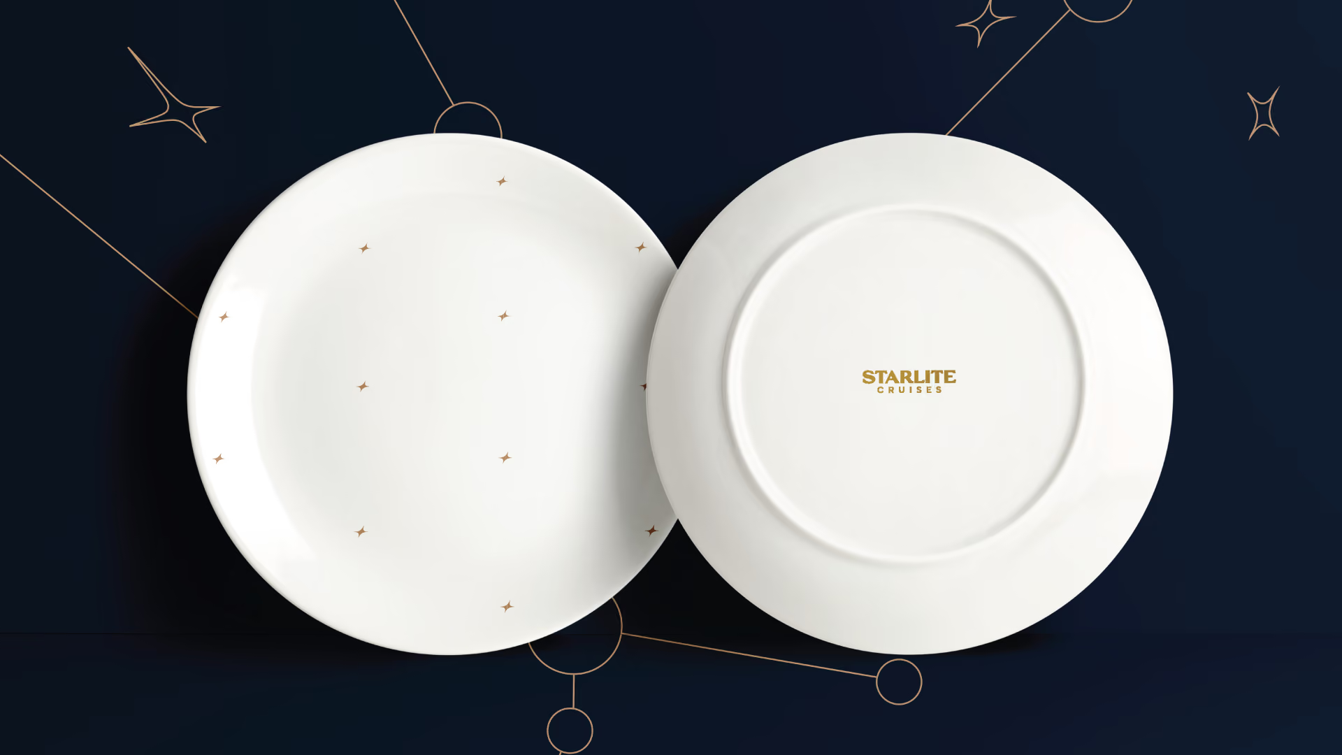
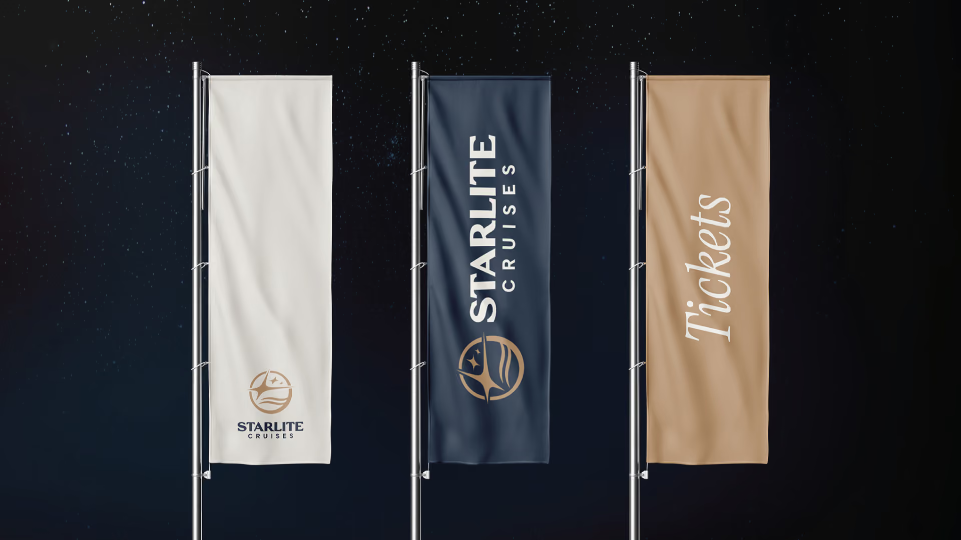
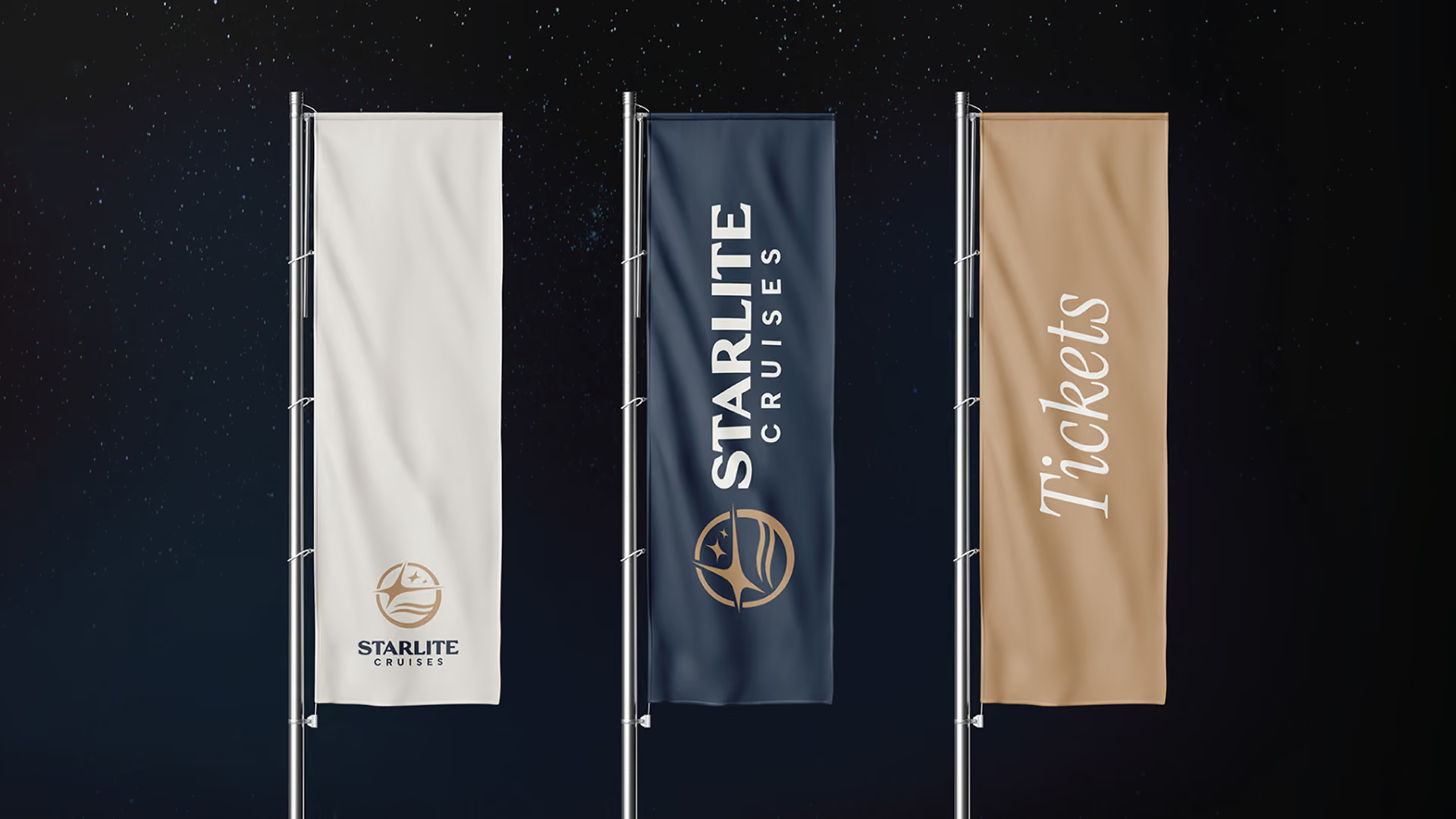
The logo design went back to the name for direction: starlight. A night out, stars overhead, a moment worth remembering. Ocean waves, a shooting star, a cluster of stars: clean, simple shapes that stay readable at any size, from a social post to a boat hull 100 meters long.
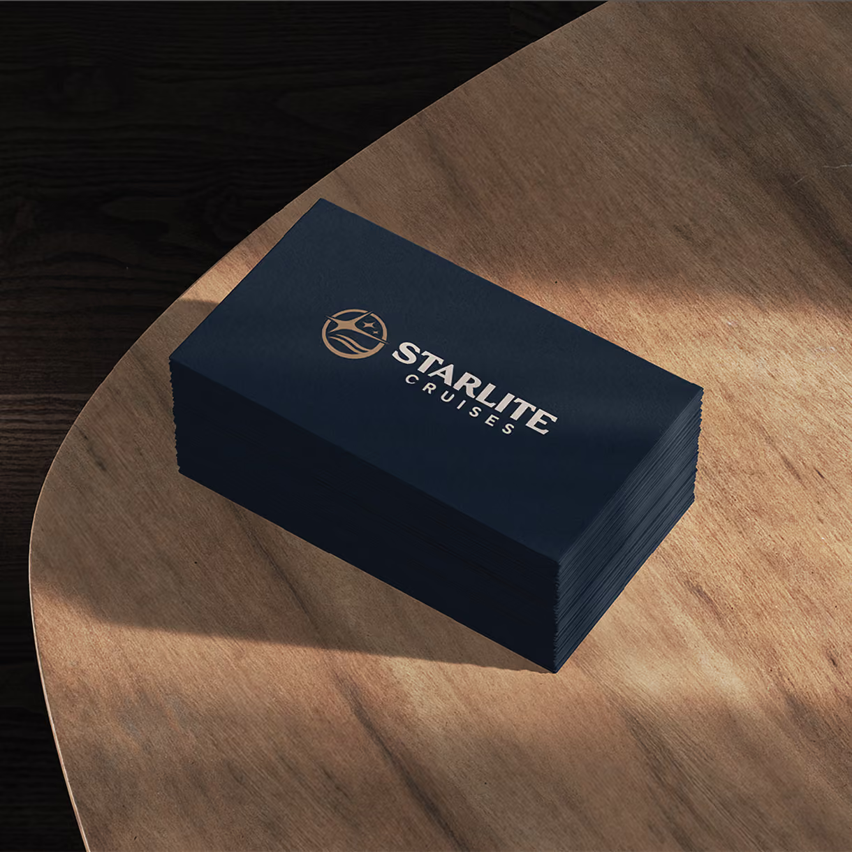
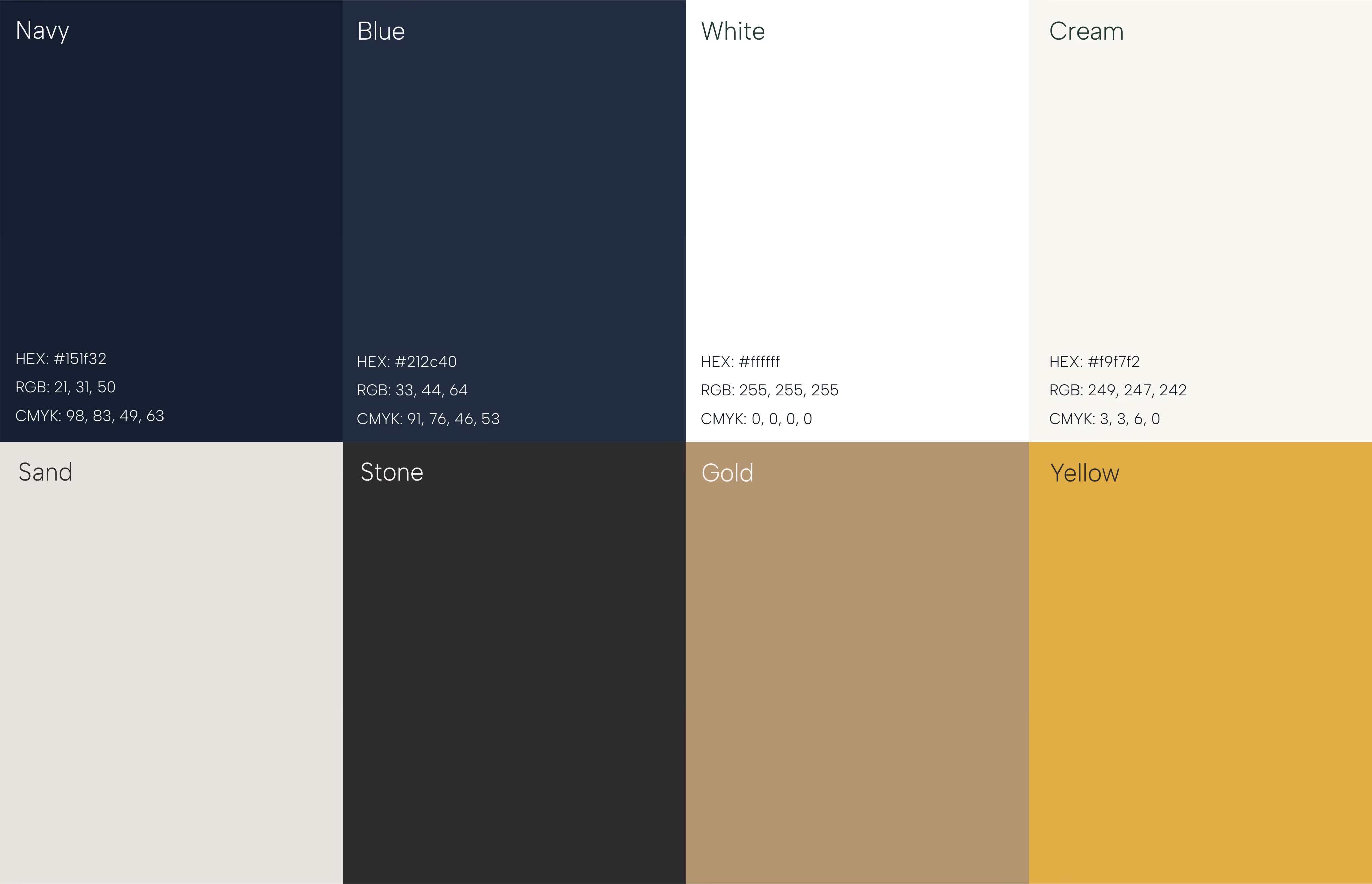
Deep navy, softer gold, and warm neutrals replaced the flat yellow and blue. The name written in all caps, with custom-drawn letters, adds craft without showing off.


What We Delivered
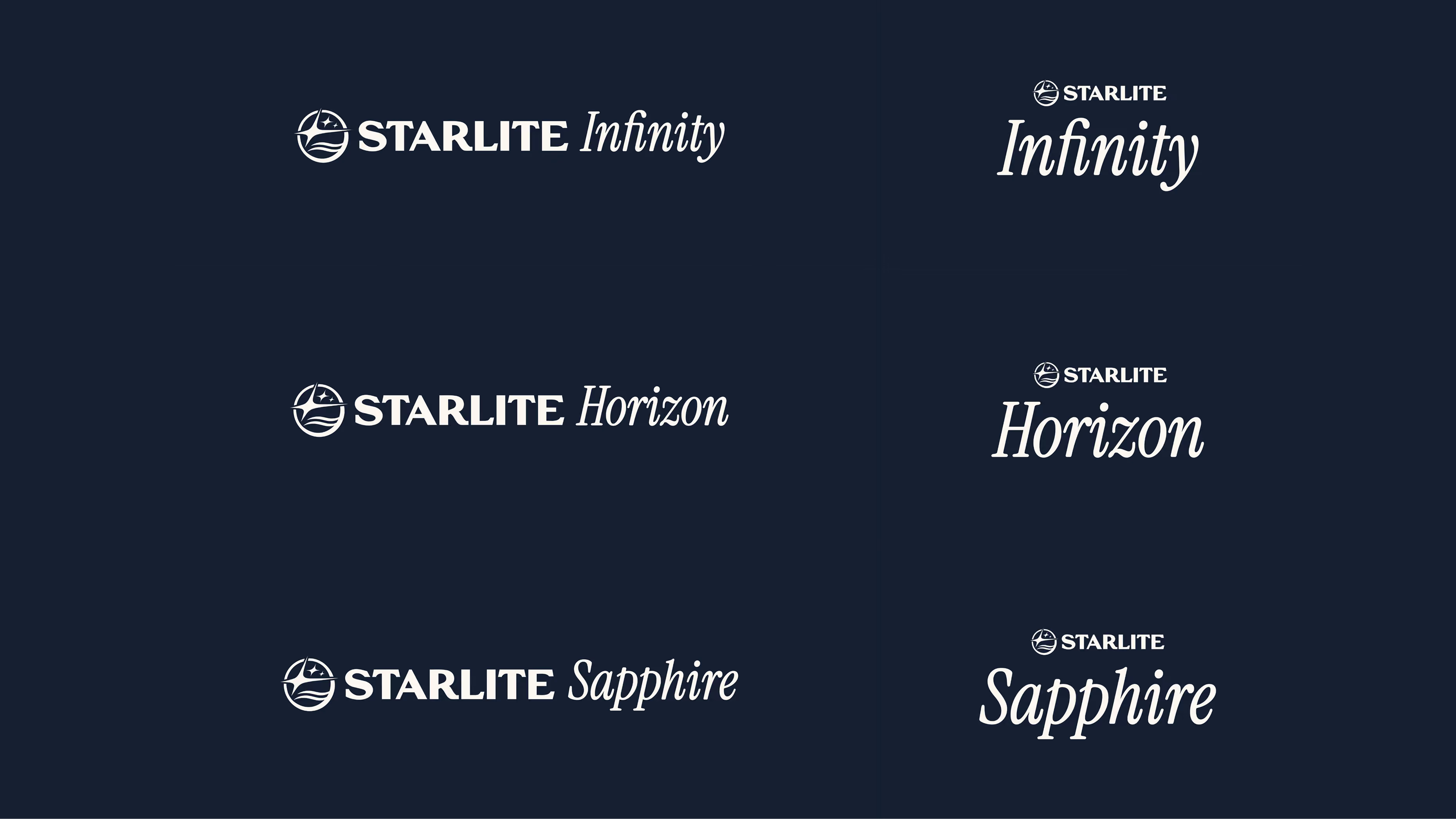
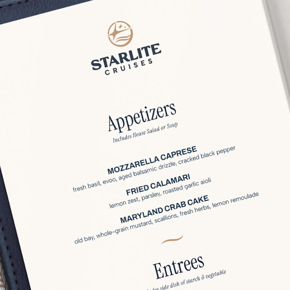
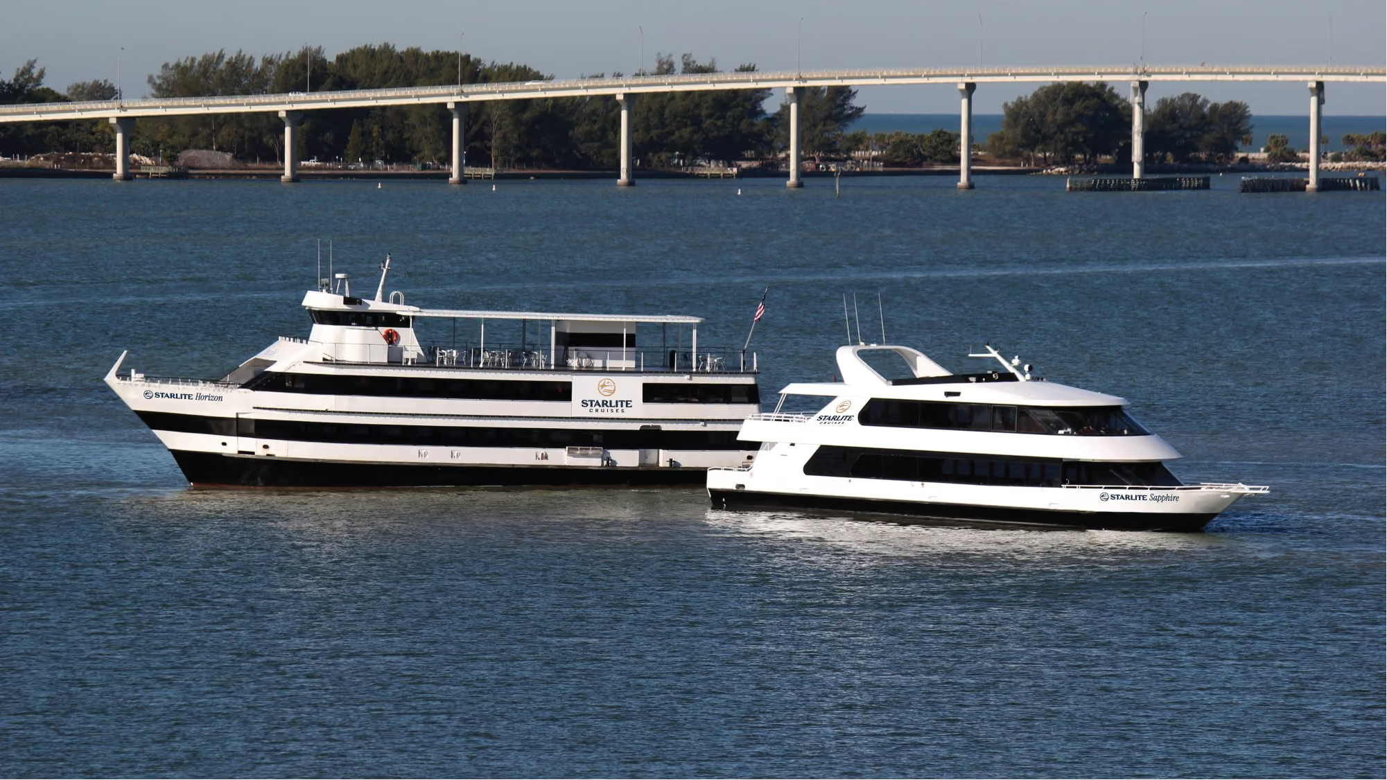
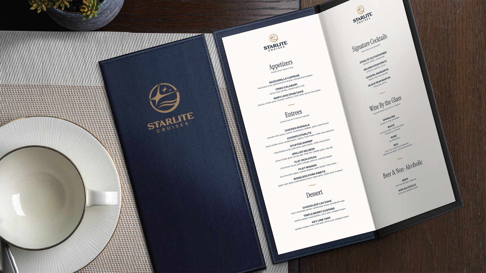
Starlite received a complete rebrand across the whole fleet: a full set of logos with a version for each ship, the Infinity, Horizon, and Sapphire, plus constellation and wave artwork and star pattern textures. The package also included the deep navy and gold colors, the fonts, menu design, and photo direction, so every ship and every printed piece carries the same look.
The Result
Every ship now carries a logo that looks the part. From the dock, the brand feels premium but still within reach. It invites price-conscious locals and tourists alike, without ever feeling like a discount cruise. The new look rolled out across the whole fleet. It gave Starlite a foundation to grow into new ships and spin-off brands without losing the thread.